
What matters most in this marble-and-grout pairing
- Light grey grout adds definition without turning the marble into a harsh grid.
- The tile finish matters as much as the grout color; polished and honed marble read very differently.
- Joint width should follow the tile’s size and calibration, not just the look you want on a sample board.
- Real marble needs sealing and gentle cleaning if you want the surface to age well.
- The best grey is usually the one that matches the stone’s undertone, not the paint color in the room.
Why light grey grout works with white marble
When I specify this look, I’m usually trying to solve a simple problem: white marble can be beautiful, but if the grout is too white, the joints disappear and the layout can look flat. If the grout is too dark, the marble starts to feel busy and the pattern takes over the room. Light grey sits in the middle, so the stone still feels bright while the edges stay readable.
That balance is especially useful in bathrooms because grout lines do more than frame the tile. They affect how large the room feels, how much movement you see on the surface, and how forgiving the finish will be after a few months of real use. Light grey usually hides minor shadowing, daily dust, and some hard-water residue better than pure white, while still keeping the overall palette calm.
| Grout tone | Visual effect | Maintenance feel | Best use |
|---|---|---|---|
| White | Seamless and very bright | Shows discoloration fastest | Showpiece walls, low-traffic areas |
| Light grey | Soft definition with a clean edge | More forgiving than white | Most bathrooms, especially showers |
| Medium grey | Stronger contrast and more pattern | Hides some soil, but reads busier | Floors, larger mosaics, modern schemes |
In practice, I find light grey is the safest middle ground for homeowners who want the timeless look of marble without signing up for a surface that feels precious. From here, the next question is where the pairing actually performs best in a bathroom, because that changes the spec more than people expect.
Where it looks best in real bathrooms
This combination is not equally strong everywhere. On a vertical shower wall, light grey grout can sharpen the marble just enough to make the pattern feel architectural. On a floor, the same grout can either ground the room or visually break it up, depending on tile size and joint spacing. I usually separate the decision by use, not just by appearance.
Shower walls
Shower walls are the easiest place to use white marble with soft grey joints because the surface is seen at eye level and doesn’t take the same abuse as a floor. Here, the grout mainly controls visual rhythm. A subtle grey line keeps the field from looking washed out, especially if the marble has faint veining that you want to preserve rather than drown in contrast.
Shower floors
Floors are less forgiving. More grout joints can improve traction, but they also create more maintenance. Small mosaics, hexagons, and basketweaves often make sense here because the added grout helps underfoot grip and suits the scale of a shower pan. If the grey is too dark, though, the floor can start to feel checkerboard-like, which is rarely the mood people want in a marble bath.
Read Also: New Grout Over Old - Does it Really Work?
Vanity backsplashes and tub surrounds
These are the places where the look can be most elegant. The grout becomes a quiet outline instead of a feature, so the stone feels deliberate rather than decorative. I like this application when the room already has some texture from wood, metal, or fluted fixtures, because the marble can stay refined without competing with every other finish.
If you are deciding between wall and floor use, I would usually save the most delicate marble patterning for the walls and keep the floor slightly simpler. That leads directly to the part that changes the outcome more than color alone: finish, joint width, and layout.
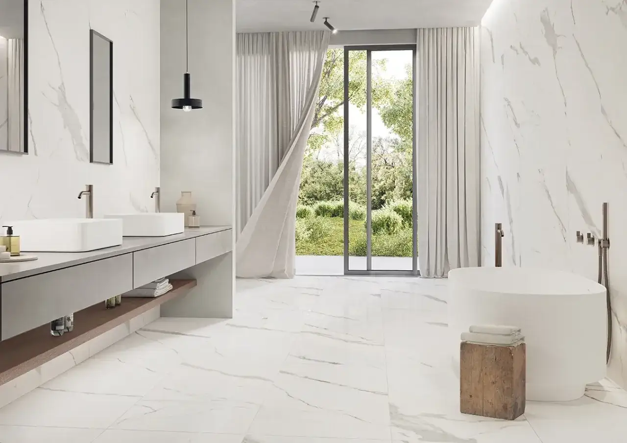
Finish and joint width change the whole read
Marble finish changes how the grout color behaves. Polished marble reflects more light, so the grout line can look softer and narrower from a distance. Honed marble absorbs more light, which makes the same grout joint read more matte, more grounded, and often a little more contemporary. If the room has bright natural light, the difference becomes even more obvious.
Joint width matters just as much. For natural stone, I rarely push for a zero-joint look. In the real world, the tile’s calibration, the installer’s skill, and the pattern all affect what will actually look clean. A narrow joint around 1/16 inch can feel crisp on well-made stone, while 1/8 inch often looks more honest and is easier to live with when the material varies slightly. When the tile is not perfectly consistent, a slightly wider joint usually looks better than an over-tight joint that starts to wander.
Pattern also changes the mood. Straight-set marble with soft grey joints feels calm and classic. Herringbone, basketweave, and hexagon layouts add movement, which can be beautiful, but they also amplify grout visibility. That is fine if you want a more textural bathroom. It is less ideal if the goal is a quiet, spa-like wall that barely announces itself.
One practical detail I watch closely is grout chemistry. For narrower joints, many installers use a grout suited to the actual joint size and tile finish rather than choosing by color alone. On polished marble, the wrong aggregate can scratch the surface, so the finish and the product need to be considered together, not separately. This is one of those details that sounds small until the room is installed and the surface starts showing everything.Maintenance is the price of using real marble
This is the part people underestimate. Marble is a natural stone, so it is more sensitive than porcelain to acids, staining, and careless cleaning. Grout adds its own maintenance burden because it is porous and can hold moisture, soap residue, and mineral deposits. Light grey helps, but it does not erase the need for routine care.
I recommend sealing both the marble and the grout if the product and installation call for it, especially in showers and on floors. Sealing does not make the surface waterproof, but it does slow down absorption and gives you more time to clean spills before they leave a mark. In many homes, it makes sense to check the grout once a year with a simple water test: if water darkens the joint instead of beading, it is probably time to reseal.
Daily care should stay simple. Use a pH-neutral cleaner designed for stone or tile, wipe away soap residue regularly, and avoid vinegar, bleach, and abrasive powders. In a shower, a quick squeegee after use does more for the long-term appearance than most people expect. Good ventilation matters too, because moisture sitting in the grout lines is what turns a fresh bathroom into a dull one.
If the bathroom sees heavy use, a higher-performance grout can be worth it. I usually think of that as an investment in the look, not just in durability. The better the grout resists staining, the longer the marble keeps its clean outline and the less the room drifts toward patchy or tired.
Once you understand the maintenance tradeoff, the next step is avoiding the mistakes that make the whole installation look less intentional than it should.
The mistakes I see most often
- Choosing a grey that is too dark, which makes the tile grid dominate the marble.
- Matching the grout to the brightest white in the stone instead of to the overall undertone.
- Ignoring the room’s lighting, especially warm evening light that can shift the grey warmer than expected.
- Using a finish that clashes with the room, such as highly polished marble in a space that otherwise reads matte and quiet.
- Forcing very tight joints on inconsistent natural stone, which can make the installation look uneven rather than sleek.
- Skipping a real sample board and approving the color from a tiny chip under showroom lighting.
The sample board mistake is the one I would put closest to the top. Light grey grout can look elegant in a warehouse or showroom and then read completely differently next to LED vanity lighting, daylight, and a painted wall. I always want to see the stone, grout, and surrounding finishes together before anyone signs off.
If you want a good rule of thumb, test the combination in both daytime and evening light. A grey that feels balanced at noon may look cooler at night, while a slightly warmer grey can suddenly lean beige in a room with warm bulbs. That is not a failure of the material; it is just how undertones work.
The version I would choose for common bathroom styles
For a spa-like primary bath, I would usually choose honed white marble with a soft, cool light grey grout and a restrained layout. It feels calm, and it ages more gracefully than an all-white joint line. For a classic bathroom, polished marble with similarly light grey joints gives a cleaner, more tailored look without losing the traditional feel. For a family bath, I would lean toward a grout that is still light but slightly more forgiving, because daily use matters more than showroom perfection.
My own decision process is simple. I start with the stone’s undertone, then I look at the finish, then I check the scale of the tile, and only after that do I lock in the grout color. If any one of those pieces is off, the bathroom can still be nice, but it will not feel cohesive. When all four line up, the result is quiet in the best possible way: bright, balanced, and clearly designed rather than merely installed.
That is why this pairing works so well when it is handled with restraint. Keep the contrast soft, respect the stone’s maintenance needs, and sample everything in the actual room before committing. The marble will do the rest.