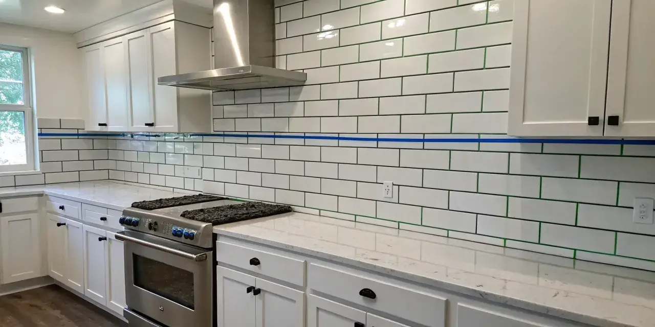
This finish is strongest when the contrast is deliberate
- Blue grout turns a simple subway layout into a visible pattern, so alignment matters more than it does with white grout.
- Muted blue-gray shades usually age better than bright, saturated blues in bathrooms and kitchens.
- For most subway tile, grout joints around 1/16" to 1/8" are common, but the tile’s edge quality should guide the final joint size.
- Cement-based grout usually needs sealing, while epoxy and many ready-to-use formulas reduce maintenance.
- The look tends to work best on backsplashes, shower niches, accent walls, and other surfaces where the pattern can be intentional.
Why the pairing works
I like this combination because it gives white subway tile a point of view. The blue lines separate each tile just enough to make the grid visible, which adds structure without making the wall feel heavy. That is the real appeal: the tile still reads clean, but the grout gives it personality.
The effect changes with the finish of the tile. On glossy tile, blue grout feels sharper and more graphic. On matte tile, it looks softer and a little more architectural. A pale blue can suggest a coastal or classic bath, while a deeper shade moves the look toward tailored and contemporary. In other words, the grout is doing more than filling a gap. It is steering the style.
That contrast is what makes the finish interesting, and it also determines where it belongs.
Where this look earns its keep
I usually reserve stronger grout contrast for surfaces that can handle being a focal point. A full wall of white tile with blue joints can look fantastic, but only if the room has enough restraint elsewhere. If every other surface is competing for attention, the grid starts to feel noisy instead of intentional.
| Application | Why it works | What to watch |
|---|---|---|
| Kitchen backsplash | Small enough for the color to feel fresh and controlled. | Cooking splatter makes grout maintenance more important. |
| Shower niche | Creates a clear accent without taking over the whole room. | Corners and cut edges need a neat install. |
| Feature wall in a shower | Gives the room a custom, tailored feel. | Strong blues can get busy if the shower is large. |
| Powder room or laundry backsplash | Perfect for a statement in a compact space. | The rest of the palette should stay calm. |
| Full-room wrap | Works when the goal is a bold, patterned envelope. | Needs very clean layout lines and careful lighting. |
My practical rule is simple: the larger the surface, the more measured the blue should be. A restrained shade can stretch farther than you think, but a loud one can overwhelm a room faster than most homeowners expect. Once you know the right canvas, the next decision is the shade itself.
How to choose the right blue
Blue grout is not one look. The color you pick changes the room just as much as the tile does. I usually recommend testing at least two sample boards: one in daylight and one under the actual vanity or under-cabinet lighting. The same grout can look calm in one corner and oddly bright in another.
| Blue shade | Overall feel | Best use | Main risk |
|---|---|---|---|
| Dusty blue-gray | Soft, calm, and easy to live with | Main bathrooms, kitchens, and larger wall areas | Can disappear in a dim room |
| Denim blue | Balanced and relaxed | Family bathrooms and everyday backsplash areas | May read cooler than expected next to white quartz or cool paint |
| Cobalt | Bold and energetic | Small accents, niches, or playful powder rooms | Can overpower a large wall |
| Navy or ink blue | Rich, graphic, and more tailored | Rooms with brass, walnut, or white oak | Can feel heavy if the space is already dark |
When I want the result to feel timeless rather than trendy, I lean toward blue-grays and muted denim tones. They still create contrast, but they do not fight the tile. If the goal is a stronger decorative statement, navy can be excellent, especially in a small area where the effect feels deliberate instead of overwhelming. The shade only works if the grout itself can hold color and stay clean, so maintenance comes next.
Grout type and maintenance are where the real trade-off lives
Blue grout looks good only if it stays blue. That sounds obvious, but it is where many projects go sideways. Colored grout can show haze, uneven washing, and staining more clearly than people expect, especially on glossy white tile. I care a lot about the grout formula here because a beautiful color that is hard to keep consistent stops being beautiful pretty quickly.
| Grout type | Why I would use it | Trade-offs | Best fit |
|---|---|---|---|
| Cement-based grout | Common, familiar, and available in many colors | Porous, so it usually needs sealing and more upkeep | Most standard wall tile jobs when you want flexibility |
| Epoxy grout | Strong stain resistance and good color consistency | Less forgiving to install and often harder to clean during application | Showers, busy kitchens, and other high-use areas |
| Ready-to-use or single-component grout | Convenient and often low-maintenance | Color options can be narrower, and product behavior varies by brand | Projects where easier upkeep matters more than custom mixing |
For most wall installations, I would also keep the joints modest. Subway tile usually looks best with joints around 1/16" to 1/8", depending on the tile’s size variation and edge quality. A more precise tile with cleaner edges can take a tighter joint and make the color contrast feel crisp. A handmade or slightly irregular tile often looks better with a bit more breathing room, because the wider joint softens the imperfections instead of highlighting them.
- Use color-matched caulk at corners and change-of-plane joints instead of forcing grout where movement will happen.
- Clean haze early; blue pigment haze on white tile is more noticeable than people think.
- Seal cement grout according to the product instructions, then inspect it over time instead of assuming it is permanent.
- Use a pH-neutral cleaner for routine maintenance if you want the finish to stay bright.
- Test a sample board before installation, because the same blue can look very different once it dries.
With the material side settled, the room still needs a few design cues to keep the finish from feeling isolated.
The surrounding finishes decide whether it feels polished
I think this is where the best versions of the look separate themselves from the merely cute ones. Blue grout is not supposed to float alone in the room. It should connect to something else, even if that connection is subtle. A brushed nickel faucet, a walnut vanity, a pale blue paint color, or a simple white countertop can all help the grout feel intentional.
- Chrome or polished nickel keeps the room fresh and clean, which suits a more classic bathroom.
- Brushed brass or unlacquered brass warms the blue and stops the space from feeling too cool.
- Wood cabinets or vanities add depth and keep the tile from dominating everything.
- White quartz or marble-look surfaces reinforce the crisp, graphic side of the palette.
- Soft gray or blue-gray paint makes the grout feel connected to the rest of the room instead of random.
Pattern choice matters too. A running bond layout keeps the installation familiar, while a stacked bond feels more modern and architectural. If the tile has a slight bevel, the blue grout will catch the edge and make every line more visible, which can be beautiful or distracting depending on the room. I also find that very busy floors are a bad match for strong grout contrast; the eye needs somewhere to rest. Before anything gets ordered, I always slow down for a last round of checks.
The last decisions that keep the finish from feeling accidental
If I were signing off on this layout for a client, I would verify a few things before the grout bag ever gets opened. Those details do not sound glamorous, but they are what make the finish look designed instead of improvised.
- Confirm the actual tile size and edge quality, not just the nominal size on the box.
- Mock up the grout color on a spare board and let it dry fully before deciding.
- Check how the color reads under the room’s real lighting, not only in daylight.
- Decide where caulk should go so movement joints are handled correctly.
- Keep extra grout from the same batch if the project is large, because color matching matters later.
- Make sure the installer understands how much contrast you want, since a slightly different joint width can change the whole look.
If you want a backsplash or bath wall that feels crisp but not sterile, this is a strong direction. I would just keep the palette tight, the tile work precise, and the maintenance plan realistic. When those three pieces line up, the finish feels deliberate rather than decorative.