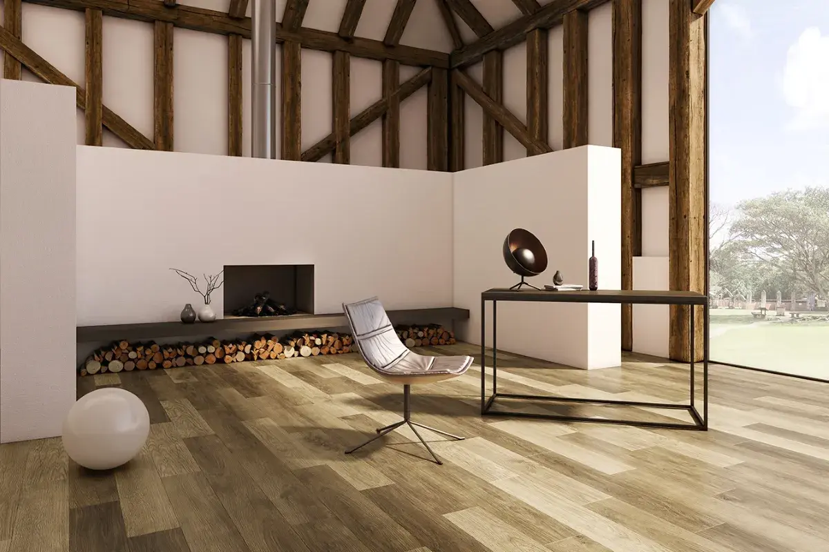
The right vinyl plank layout patterns can make a small room feel wider, soften awkward angles, and keep the finished floor from looking busy. In bathrooms, hallways, and open-plan spaces, the layout matters almost as much as the plank color because it controls how the eye moves across the room, where the cuts land, and how polished the floor feels once everything is installed. This guide breaks down the main pattern choices, when each one works, and the practical details that keep the final result looking intentional.
The best layout is the one that suits the room, not just the sample board
- Straight lay feels calm and clean, especially in modern bathrooms and narrow rooms.
- Staggered rows are the safest all-around choice for most vinyl plank installations.
- Diagonal and herringbone add movement, but they cost more in cuts, waste, and planning.
- Room shape, light, and sightlines should decide the direction before you start cutting.
- Most manufacturer guides call for a clear expansion gap and a stagger between end joints, but the product instructions always win.
- Bathroom layouts work best when they avoid tiny slivers near tubs, toilets, and doorways.
Why the layout changes how the floor feels
Flooring is one of those details that looks simple until the wrong pattern makes a room feel shorter, narrower, or oddly chopped up. I treat layout as a design decision and a measurement problem at the same time. A floor with clean lines can calm a busy bathroom, while a more active arrangement can add energy to a plain space that needs character.
The biggest effect comes from direction. Run the planks the wrong way and you can visually shorten a room or draw attention to uneven walls. Run them well and the floor starts doing subtle work for you: it stretches the space, hides small imperfections better, and makes the installation look deliberate instead of improvised. Once that is clear, it becomes easier to compare the actual pattern choices.
The pattern options worth comparing
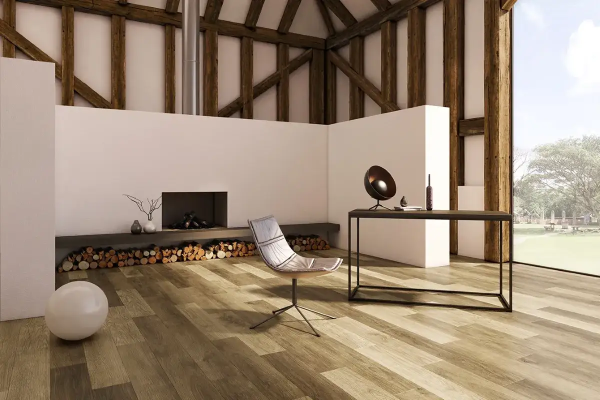
When people talk about plank layout, they usually mean a small set of proven arrangements. Some are practical and quiet. Others are decorative and demanding. The right choice depends on how much visual movement you want, how much waste you can tolerate, and how complex the room is.
| Pattern | Visual effect | Best use | Main tradeoff |
|---|---|---|---|
| Straight lay | Clean, linear, calm | Modern bathrooms, small rooms, minimalist spaces | Can feel plain if the room needs more character |
| 1/3 stagger | Natural, balanced, less repetitive | Most living spaces and family bathrooms | Requires a bit more planning than a simple offset |
| 1/2 stagger | Classic brick-like rhythm | Traditional interiors with long, even runs | Can create a repeating visual beat if used too rigidly |
| Diagonal | More movement and depth | Square rooms or spaces that feel boxy | More cuts, more waste, more layout checking |
| Herringbone | High design, strong texture, very intentional | Feature floors, larger bathrooms, statement spaces | Highest planning load and usually the most waste |
| Chevron | Sharper, more graphic V-shape | Design-forward interiors with room to show it off | Not every vinyl plank product is built for it |
If I had to narrow the list for most homes, I would start with straight lay, 1/3 stagger, and diagonal. Herringbone is worth considering when the room can support it visually and financially, but it should never be the default just because it looks stylish in photos. The best pattern is the one that suits the room you actually have, not the one that looks most dramatic on a mood board.
How to match the pattern to the room
The same layout can feel right in one room and wrong in another. A narrow bathroom, a long hallway, and a square guest bath all ask for different treatment. I usually choose the pattern based on three things: the room’s proportions, the main sightline, and where the difficult cuts will land.
- Long, narrow rooms usually look best when the planks run lengthwise. That extends the space and keeps the eye moving forward instead of across every seam.
- Square rooms can handle a bit more movement. A diagonal layout often works well here because it breaks the boxy feeling without overwhelming the room.
- Bathrooms need extra caution around vanities, tubs, toilets, and door openings. I try to avoid ending up with skinny slivers where the eye lands first when someone enters the room.
- Open-plan spaces usually benefit from the simplest possible direction. Too many visual turns make the floor feel segmented instead of continuous.
Natural light matters too. In many homes, I run the planks parallel to the main light source because the seams read more softly that way. That is not a rigid rule, though. If the room has a stronger architectural line, like a long vanity wall or a clear doorway axis, that sightline can matter more than the window. Once the direction is set, the installation details become the next thing that separates a clean result from a frustrating one.
The installation rules that keep the layout looking intentional
Even a smart layout can look wrong if the first rows are crooked or the joints repeat too predictably. I always check the product’s installation guide first, because vinyl plank systems vary more than people expect. Still, a few rules show up again and again across quality installs.End-joint spacing matters more than most beginners think
Many manufacturers want adjacent end joints staggered by at least 6 to 8 inches, and some wider products need even more than that. The purpose is simple: you want the seams to look random enough that the floor reads as a surface, not a grid of short pieces. A repeated seam pattern can make the install look fake, and it can weaken the visual rhythm of the floor.
The perimeter gap is not optional
Floating vinyl floors need room to move. A typical expansion gap is often around 1/4 inch, though some products specify a different number. I never treat that as a guess. The correct gap depends on the product, the room, and the manufacturer’s system, especially around fixed objects like tubs, cabinets, pipes, and door casings. If you trap the floor, the layout may look perfect on day one and still fail later.
Read Also: Best Shower Floor - Traction, Drainage & Style Guide
A flat subfloor protects the pattern
Vinyl plank is forgiving, but it is not magic. If the subfloor waves, the pattern will reveal it, especially in direct light. Before I commit to a final layout, I want the floor flat, dry, and ready for a floating or glue-down system, depending on the product. In bathrooms, that prep matters even more because moisture and movement expose weak planning faster than any other room.
When those basics are right, the pattern can do its job. When they are wrong, even a beautiful layout starts looking accidental, which is why the next section is mostly about avoiding preventable mistakes.
Common mistakes that make a good floor look off
Most layout problems are not dramatic. They are small decisions that pile up until the floor feels slightly wrong. The good news is that these mistakes are easy to avoid once you know what to look for.
- Repeating the same cut length row after row. That creates a visible rhythm that feels mechanical.
- Starting from a crooked wall instead of a reference line. Walls are often out of square, and the floor should not inherit that error.
- Ending with tiny slivers at the most visible edge of the room. Small edge pieces usually look like a mistake, not a design choice.
- Ignoring transitions at doorways. If the pattern shifts badly at the threshold, the room loses continuity.
- Using too many cartons from one shade range at the end. Mixing boxes throughout the job helps keep the color and grain variation balanced.
- Forcing a decorative layout into a cramped room. Herringbone is attractive, but in a tight bathroom it can feel busy very quickly.
A simple planning method before you start cutting
I like to plan vinyl plank flooring in the same order I would solve a design problem: measure the room, find the main sightline, test the pattern, then lock in the starting line. It keeps me from chasing the layout after the cuts have already started.- Measure the room in more than one direction and note the narrowest points, not just the overall square footage.
- Decide which wall, doorway, or window dominates the view when someone enters the room.
- Lay out a few rows dry to see where the end joints land and whether the pattern repeats too obviously.
- Check the product’s minimum stagger requirement and adjust the starting cut so the joints do not create a predictable rhythm.
- Confirm where the last full plank and the final cut will land so you do not end up with a sliver at the edge.
| Layout type | Reasonable waste allowance |
|---|---|
| Straight lay or simple stagger | About 7% to 10% |
| Diagonal layout | About 10% to 15% |
| Herringbone or chevron | About 15% to 20% or more |
Those are planning ranges, not hard laws. Odd-shaped rooms, lots of doorway cuts, and bathroom fixtures can push waste higher. I would rather order a little extra than be stuck trying to match color and grain from a second batch that reads slightly different under the light.
The layouts I would still trust in a bathroom
For most bathrooms and everyday interiors, I still favor restraint. A straight or gently staggered floor usually looks the most settled, especially when the plank direction follows the longest run of the room. That approach feels current in 2026 because it lets the materials and the fixtures do the talking instead of making the floor the loudest thing in the space.
If the room is larger and you want a more designed look, herringbone can be excellent, but only when the room has enough width to let the pattern breathe. In a small bath, the visual energy can become clutter. In that setting, I would rather see a quiet floor with clean transitions, generous plank lengths, and no awkward slivers near the vanity or tub.
The best result is the one that looks deliberate from the doorway and stays practical during installation. If you keep the room shape, the sightline, and the waste plan in mind from the start, the layout will do more than cover the subfloor. It will make the whole space feel more finished.