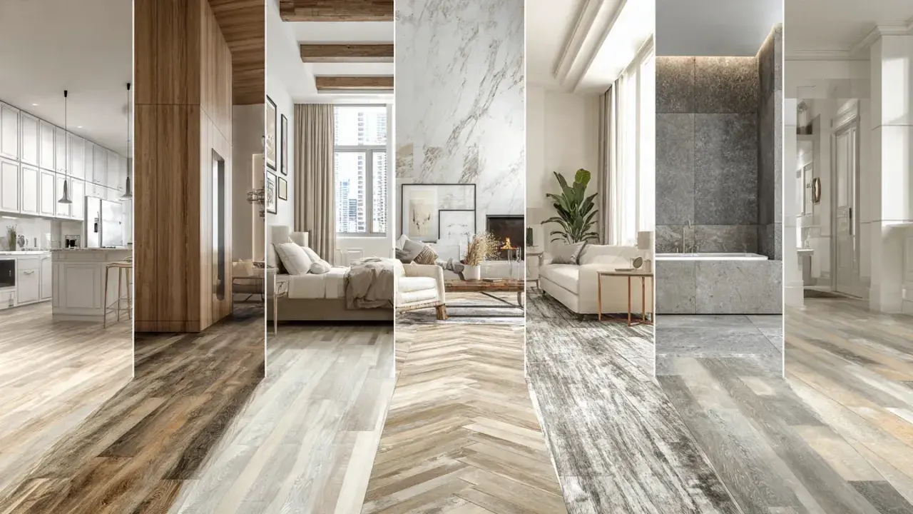
LVT can look calm and seamless, or it can become the design feature that ties a room together. The difference is usually the layout: straight lay, brick bond, diagonal, herringbone, chevron, or a more decorative border pattern. I focus on the floor first because the best lvt installation patterns do more than look good; they help a room feel wider, cleaner, and more intentional.
What matters before you choose the layout
- Simple layouts are faster and cheaper; decorative layouts need more cutting, more planning, and usually more waste.
- Not every LVT collection supports every pattern, especially with click-lock rigid-core products.
- Bathrooms and other compact rooms benefit most from layouts that control visual direction, not just from a pretty motif.
- Plan for extra material: 10% is a solid baseline, while diagonal, herringbone, and border work often need 15% to 20%.
- Subfloor flatness matters more as the pattern gets more intricate.
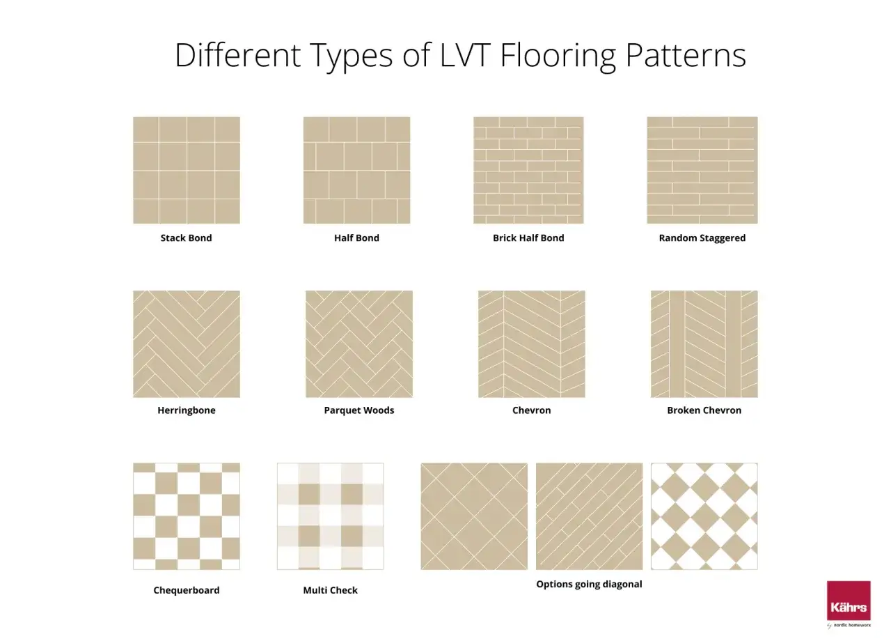
The patterns that change the room
When I talk about LVT layouts, I usually break them into a few practical families rather than a long design glossary. Some are quiet and architectural, others are deliberately decorative, and a few are best used only when the room gives you enough space to let them breathe.
| Pattern | What it does visually | Complexity | Best use | Main tradeoff |
|---|---|---|---|---|
| Straight lay or grid | Feels calm, clean, and symmetrical | Low | Small baths, powder rooms, minimalist interiors | Can feel plain if the room needs more character |
| Brick bond or offset | Adds movement without looking busy | Low to medium | Plank-look LVT, kitchens, laundry rooms, hall baths | Needs careful staggering so the floor does not look uneven |
| Diagonal | Makes square rooms feel larger and more dynamic | Medium | Compact rooms, awkward layouts, rooms with strong side walls | Creates more perimeter cuts and more waste |
| Herringbone | Feels tailored, classic, and high-end | High | Bathrooms, entries, feature zones, primary suites | Labor-heavy and less forgiving around tricky cuts |
| Chevron | Looks sharper and more directional than herringbone | High | Formal baths, long sightlines, statement floors | Requires very precise alignment and often product-specific parts |
| Basket weave or block | Feels decorative and traditional | High | Larger bathrooms or areas that need a focal point | Can read as visually busy in a tiny room |
If a bathroom is small, I usually lean toward a layout that gives the eye one clean direction instead of several competing ones. A good pattern should make the room feel better proportioned, not just more elaborate. That leads straight into the part many people miss: the installation method can narrow the pattern choices before design ever enters the conversation.
Why the installation method changes your options
Not every LVT product behaves the same way. Glue-down, loose-lay, and rigid-core click systems each have different limits, and those limits affect how far you can push the pattern without fighting the material.
| Installation method | Pattern flexibility | Where it works well | What to watch for |
|---|---|---|---|
| Glue-down | Highest flexibility for custom layouts | Herringbone, chevron, borders, diagonal work, basket weave | Needs a well-prepared subfloor and careful adhesive work |
| Loose-lay | Good for simpler patterns and some decorative layouts | Fast remodels, product lines designed for easy replacement | Pattern options are product-specific and usually more limited |
| Rigid-core click | Best for straightforward layouts and select decorative options | DIY-friendly projects, quick installs, open rooms | Expansion space, locking direction, and product approval matter a lot |
I would never assume a pattern will work just because the tile or plank shape looks right on a mood board. The product itself has to support the geometry, especially if the floor needs borders, a tight centerline, or a repeated turn pattern. Once that is clear, the room shape becomes the real design brief.
How I choose a layout for bathrooms and other tight spaces
Bathrooms are where layout decisions become visible very quickly. You do not have a huge field of uninterrupted flooring to hide mistakes, so the pattern has to work with the vanity, toilet, tub, shower curb, and doorway rather than fighting them.
- Small powder room - I usually start with a straight lay or a subtle diagonal. Both can make a compact room feel more deliberate without overloading it.
- Hall bath - Brick bond or a restrained diagonal usually works well because the layout can follow the room without making every fixture look clipped.
- Primary bath - Herringbone or chevron can look excellent here, especially when the space has enough open floor area for the pattern to settle visually.
- Long, narrow room - Running the pattern along the length of the room usually feels better than fighting the narrow dimension with a busy layout.
- Spa-style bath - A calm grid or a soft diagonal often supports the rest of the design better than a loud floor, especially if the fixtures and wall finishes already do a lot of work.
My rule is simple: if the room already has strong lines from cabinetry, tile walls, or a large shower enclosure, I keep the floor more controlled. If the room feels plain or boxy, the floor can do more of the architectural heavy lifting. Either way, the next step is not cutting tile, but planning the floor like a drawing.
The planning details that prevent an expensive do-over
Patterned LVT rewards planning and punishes improvisation. Before anything is fixed in place, I want the room measured carefully, the centerline established, and the cut plan checked against the fixtures that matter most.
- Measure the real room, not just the broad square footage. Alcoves, closets, bump-outs, and toe kicks all affect the cut count.
- Set a visible reference line. In a bathroom, that usually means finding the line that makes the floor look balanced from the doorway, not just mathematically centered.
- Dry lay the first section. I want to see where the pattern lands at the vanity, toilet flange, tub skirt, and doorway before the install becomes permanent.
- Check the subfloor flatness. For a practical checkpoint, I treat about 1/8 inch of variation over 6 feet as a line that deserves correction, even though some products ask for stricter tolerances.
- Order enough material from the same lot. I budget about 10% extra for a straight layout and 15% to 20% for diagonal, herringbone, chevron, or border-heavy work.
- Confirm transitions and movement gaps early. The right edge detail keeps the pattern looking finished instead of forced.
That extra planning time is rarely wasted. In a bathroom, the eye lands on the cuts around the toilet, along the tub, and at the doorway, so a good mock-up saves the floor from looking patched together. From there, the biggest threat is usually not the pattern itself, but the mistakes that make it feel accidental.
The mistakes that make a good pattern look wrong
Most bad patterned floors are not ruined by the pattern choice. They are ruined by the way the layout was started, measured, or finished.
- Starting from the wrong wall - If the first line is not tied to the room’s sightline, the pattern can drift in a way that is hard to notice until the room is finished.
- Ignoring the focal point - A bathroom usually has one or two visual anchors, such as a vanity or shower. The floor should support those, not cut across them awkwardly.
- Using too much pattern in a small room - Some bathrooms simply cannot carry a bold layout and a busy wall finish at the same time.
- Underordering tile - Decorative cuts burn material quickly, and a small shortage can delay the whole project.
- Mixing boxes without checking shade variation - Even within the same collection, batch differences can show once the floor is installed.
- Forgetting the doorway transition - A beautiful pattern can lose its impact if it ends abruptly at the threshold.
- Choosing a layout the product was not designed for - This is the quiet mistake that causes the loudest problems later.
What I tell clients is that a restrained floor is often the smarter luxury move. A clean pattern with good alignment usually reads more expensive than a more ambitious layout that fights the room. That is why I finish with a simple install order that keeps the decision-making under control.
The install order I trust when the pattern has to look intentional
When I want a patterned LVT floor to feel designed, I follow the same order every time: choose the layout first, confirm the product can support it, and only then move into the room.
- Lock in the pattern before you buy.
- Verify the exact collection supports that pattern and installation method.
- Bring the boxes into the room and check the shade and finish mix.
- Map the centerline and the visible cuts before adhesive or locking clicks come into play.
- Set the first reference row where the eye will notice it most, not where it is easiest to start.
- Keep the subfloor flat, clean, and dry.
- Leave the recommended perimeter space and finish the edges cleanly.
- Save a few spare tiles or planks for future repairs.
The cleanest LVT floors are usually the ones where the layout looks restrained, not loud. If the room is small, let the pattern be precise; if the room is plain, let the floor add architecture. That balance is what makes the finished surface feel designed instead of merely installed.