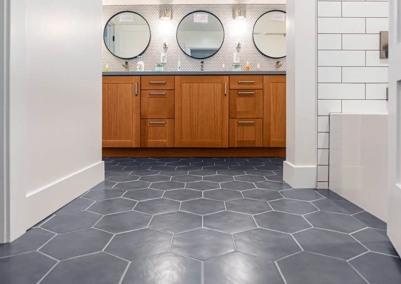
Choosing the right tile direction to make room look bigger is less about a single rule and more about controlling the lines the eye follows. In a bathroom or other compact space, tile orientation, pattern, grout color, and tile size all work together to either open the room up or break it into smaller visual pieces. I’m going to show you how I decide which direction to run tile, where that choice matters most, and when another detail matters even more.
The fastest way to make tile feel less cramped is to work with the room’s longest visual line
- Run tile to support the dimension you want to emphasize, not just the one that looks easiest to install.
- In long narrow rooms, laying rectangular tile across the narrow width often makes the space feel wider.
- Vertical wall tile can make a low ceiling feel taller, while horizontal lines can widen a wall.
- Large-format tile, tight grout joints, and a calm pattern usually do more for spaciousness than direction alone.
- Too many direction changes in one sightline can make a small room feel chopped up.
How tile direction changes the way a room reads
When I look at a small room, I start with one question: where does the eye naturally travel first? Tile direction works because the human eye reads lines quickly. Long uninterrupted lines make a surface feel longer, wider, or taller depending on how they are set. That is why a horizontal run can widen a narrow room, while a vertical stack can pull attention upward and make the ceiling feel higher.Grout lines matter too. A floor with lots of tight, repeated joints looks busier and smaller than one with fewer, cleaner breaks. This is why direction should never be chosen in isolation. I treat it as part of a bigger visual system that includes tile size, pattern, color, and the room’s main sightline from the door.
In practice, the best layout is usually the one that reduces visual noise and gives the room one strong direction instead of several competing ones. From there, the next step is matching that direction to the shape of the room.
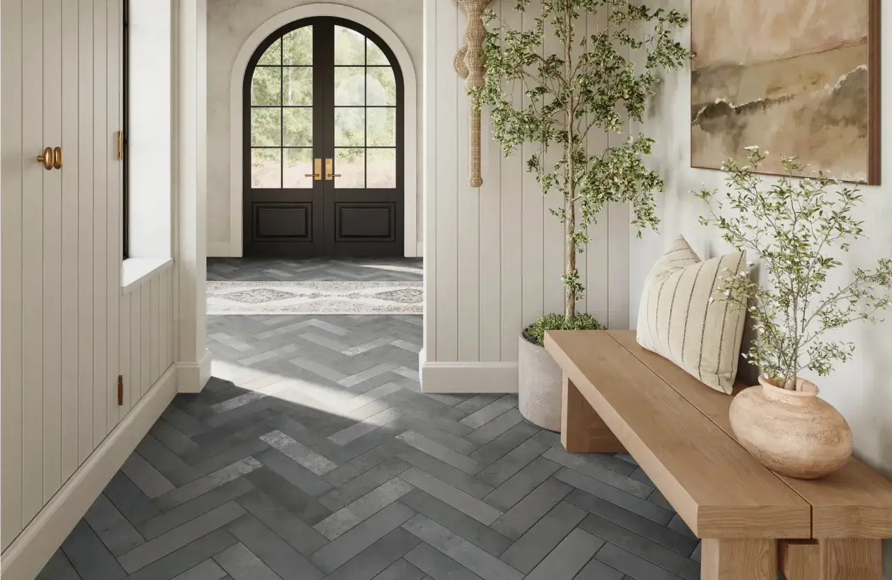
Which direction works best in real room shapes
The room’s proportions should drive the layout. A square powder room does not need the same tile direction as a long galley bath, and a shower wall has different visual needs than the floor.
| Room shape | Direction I usually favor | Why it helps | Watch out for |
|---|---|---|---|
| Long, narrow bathroom | Run rectangular floor tile across the narrow width | It softens the tunnel effect and makes the room feel less stretched | A busy wall pattern can cancel out the effect |
| Small square bathroom | Straight-set or diagonal, depending on the focal point | Straight-set feels calm; diagonal can open up the floor visually | Diagonal layouts add cuts and can look fussy if the tile is too small |
| Low-ceiling bath | Vertical wall tile or a stacked vertical pattern | It draws the eye up and adds height | Using vertical lines everywhere can make the room feel narrower |
| Shower enclosure | Keep the main wall direction simple and consistent | It makes the shower feel more intentional and less broken up | Too many pattern changes inside the shower can feel crowded fast |
For bathrooms, I usually think in terms of one dominant direction and one supporting direction. For example, a floor can run across the width while the shower walls stay clean and vertical. That combination often feels larger than forcing every surface to do something dramatic at once.
Patterns that make a room feel larger without trying too hard
Direction is only half the story. The pattern you choose can reinforce the illusion or fight it. Some layouts are quiet and expansive, while others add movement and personality at the cost of a little visual space.
Straight-set is the cleanest option. It creates a calm grid and works especially well with large-format tile because the surface feels more continuous. If the room already has strong architecture, this is often my first choice.
Running bond, also called a brick pattern, can widen a room because the offset joints create horizontal motion. It is a good fit for rectangular tile, especially on walls or in a narrow bath where you want the eye to move side to side.
Herringbone adds energy and can be beautiful in a small space, but I use it carefully. It can make the room feel richer and more detailed, yet if the tile is too small or the room is already busy, the pattern starts working against spaciousness.
Diagonal layouts can make a square room feel less boxy because the corners are less visually direct. The tradeoff is complexity. Diagonal tile usually means more cuts and more waste, so I reserve it for rooms where the effect is worth the extra labor.
If you want a safe, spacious look, straight-set and running bond are usually the easiest wins. If you want more movement, diagonal or herringbone can work, but they need restraint.
Why tile size, grout, and finish matter almost as much as direction
I’ve seen rooms that were laid in the “right” direction but still looked cramped because the tile choice was too fragmented. Small tiles create more grout lines, and grout lines create visual texture. That texture can be useful, but in a tight room it often makes the surface feel busier than necessary.
Large-format tile usually helps because it reduces the number of interruptions. In many bathrooms, sizes like 12x24, 24x24, or even 24x48 can make the floor or shower wall feel calmer than a field of smaller pieces. The exact size depends on the room and the installer’s ability to handle clean cuts, but the principle is simple: fewer seams usually reads as more space.
Grout color matters too. A grout that blends closely with the tile keeps the surface unified, while high-contrast grout turns every joint into a visual border. That border can be useful in a decorative room, but if your goal is to open up the space, subtle usually wins.Finish is part of the equation as well. A matte tile can feel quiet and refined, while a polished surface may reflect more light and add brightness. I treat finish as a support decision, not the main trick. The room still needs a layout that makes sense.
How I choose the layout before a single tile is set
When I plan a tile layout, I do not start with the pattern. I start with the room’s shape, the doorway, and the first thing someone sees when they walk in. Then I work backward from that view so the tile lines support it instead of fighting it.
- Stand at the entry and identify the first sightline.
- Decide whether the room needs to feel wider, longer, or taller.
- Mock up at least two orientations with spacers or a dry layout.
- Look for awkward slivers at the walls, tub, vanity, or shower curb.
- Choose the direction that gives the cleanest cuts and the calmest finished view.
This is where a lot of homeowners get tripped up. The orientation that sounds best on paper is not always the one that looks best in the room. A layout with balanced cuts on both sides usually looks more intentional than a layout that leaves one skinny strip tucked against a visible wall.
I also pay close attention to transitions. If the floor tile changes direction at the bathroom threshold, or if the shower wall fights the floor pattern, the room can start to feel smaller instead of larger. Consistency does more work than most people expect.
The mistakes that shrink a room even when the tile is good
Some of the worst visual results come from otherwise decent tile choices. The issue is not the material itself; it is how the layout is handled.
- Running tile in the same direction as the room’s long axis when you are trying to make it feel wider.
- Mixing too many directions in one small sightline.
- Using a high-contrast grout that turns every joint into a hard border.
- Choosing a very small tile that creates a dense grid of lines.
- Ignoring the placement of the vanity, tub, or shower curb, which are the shapes people notice first.
- Forcing a pattern that looks dramatic but makes the room feel busier than it needs to be.
Most of these mistakes come from focusing on style before proportion. In a larger room, that can be fine. In a small bathroom, the proportion is the style. Once the room is visually balanced, the design starts to feel more expensive and more intentional, even if the materials are modest.
The layout choices that make the biggest difference in a small bathroom
If I had to reduce the whole topic to a few practical rules, I would keep it simple: choose one clear direction, keep the pattern calm, and use the tile size to reduce visual clutter. That combination does more for a small bathroom than chasing a dramatic layout that looks clever but fights the room.
For most compact spaces, I favor a layout that either widens the room or quietly stretches it, depending on the main problem you want to solve. If the bathroom feels like a corridor, I try to break that length. If the ceiling feels low, I push the eye upward with vertical lines on the wall. If the room is boxy, I soften it with a pattern that eases the corners rather than spotlighting them.
The best result is the one that makes the room feel larger without making the tile installation feel loud. That is the balance I aim for every time: strong enough to reshape the space, restrained enough to let the bathroom feel calm, open, and finished.