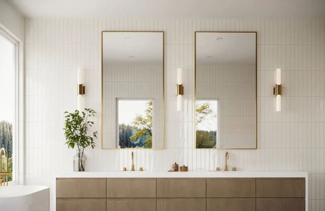
Subway tile still works because it is simple enough to disappear and flexible enough to shape a room. The best subway tile design ideas are rarely about the tile alone; they are about pattern, scale, grout, and where you stop the material. In a bathroom or kitchen, those choices decide whether the finish feels calm, crisp, vintage, or quietly modern.
Key takeaways for choosing a subway tile look
- Running bond is still the safest timeless layout, but stacked and vertical patterns can make a room feel more architectural.
- Grout color changes the mood quickly: matching grout softens the surface, while contrast makes the pattern read louder.
- Longer tile sizes such as 2x8, 3x12, or 4x16 inches feel more current than the old 3x6 standard.
- Glossy finishes bounce light; matte or textured finishes usually feel calmer and less reflective.
- Feature zones work better than tiling every surface in the same way.
- Restraint wins: one strong idea usually looks better than three competing ones.
Layout choices that make the biggest visual difference
The layout changes more than people expect. The same rectangular tile can read traditional, modern, or even slightly graphic depending on how it is set, and that is why I always start here before I think about color.
| Layout | Best effect | Where it works best | What to watch |
|---|---|---|---|
| Running bond | Classic, calm, familiar | Most bathrooms, kitchen backsplashes | Can feel predictable if everything else is also neutral |
| Stacked horizontal | Clean and contemporary | Minimal bathrooms, modern kitchens | Needs precise alignment or it looks off quickly |
| Vertical stack | Height and a tailored look | Small bathrooms, shower walls | Works best with elongated tiles |
| Herringbone | Movement and energy | Feature walls, niches, smaller statement areas | More cuts, more waste, more labor |
| Chevron or diagonal layouts | Strong directional rhythm | Accent zones where you want drama | Easy to overuse in large areas |
If you want the safest choice, I still reach for running bond. If you want the room to feel designed rather than simply tiled, stacked or vertical patterns usually do more with less. That leads directly into the next decision, because pattern only works when the color and grout support it.
Let color and grout decide how bold the room feels
White tile with white grout is still a clean, useful option, but it is not the only one that feels timeless. I like tone-on-tone pairings when the goal is softness, because they let the surface texture do the work instead of forcing the pattern to carry everything.
- Matching grout gives a seamless, low-contrast look that works well in smaller bathrooms and calmer kitchens.
- Light gray grout adds just enough definition to keep white or pale tile from disappearing.
- Dark grout makes the grid read clearly, which is useful when you want the layout to feel crisp and intentional.
- Colored tile with close grout feels more tailored than flashy, especially in green, blue, clay, or charcoal tones.
- High-contrast grout is best when the pattern itself is the statement, not just the tile color.
In 2026, I see more designers using color with restraint: inky blue on a shower wall, soft sage behind a vanity, warm cream with a matte finish, or black tile used in a very controlled band. The move is not toward louder surfaces; it is toward surfaces that feel edited. Once the color story is set, the next question is whether the tile size supports that mood or fights it.
Match the tile size to the room, not the trend
The classic 3x6 tile still has a place, but elongated shapes such as 2x8, 3x12, and 4x16 often feel more current because they stretch the wall visually. Bigger tiles also mean fewer grout lines, which usually makes a space feel calmer and easier to live with.
I tend to think about size in terms of how busy the room already is. If the bathroom has a patterned floor, a bold vanity, or a strong stone countertop, I prefer a simpler tile proportion so the wall does not compete. If the room is otherwise quiet, a slightly smaller or more detailed tile can add interest without making the space feel crowded.
There is a tradeoff, though. Smaller tiles can create texture and charm, but they also add more joints, more visual noise, and more installation time. If you want the room to feel taller, a vertical orientation or taller tile format usually works better than shrinking the tile itself. Once the format is right, the next step is deciding where the tile should live so it makes an impact without taking over.
Use one feature zone instead of tiling everything the same way
This is where subway tile becomes much more interesting. A focused feature zone gives the room a destination point, and it often looks more expensive than covering every wall with the same treatment.
- Floor-to-ceiling shower walls create a clean envelope and make the shower feel like part of the architecture.
- A half-height wainscot keeps a bathroom practical while leaving the upper wall free for paint, wallpaper, or a softer finish.
- A vanity backsplash panel draws attention to the sink area and works especially well when the rest of the room is simple.
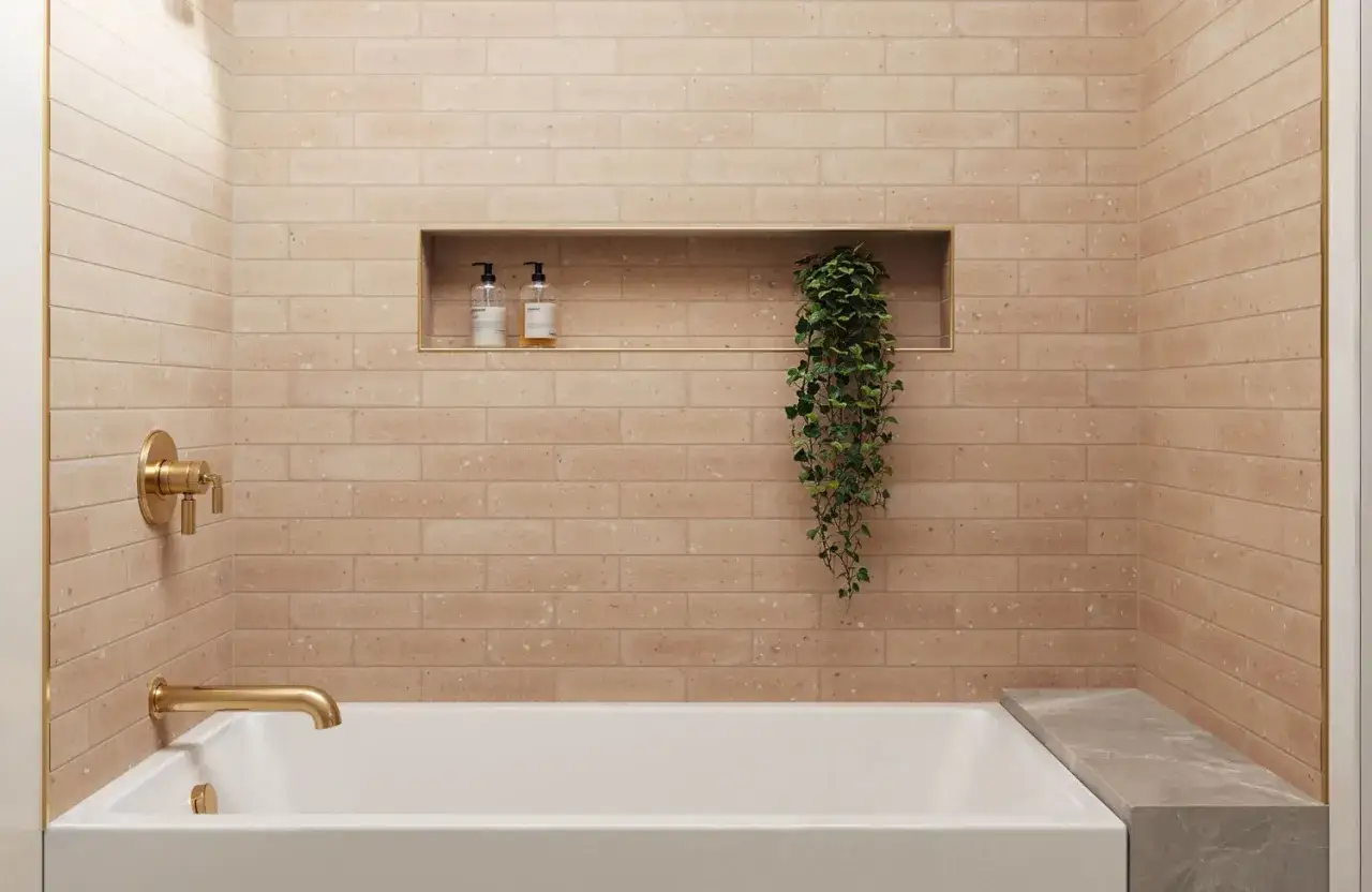
- A recessed niche is a small place to introduce a different pattern, grout color, or border detail without overwhelming the room.
- A tub surround can become the visual anchor in a primary bath, especially if the rest of the room is restrained.
I like this approach because it gives the tile a job. Instead of asking subway tile to solve every design problem, you let it frame the parts of the room that matter most. To make that strategy work in real life, the material and finish need to suit the way the room is used every day.
Choose materials and finishes that fit the room you actually live in
Not every subway-style tile performs the same way, and that matters more in a shower than on a backsplash. I always separate the look from the job first: a tile can be beautiful and still be the wrong choice for a wet wall, a steamy bath, or a high-touch backsplash behind a sink.
| Material or finish | What it feels like | Best use | Main limitation |
|---|---|---|---|
| Ceramic | Classic and easy to live with | Most wall applications, especially backsplashes and accent walls | Less dense than porcelain, so it is not always the first choice for every wet zone |
| Porcelain | More durable and often more refined in feel | Shower walls, heavy-use bathrooms, areas that need easier maintenance | Can cost more and may feel less handmade if the finish is too uniform |
| Glossy glaze | Bright, reflective, slightly polished | Rooms that need more light or a cleaner visual bounce | Shows reflections and surface imperfections more readily |
| Matte or honed | Calmer, softer, more architectural | Modern bathrooms and spaces that should feel grounded | Can read flatter if the rest of the palette is too quiet |
| Handmade-look or zellige-style | Textured, varied, warm, and less rigid | Feature walls and rooms that need character | Requires more patience during installation because slight irregularities are part of the appeal |
For most American bathrooms, I think porcelain is the safest all-around choice when durability matters, while ceramic remains the easiest everyday option for walls and backsplashes. The real trick is not picking the fanciest material; it is picking the one that matches the room’s moisture, cleaning, and visual demands. That brings me to the part that most people underestimate: the finishing details.
The details that keep it looking current in 2026
The difference between a room that feels designed and a room that feels assembled is usually not the tile itself. It is the finish logic around it.
- Keep one idea dominant so the tile, grout, and fixtures do not all try to be the focal point.
- Align the edges cleanly and decide in advance how the tile will terminate at corners, ceilings, and trim lines.
- Use contrast intentionally instead of adding pattern, color, and gloss all at once.
- Let adjacent materials breathe so the paint, countertop, mirror, or vanity can do some of the visual work.
- Avoid default white-on-white everywhere unless the room has strong shape, good light, or another material with enough character to carry it.
If I were specifying a bathroom today, I would keep the formula simple: choose a pattern that suits the architecture, a grout color that either softens or defines the tile, and one feature zone that earns the attention. That combination is what keeps subway tile from feeling generic and makes it look intentional long after the trend cycle moves on.