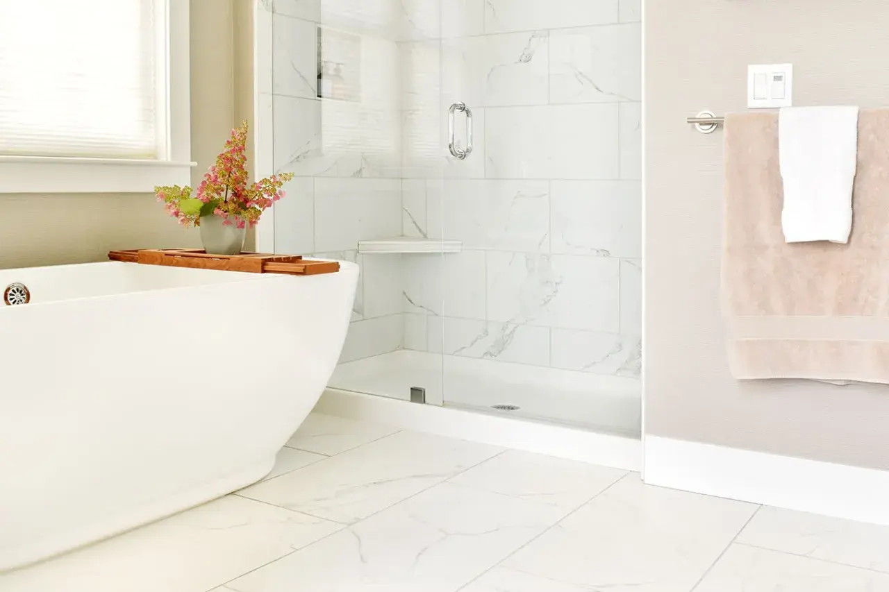
The safest grout choice is the one that supports the stone, not the other way around
- Blending grout creates a calmer, larger-looking marble surface; contrast creates a more graphic tiled look.
- For most light marble, soft white, ivory, or pale greige usually looks more natural than a stark bright white.
- Polished and soft marble usually needs unsanded grout in narrow joints, but the stone and grout manufacturer instructions still matter most.
- Test grout on a sample board in the actual room, because lighting and marble absorption can change the final color.
- Bathrooms reward practical choices: the best color is the one that looks good on day one and still behaves well after a year of cleaning.
How grout color changes the feel of marble
When I spec marble, I think of grout as part of the surface, not an afterthought. A close match softens the grid and lets the veining do the visual work; a stronger contrast draws attention to the tile layout itself. That is the real choice behind marble tile grout color: do you want the installation to read as one field of stone, or as a deliberate pattern of separate pieces?
| Grout approach | What it does visually | Best for | Main tradeoff |
|---|---|---|---|
| Near-match | Creates a smooth, unified surface | Small bathrooms, classic marble, quiet design | Can look flat if you want more definition |
| Soft contrast | Shows the tile shape without shouting | Shower walls, honed marble, medium-sized rooms | Needs careful sampling to avoid a harsh line |
| Strong contrast | Turns the grout into a visible design feature | Modern, high-contrast interiors | Can make marble feel busier and more geometric |
As a rule, the narrower the joint, the less the grout line competes with the stone. Once you get beyond about 1/8 inch, the lines start to matter more, especially on polished marble where light catches every edge. That is why I rarely choose a dramatic grout color unless the rest of the bathroom is intentionally crisp and architectural.
Which grout colors usually work best with common marble looks
For marble tile grout color, I usually start one shade softer than the brightest white in the stone. That gives me room to keep the surface calm without making it look chalky or mismatched.
| Marble look | Grout colors I would test first | Why these work |
|---|---|---|
| Bright white marble | Soft white, pearl, light mist | Keeps the installation seamless without turning the room clinical |
| Creamy white marble | Ivory, linen, warm bone | Prevents the grout from looking too blue or too stark next to the stone |
| Gray marble | Dove gray, silver, fog | Reinforces the cool tone and keeps the veins in focus |
| Beige or taupe marble | Greige, sand, mushroom | Matches the warmth in the stone and keeps the floor from feeling patched together |
| Boldly veined marble | Off-white, very pale gray | Lets the veining stay dominant instead of making the grout line compete with it |
I would be careful with pure white grout next to creamy marble. The contrast is often small in the sample chip and much more obvious on a wall or floor. Likewise, dark grout can look dramatic in a showroom but surprisingly loud in a bathroom once the lighting, mirrors, and fixtures are all in play.
Room light, tile finish, and joint width change the answer
The same grout color can look clean in one bathroom and off in another. Natural daylight tends to make grout lines read more clearly, while warm vanity lighting can soften them. Honed marble also behaves differently from polished marble: the matte surface reduces glare and usually makes a soft-contrast grout feel more natural, while polished stone amplifies the sharpness of every line.
- In a small powder room, I lean toward a blend or very soft contrast so the walls feel larger.
- In a spacious shower or floor with larger-format tile, a little contrast can help the layout feel intentional instead of washed out.
- In rooms with strong daylight, I test the sample near windows, not just under one lamp.
- With joints around 1/16 to 1/8 inch, subtle grout colors usually look best because the joint itself stays visually quiet.
- When the joint is wider, the grout becomes a design element whether you want that or not.
This is also where I stop trusting memory and start trusting the actual room. A marble sample that looks warm in a showroom can look cooler against a white vanity, and a grout that seems soft under store lights can read much darker once it is in natural daylight. The room decides more than the color card does.
Why grout type and joint width matter as much as color
Color is only half the job. Marble is a natural stone, so the wrong grout formula can scratch, stain, or simply look wrong once it cures. CUSTOM Building Products specifically notes that white grout is generally best for light marble and that some marble can be scratched or damaged by sanded or pigmented grouts. That warning matters because the finish of the stone is part of the design, not just the grout shade.
For polished or soft marble, I usually look first at unsanded grout for narrow joints, especially at 1/8 inch or less. For wider joints, sanded options may be appropriate, but only if the marble surface can handle them. If the project needs better stain resistance or more consistent color, high-performance or ready-to-use grout can help, but compatibility with the stone still needs to be checked before anyone mixes a batch.- Use unsanded grout for soft or polished marble when the joint is narrow enough.
- Use sanded grout only when the stone and joint width can handle it.
- Do not assume a grout that works beautifully on porcelain will behave the same on marble.
- Ask for a test area if the stone is especially soft, veined, or absorption-prone.
In practice, this means the best-looking color is useless if the formula damages the stone. I would rather adjust the grout shade slightly than force a product that puts the marble at risk.
How I test a grout color before I commit
Sample boards are not optional when the finish matters. I build a test board with the actual marble, the actual joint width, and the exact grout formula, then I view it where the tile will live. MAPEI notes that grout color charts are guides only and that the final shade depends on lighting, installation conditions, and the absorption of the tile or stone; that is exactly why the board matters more than the brochure.
- Use a real piece of the marble, not a photo.
- Set the joints to the same width the installer will use.
- Test at least two close grout colors, not just one.
- Let the sample cure fully before judging the final shade.
- Check it in daylight, evening light, and with the bathroom fixtures on.
- If the stone will be sealed, test after sealing as well, because sealers can subtly change how the surface reads.
I also avoid making the call while the grout is still wet. Wet grout almost always looks different from the cured color, and that difference is enough to send a project in the wrong direction. A day spent on samples is cheaper than living with the wrong line color for years.
The choices I trust most in real bathrooms
When the goal is a timeless bathroom, I keep coming back to the same logic: let the marble lead, and let the grout disappear enough to support it. That does not mean every marble needs white grout, only that the grout should feel like part of the stone story rather than a separate graphic layer.
- For classic white marble, I reach for warm white, ivory, or very pale greige first.
- For cool gray marble, I prefer dove gray, fog, or silver-gray.
- For cream or beige marble, I stay on the warm side so the floor does not look mismatched.
- For a modern, architectural look, I would use a stronger contrast only if the room has enough scale to handle it.
- For most bathrooms, the safest choice is the one that looks like it belongs there after the fixtures, mirrors, and lighting are installed.
My practical rule is simple: choose the grout that makes the marble look intentional, not busy. If the board looks calm in the room and the formula is safe for the stone, you are usually close to the right answer. That is the balance I trust most when I am deciding on a marble surface that has to work hard and still look refined.