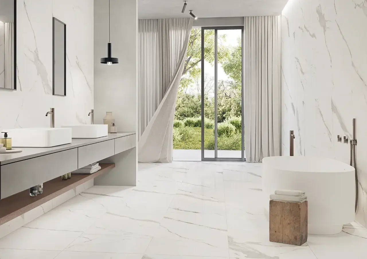
The safest grout choices keep Carrara marble calm, clean, and timeless
- Soft light gray is my default pick for most Carrara installations because it blends without looking stark.
- Warm gray or greige works when the room has warmer lighting, brass, wood, or cream accents.
- Bright white can work on shower walls, but it shows soil faster on floors and can look sharper than expected.
- Dark gray or black creates a graphic look, but it usually shifts the focus from the marble to the grid.
- Test at full cure before you commit; grout often dries lighter than it looks wet.
The shades I recommend first
If I am narrowing this down quickly, I start with a small family of neutral grout colors rather than chasing a perfect match. Carrara marble has enough natural variation that a soft, slightly muted grout usually looks more elegant than a bright, exact-white match. The goal is to support the stone, not outline every tile like a spreadsheet grid.
| Grout shade | How it reads with Carrara | Best use | Main caution |
|---|---|---|---|
| Soft light gray | Blends with the veining and gives just enough definition | Most shower walls, backsplashes, and floors | Can look cooler under blue daylight or cool LED bulbs |
| Warm gray or greige | Softer and slightly warmer, with a more lived-in feel | Bathrooms with brass, oak, linen, or warmer paint colors | Can drift beige if the room already has a lot of warmth |
| Soft white or off-white | Creates a quiet, almost seamless surface | Spa-like shower walls with very tight joints | Shows dirt more easily and can look chalky on floors |
| Bright white | Gives the highest level of blend on the cleanest-looking jobs | Minimal white-on-white interiors where upkeep is not a problem | Can feel harsh and needs more maintenance |
| Medium gray | More visible pattern and stronger tile definition | Herringbone, basketweave, or larger-format tile layouts | Can overpower delicate Carrara veining |
If you want one practical rule, I would use this: pick the grout that stays closest to the lightest field color in the marble, then move one shade darker if you want the joints to disappear less completely. That keeps the stone in charge while still giving the installation some shape. From there, the room itself starts deciding the final look.
What changes the way grout reads in real life
The same grout can look almost invisible in one bathroom and obvious in another. That is why I never choose grout color in isolation. Lighting, joint width, tile finish, and layout all shift the result in ways that are easy to miss on a sample board.
- Lighting changes the temperature. North-facing daylight and cool LEDs make gray read bluer. Warm bulbs pull out beige and cream tones faster than people expect.
- Joint width changes the visual weight. A 1/16-inch joint feels cleaner and more seamless than a 1/8-inch joint. Once the grout line gets wider, even a subtle contrast starts to show.
- Finish changes contrast. Polished Carrara usually makes grout look a little stronger. Honed marble softens the transition because the surface does not reflect light as aggressively.
- Pattern changes the amount of linework. Herringbone, basketweave, and stacked layouts multiply the amount of grout you see. If the layout is already busy, I usually keep the grout quieter.
- Wall and floor use are not the same. A pale grout on a shower wall can look refined. The same color on a floor can feel high-maintenance, especially in a primary bath.
Colors I would skip unless contrast is the goal
I do not think every bold grout choice is wrong. I just think some of them stop supporting the marble and start competing with it. With Carrara, that shift happens faster than most homeowners expect because the stone is already expressive enough on its own.
- Pure bright white on a bathroom floor can look clean on day one, then become unforgiving the moment dust, soap residue, or hard-water marks show up.
- Charcoal or black adds a very graphic frame around each tile. That can be beautiful in a modern bath, but it also makes lippage and uneven cuts more obvious.
- Cream or ivory can clash with Carrara if the marble reads cool. Instead of softening the stone, it can make the marble look slightly gray and the grout slightly yellow.
- Any saturated color pulls the room away from timeless and into a statement look. That may be intentional, but it is not what most people mean when they want Carrara to feel elegant.
My practical caution is simple: if you want the marble to be the star, do not choose a grout that introduces a second visual agenda. Strong contrast is fine when the tile pattern is the hero. With Carrara, the stone usually deserves the quieter role.
How I test grout so the final color is not a guess
This is where I slow clients down. Paper swatches and store lighting are not enough, especially with natural stone. The final grout color is a mix of the product, the tile, the lighting, and the way the installation is cut and cleaned. If you skip a real test, you are basically approving a finish by imagination.
- Bring an actual marble sample into the room, not just a photo.
- Choose at least three grout options: the one you think you want, one lighter, and one slightly darker.
- Make a small test board or grout a hidden section if the installer is willing.
- Wait for full cure before judging the color. Grout often dries a bit lighter than it looks wet, and that difference matters.
- Check the sample in daylight, at night, and under the room’s vanity or shower lighting.
- Look at the grout next to the vanity, countertop, paint, and hardware, not just next to the tile.
If I am choosing between two close shades, I usually favor the one that disappears a little more in daylight. That tends to age better in bathrooms because it keeps the stone calm instead of forcing every line to compete for attention. The effect is subtle, but in a marble room, subtle is the whole point.
The choice I would make in a bathroom that has to age well
If the room is classic, bright, and meant to feel refined for years, I would start with soft light gray. It is the safest middle ground: clean enough to feel fresh, soft enough to avoid a harsh outline, and neutral enough to work with chrome, nickel, brass, and mixed finishes.
For a warmer bathroom with wood vanity fronts, brushed brass, or creamy paint, I would move toward warm gray or greige. That gives Carrara a more relaxed look without turning the marble yellow. For a shower wall where you want the tile to nearly melt into a single surface, a carefully chosen off-white can work, but I would keep that option mostly to walls and very tidy joints.
My bottom line is straightforward: choose a grout color that respects the marble’s veining, the room’s lighting, and the amount of daily cleaning you are willing to do. If you keep those three things in balance, Carrara looks expensive for the right reasons, and the grout quietly does its job in the background.