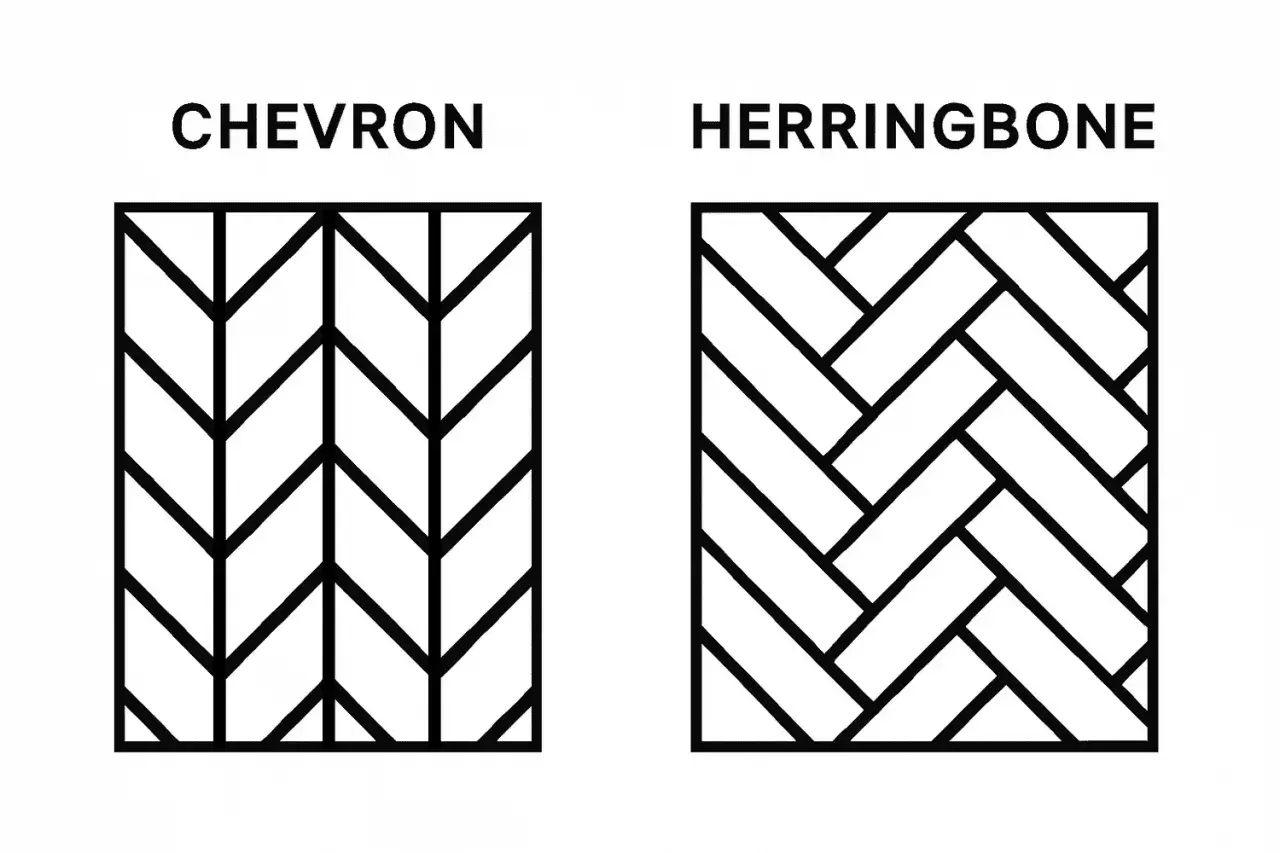
A chevron pattern is built from mirrored angles that meet in a sharp point, so the surface reads as a repeating V rather than a woven zigzag. The shortest answer to what does a chevron look like is simple: it is a series of clean, symmetrical V-shapes that point in one direction and feel more architectural than casual. In tile, that distinction matters, because the pattern can make a bathroom feel longer, taller, sharper, or more polished depending on how it is executed.
The chevron look is a crisp V that repeats with exact symmetry
- Shape: two angled sides meet at a sharp center point, creating a V.
- In tile: the pieces are cut and placed point-to-point so the pattern flows in a continuous line.
- Visual effect: it feels clean, directional, and more precise than a broken zigzag.
- Best use: bathroom walls, backsplashes, and feature areas where you want movement without visual chaos.
- Key difference: chevron is symmetrical and pointed; herringbone is staggered and more woven.
What a chevron actually looks like
At a glance, a chevron looks like a row of connected Vs, all aligned so the points and angles match each other. I usually describe it as a pattern that has been edited down to its cleanest line: no extra overlap, no broken edges, no visual wandering. That is why it feels sharper than many other geometric layouts.
In decorative terms, chevron is simple. In tile, it is more exact. Each piece has to meet its neighbor cleanly at the point, which means the pattern depends on symmetry as much as it depends on shape. If one side is off, the whole surface starts to look soft or uneven.
That is also why chevron reads so quickly. The eye follows the repeated V-shape without needing to decode the layout first, which gives the pattern a strong sense of direction. That clarity becomes even more useful once you compare it with other tile patterns.
How chevron tile differs from herringbone
People often mix these two up, but they do not read the same once they are on a wall or floor. Chevron is point-to-point and symmetrical. Herringbone is staggered, which makes it feel more woven and a little less formal.
| Feature | Chevron | Herringbone |
|---|---|---|
| Joint style | Tiles meet at a sharp point | Tiles overlap in a staggered rhythm |
| Overall look | Clean, graphic, and directional | Textured, layered, and slightly softer |
| Visual effect | Feels more tailored and modern | Feels more traditional or relaxed |
| Installation | More exacting and less forgiving | A bit more flexible visually |
| Best use | Statement walls, vanities, and sleek bathrooms | Spaces that need texture without a hard edge |
Where chevron works best in bathrooms
Chevron is at its best when it has room to read as a pattern instead of a busy texture. In bathrooms, that usually means areas where the eye can take in a larger field of tile at once.
- Shower walls: A chevron wall can make the shower feel taller and more finished, especially when the tile runs vertically through the full height.
- Vanity backsplashes: This is one of the safest places to use the pattern because the scale is small enough to feel controlled, but visible enough to make an impact.
- Accent walls: A chevron feature wall behind a tub or in a powder room can turn a plain room into a focal point without adding extra decor.
- Floors: Chevron floors look striking, but they work best with a finish that is appropriate for wet areas and a layout that does not compete with too many other surfaces.
I am more cautious with chevron on every surface at once. In a large primary bath, it can work if the color palette stays restrained. In a small bath, too much chevron can start to feel like visual traffic. The pattern is strong enough that it rarely needs backup.
That is where material choice starts to matter, because the same layout can look calm in one tile and dramatic in another. The next question is what actually changes the look once the pattern is installed.
What changes the look more than people expect
Chevron is not a single look. It is a framework, and the tile you choose can push it in very different directions. I pay attention to four things first: tile size, grout color, finish, and contrast.
- Tile size: Smaller pieces create a tighter, busier rhythm. Larger pieces feel calmer and more architectural.
- Grout color: Matching grout softens the seams, while contrasting grout makes the V-shape read much more clearly.
- Surface finish: Glossy tile catches light and sharpens the angles; matte tile softens glare and gives the pattern a quieter presence.
- Color contrast: A high-contrast palette makes the geometry pop, while tone-on-tone color keeps the effect more spa-like.
Those same choices also explain why some chevrons feel polished and others look awkward, which is usually a sign that the layout or proportions were handled too loosely.
The mistakes that make chevron feel messy
Most chevron problems are not about the pattern itself. They come from poor scale, weak alignment, or too many competing details in the room. When the geometry is this exact, small mistakes are easy to see.
- Using the wrong grout contrast: Too much contrast can overwhelm a small room; too little can flatten the pattern if you wanted it to stand out.
- Ignoring the room’s proportions: A tight repeat in a narrow room can feel cramped, while a broader layout may be better for open walls.
- Mixing too many strong finishes: If the vanity, hardware, and tile all fight for attention, the chevron loses its clarity.
- Letting the layout drift: Uneven points or inconsistent joints make the pattern look off-center, even if the tile itself is attractive.
- Treating chevron like any zigzag: The difference between a crisp V and a loose zigzag is not cosmetic; it is the whole character of the pattern.
When I review a chevron layout, I look first at the centerline and then at the corners. If the points do not feel intentional, the pattern stops reading as design and starts reading as noise. That is why precision matters more here than it does in many other tile arrangements.
Once those pieces line up, chevron reads as architecture instead of decoration pasted on top, and that is usually the version that lasts longest visually.
The simplest way to choose the right chevron for a bathroom
If I had to reduce chevron selection to one practical rule, it would be this: let the pattern be the star, and keep at least one of the other variables quiet. That might mean a soft grout, a restrained color, or a low-sheen finish. The more controlled the rest of the room feels, the more elegant the chevron will look.
For smaller bathrooms, I usually prefer chevron on a single surface such as a vanity backsplash or shower wall. For larger spaces, the pattern can carry more coverage, but only if the scale is right and the lines stay clean. In either case, the goal is the same: a V-shape that feels crisp from the doorway, not crowded when you stand close.That is the clearest way to judge the look in practice. A good chevron should feel symmetrical, intentional, and easy to read in one glance, with the tile, grout, and layout working together instead of competing for attention.