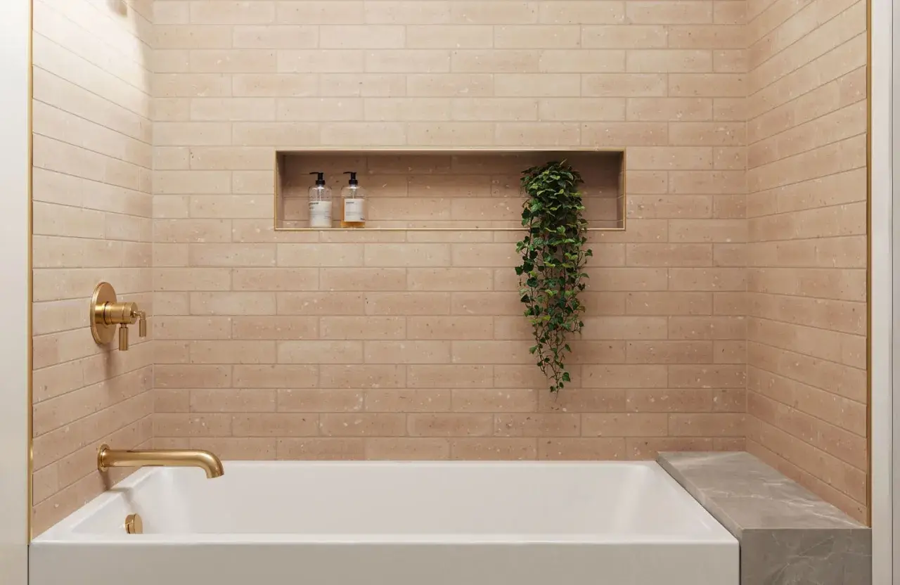
A random subway tile pattern works best when it feels controlled, not careless. In bathroom design, I like it as a way to soften the hard grid of tile without losing the clean, timeless feel that makes subway tile so useful. This article explains what the layout actually means, where it looks best, how to plan it on a real wall, and which grout, tile size, and finish choices make the biggest difference.
What matters most before you start the layout
- “Random” should read as deliberate variation, not as visual noise.
- A centered, balanced layout matters more than the label on the pattern.
- Tile size changes the feel fast: 3 x 6 reads classic, while 4 x 12 or longer reads more modern.
- Grout width and grout color can either calm the wall or turn it into a focal point.
- In a shower or tub surround, planning the cuts first saves more trouble than fixing them later.
What a random subway tile layout really means
In practice, I treat this layout as a design system. The courses may shift, but the wall still needs a repeatable rule, whether that rule is a varied running bond, an occasional vertical break, or a controlled change in tile length. Traditional subway tile is usually a white 3 x 6 glazed ceramic tile, but the category now includes many rectangular sizes that are roughly twice as long as they are wide, so the look can be tuned from subtle to bold.
The important distinction is this: a random-looking wall is not the same thing as an unplanned one. If the offsets, edge cuts, and grout lines all fight each other, the surface looks accidental. If the variation is intentional, the wall feels relaxed, custom, and a little more architectural. That is the effect most people actually want, especially in bathrooms where a hard, repetitive grid can feel flat.
The next decision is how much variation the room can handle without turning busy.
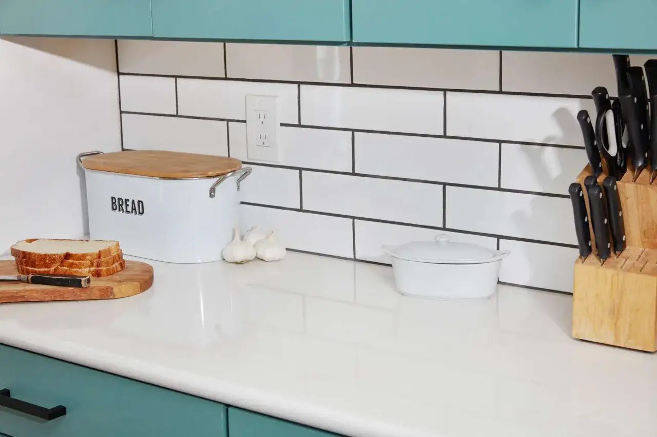
Layouts that feel random but stay intentional
I rarely recommend true chaos here. What works is a controlled set of moves repeated across the wall so the eye sees rhythm instead of disorder. These are the versions I reach for most often.
| Layout approach | Visual effect | Best use | Tradeoff |
|---|---|---|---|
| Gentle variable running bond | Soft motion without losing the classic subway-tile feel | Main shower walls, tub surrounds, full-height backsplashes | Too much variation can make the wall look wavy |
| Vertical accents inside a horizontal field | More energy and a slightly taller read | Powder rooms, vanity walls, shower niches | Can feel busy in a small room with limited light |
| Mostly stacked rows with planned breaks | Clean and modern, but less rigid than a full grid | Minimal baths, modern suites, accent walls | Needs careful spacing so the breaks feel intentional |
| Mixed lengths within one family | Custom, tailored, and less repetitive | Larger primary baths, feature walls, elongated shower walls | Only works well when tile thickness and calibration are consistent |
If I had to simplify the choice, I would say this: use the gentlest variation in a shared bathroom and save the more expressive layouts for a powder room or a feature wall. In a small shower, restraint usually ages better than novelty. The next step is deciding how to set that layout out cleanly on the wall.
How I plan the layout so it doesn't look accidental
The layout phase is where most of the quality comes from. I never assume a bathroom wall is perfectly square, and I do not start setting tile until I know where the centerline and the edge cuts will land. That matters even more with a non-uniform pattern, because a visually relaxed wall still has to finish with balanced cuts and clean corners.
- Start from the most visible sightline. In a shower, that is often the wall you see first from the door. In a vanity backsplash, it is usually the wall centered behind the sink or mirror.
- Dry-lay a few courses before mixing mortar. This lets me see whether the pattern drifts, whether the corners feel heavy, and whether the final cuts land at a sensible size.
- Keep the variation controlled. If I am using a running bond, I want the stagger to feel deliberate. On longer rectangular tile, I stay cautious with anything beyond a 33 percent offset unless the tile maker approves more, because lippage becomes easier to see.
- Protect the edges. Tiny sliver cuts at the perimeter make even expensive tile look underplanned. A centered, balanced field usually looks better than a mathematically perfect layout that leaves awkward scraps on the outside.
For an actual bathroom wall, that planning usually means making the room work around the tile, not the other way around. Once the field is set out, grout and finish decide whether the layout reads soft, sharp, or somewhere in between.
Grout, tile size, and finish change the whole read
Grout is not a finishing detail; it is part of the pattern. On white subway tile, white grout gives the softest and most classic result, while charcoal or colored grout pushes the geometry forward. Joint width matters just as much. A 1/16-inch grout joint can look crisp on very consistent, rectified tile, but 1/8 inch is often the safer and more forgiving choice when the tile has normal variation.
I also pay attention to how much the tile itself varies from piece to piece. Tile can differ by about 3/32 inch between the largest and smallest pieces in a box, which means very narrow joints leave less room to hide those differences. A useful rule is to keep the grout joint at least twice the average difference between the largest and smallest tiles. That is one of those practical details that makes a layout look finished instead of fussy.
- Glossy ceramic reflects light and makes a varied layout feel brighter and lighter.
- Matte or satin tile softens the geometry and works well in spa-like bathrooms.
- Textured or handmade-looking tile adds character, but it needs more careful planning because the edges and surface variation become more visible.
- Longer formats look more current, but they also demand a flatter wall and more disciplined placement.
In a shower, I would pair that kind of tile with a moisture-appropriate installation system rather than trying to force a backsplash-style shortcut into a wet area. With the surface decisions made, the main risk left is usually not the material itself. It is the way people mis-handle the pattern.
The mistakes that make a relaxed wall look messy
The layouts that fail usually fail for the same reasons: the variation is too casual, the edges are ignored, or the tile and grout are fighting each other. These are the problems I look for first.
- Making it random by accident - if every course changes differently, the wall reads as noise instead of movement.
- Using a 50 percent offset on long tile without checking the spec - larger rectangles are more prone to visible lippage, and many manufacturers limit the offset on longer edges.
- Leaving sliver cuts at the ends - tiny perimeter cuts make a tile job look improvised, even when the field is well executed.
- Choosing high contrast too early - dark grout can look great, but it also exposes every alignment issue.
- Mixing too many ideas in one small bath - offset variation, bold grout, texture, and color shifts can compete instead of cooperate.
If the wall draws attention to mistakes before it draws attention to the fixture or finish, the layout is doing too much. That is why I usually simplify the room’s strongest surfaces and let one detail carry the personality.
The version I would use in most bathrooms
For most American bathrooms, I would choose a 3 x 6 or 4 x 12 subway tile, a modest stagger, and grout that sits close to the tile color. That combination keeps the wall clean from a distance and still gives it enough movement to feel custom. If the room is small or the light is low, I would keep the pattern quieter and let the tile surface do the heavy lifting. In a larger primary bath, I am more willing to introduce a vertical accent, a deeper grout tone, or a small change in rhythm at a niche.
The best result is not the most chaotic one. It is the one that looks deliberate from the doorway, holds up at arm’s length, and still feels easy to live with after the novelty wears off.