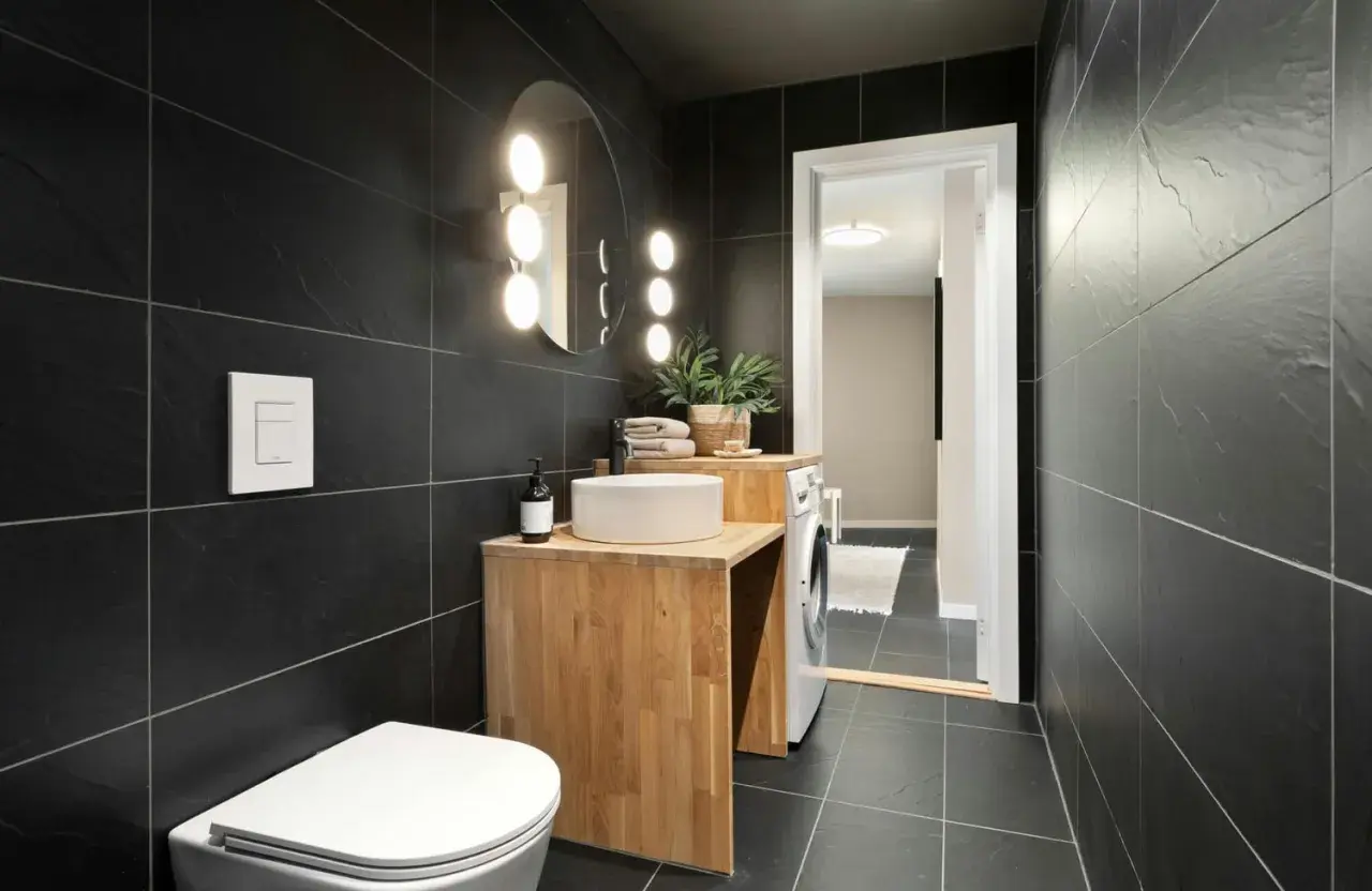
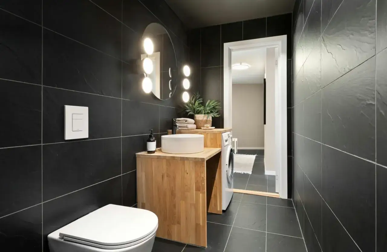
Black tile can make a bathroom feel sharp and expensive, but the surrounding color decides whether it reads polished, cozy, or cold. The practical answer to what colour goes with black tiles in bathroom design is that black behaves like a neutral anchor, so warm white, soft greige, sage, dusty blue, wood, and brass are the safest places to start. I usually tell people to think less about matching black tile and more about balancing its weight with light, texture, and undertone.
The safest pairings are the ones that soften black without flattening it
- Warm white and off-white create the cleanest contrast without making the room feel cold.
- Greige, taupe, and beige warm up black tile and work especially well in small bathrooms.
- Sage, muted olive, and dusty blue add personality while still feeling calm.
- Grout color, lighting, and hardware can change the result as much as the wall color.
- Brass, brushed nickel, and natural wood help black tile feel finished instead of heavy.
Why black tile works with more than one color family
Black is not a color you need to “match” in the usual sense. I treat it as a frame: it sharpens whatever sits next to it and makes other colors feel more deliberate. Put a clean light beside black tile and the room looks crisp; add a warmer shade and it feels softer; layer in a deeper tone and the space turns moody on purpose.
That is why the same black tile can look completely different from one bathroom to another. A glossy tile already reflects enough light to feel alive, while a matte tile usually needs more help from paint, lighting, or texture. Once you understand that, the rest of the palette choices become much easier to make.
So before chasing a “perfect” color, decide whether you want contrast, warmth, or a darker, more cocooned effect. That choice will point you toward the right family of shades.
The color families that work best with black tile
If you want the shortest answer, start with warm white, greige, sage, or dusty blue. Those four cover most bathrooms because they either brighten the room or give black tile a softer edge without fighting it. If you want more drama, deeper navy or muted forest green can work too, but they need better lighting and a little more confidence in the rest of the finishes.
| Color family | What it does | Best use | Main caution |
|---|---|---|---|
| Warm white or ivory | Keeps the room bright and makes black tile feel intentional | Small bathrooms, powder rooms, and spaces with limited daylight | Avoid icy, blue-based whites that can feel sterile |
| Greige, taupe, or soft beige | Softens contrast and warms up the room | Family bathrooms and transitional interiors | Too much gray can look flat under cool lighting |
| Sage or muted olive | Adds a calm, natural feel without looking loud | Bathrooms with wood vanities, brass hardware, or plants | Keep the saturation low in darker rooms |
| Dusty blue or blue-gray | Feels fresh, clean, and slightly spa-like | Modern bathrooms with white fixtures or chrome | Very pale blue can feel cold instead of serene |
| Navy or deep blue | Creates a tailored, moody look | Larger bathrooms or rooms with strong natural light | Needs enough light and texture to avoid feeling heavy |
| Blush or terracotta | Adds warmth and personality | Accent walls, towels, art, or decorative details | Use it sparingly so the room does not feel theme-driven |
My practical rule is simple: if the bathroom is small or windowless, lean warm and light; if it is larger or filled with daylight, you can go deeper. Black tile can support both directions, but it does not forgive a color choice that ignores the room’s light level.
If you want to stay monochrome, charcoal can also work beside black tile, especially when the tile has texture or variation. I would just avoid making every surface equally dark unless the room has the space and lighting to carry that mood.
How room size and light change the choice
The same color can look elegant in one bathroom and oppressive in another. That is why I look at scale before I look at the paint chart. Black tile needs enough visual breathing room to feel sophisticated, and light is what creates that space.
Small bathrooms and windowless rooms
In a compact bathroom, I would usually stay with warm white, soft cream, pale greige, or a very restrained sage. These shades keep black tile from closing in the room. A light ceiling helps too, because it pulls the eye upward and makes the whole space feel taller. If the room depends on artificial light, choose warm bulbs around 2700K to 3000K rather than a harsh daylight bulb, which can make black tile feel colder and more severe.
Larger bathrooms with better daylight
When the room is bigger or has real daylight, the palette can take more risk. This is where navy, forest green, and deeper blue-gray start to make sense. They give black tile a richer backdrop and make the room feel more designed. You still want texture, though. A flat wall color beside matte black tile can disappear; a finish with slight movement, sheen, or material variation usually looks better.
Black floors versus black walls
Black floor tile is usually easier to pair with lighter walls because the floor already carries a lot of visual weight. Black shower walls or a black feature wall ask more of the rest of the room, so I tend to soften them with white trim, a pale wall color, or a lighter vanity. That difference matters more than people expect, and it is often the reason one bathroom feels balanced while another feels over-dark.
Once the room’s scale is working in your favor, the details decide whether the palette feels polished or merely dark.
The details that make the palette feel finished
Wall color gets most of the attention, but grout, metal finishes, and wood tones often decide the final result. I have seen a good color choice look wrong simply because the surrounding details were fighting it. The upside is that these are usually easier to adjust than the tile itself.
Grout should be deliberate
White grout gives black tile a crisp, graphic grid. It is strong and clean, but it also shows every line, so it works best when you want pattern to be part of the design. Charcoal grout softens the contrast and makes the tile feel more seamless. Black grout can look very polished, especially with dark tile, but it can also flatten the surface if the tile itself has little texture. I like to choose grout based on whether I want the tile to stand out or blend in.
Hardware changes the temperature
Brass and bronze warm black tile immediately. Chrome and polished nickel keep the room feeling cleaner and a little cooler. Matte black hardware can look excellent in a monochrome bathroom, but I would use it carefully in a dark room because too much of it can make the space feel visually dense. If you want a bathroom to feel current without becoming trendy, brushed nickel and warm brass are the easiest metals to live with.
Read Also: Backsplash Backer Board - Do You Really Need It?
Wood and stone add the warmth black tile needs
Natural wood behaves like a color choice here because it changes the temperature of the room so strongly. Oak, walnut, and ash each bring a different feel, but all of them soften black tile better than another hard surface would. A wood vanity with a simple stone top is one of the most reliable combinations I use, especially in American bathrooms where people want something that feels modern but not severe. If you add stone, keep the veining calm; busy stone next to black tile can start to compete.
These details are where black tile starts to look intentional instead of merely dark, which is why the next thing to avoid is anything that adds visual confusion.
Mistakes I would avoid with black bathroom tile
- Using a cold, stark white. It can make black tile look harsher than it needs to, especially in a room with cool lighting.
- Painting everything flat gray. Gray plus black can feel lifeless if there is no warmth, wood, or texture to break it up.
- Ignoring undertones. A blue-black tile wants a different partner than a brown-black or charcoal-black tile.
- Overloading the room with accents. Black tile already has presence, so too many competing colors make the bathroom feel busy instead of composed.
- Forgetting lighting. A good palette can still fail under the wrong bulbs, so I would always check the room under evening light before locking anything in.
If you want a simple sanity check, step back and ask whether the room feels calm, balanced, and readable from the doorway. If the answer is no, the problem is usually contrast, not the black tile itself.
A simple rule that keeps black tile looking intentional
When I narrow it down for a real bathroom, I usually choose one of three directions: warm and bright with warm white or ivory, soft and lived-in with greige or sage, or moody and tailored with navy or deep green. From there, I repeat the same temperature in the grout, hardware, and vanity so the room feels coherent instead of pieced together.
If I had to give one all-purpose answer, I would start with warm white walls, a wood or stone vanity, and either brass or brushed nickel hardware. That combination works across a lot of black tile bathrooms because it keeps the room bright enough, calm enough, and modern without trying too hard. If your tile is especially glossy, you can push the palette a little deeper; if the room is small or windowless, stay lighter and let the black tile be the statement.