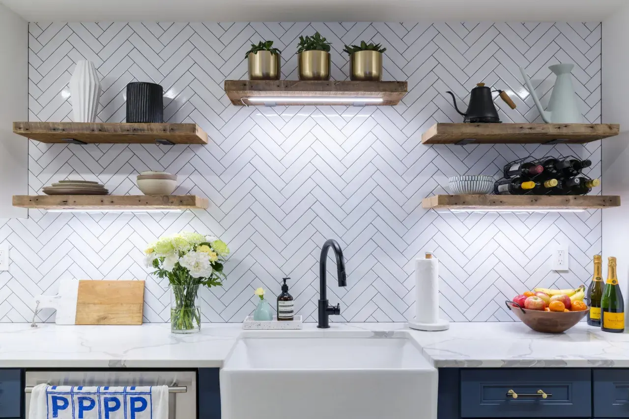
Chevron tile can still make a bathroom feel tailored and architectural, but the real question is, is chevron tile out of style, or has it simply become a more selective design choice? In 2026, I would not call it obsolete. I would call it directional: it works best when the scale, color, grout, and placement are doing real design work instead of carrying the whole room on their own. This article breaks down what feels current, what feels tired, and how to use the pattern without making the space look busy.
Chevron tile still works when the room does not need the pattern to do all the work
- Chevron is still current in 2026, but it reads as a design choice, not a neutral default.
- It looks freshest in tone-on-tone palettes, matte finishes, and well-proportioned bathroom layouts.
- High-contrast chevron in small, busy spaces is where it most often starts to feel dated.
- Herringbone is softer and more timeless; straight stack is calmer and easier to live with.
- The finish, grout color, and scale matter as much as the pattern itself.
The short answer is more nuanced than yes or no
If the room needs a crisp, geometric focal point, chevron can still do the job well. What has changed is the setting: in bathrooms that already have dramatic stone, bold color, or a lot of mixed materials, the pattern can feel louder than it needs to.
I think of chevron as a surface that wants editing. Keep the palette tight, and it reads as intentional; layer too many other statements around it, and it starts to feel like the bathroom is trying too hard. That is why the answer is less about trend status and more about restraint.
That distinction matters, because the difference between current and tired is usually in the execution, not the pattern itself.
Why chevron still feels current in bathrooms
Chevron still earns a place because it gives a room movement without needing extra ornament. The V-shape naturally pulls the eye, which can make a narrow shower wall feel longer or a backsplash feel more tailored.
It also has a cleaner read than many people expect. In a true chevron layout, the tile ends meet at a point, so the surface looks sharper and more architectural than a loose zigzag. That is why it can work in both modern and transitional bathrooms when the finish is right.
I also like its flexibility. The same pattern can feel calm in matte porcelain, warmer in limestone or marble, and more contemporary when the grout almost disappears. Designers have not abandoned it; they have just stopped treating it as a default answer.
Once you know why it works, the next question is where it stops working.
Where the pattern starts to look tired
Chevron usually goes stale for one of four reasons: too much contrast, too much repetition, the wrong scale, or a finish that fights the room. None of those problems are about chevron alone. They are about how aggressively it is used.
| What keeps it fresh | What ages it faster |
|---|---|
| Tone-on-tone grout that softens the geometry | High-contrast grout in a small bathroom |
| One patterned surface with room to breathe | Chevron on the floor, wall, and niche all at once |
| Elongated tile that creates a clean V | Tiny pieces or awkward cuts that make the pattern choppy |
| Matte or honed finishes with controlled movement | Glossy tile with busy veining that competes with the layout |
The pattern feels most dated when it is forced to do the job of color, texture, and drama at the same time. If the bathroom already has a strong vanity front, veined countertop, or sculptural lighting, chevron should usually stay in the background.
When you can spot those warning signs, it becomes much easier to style the pattern without overdoing it.
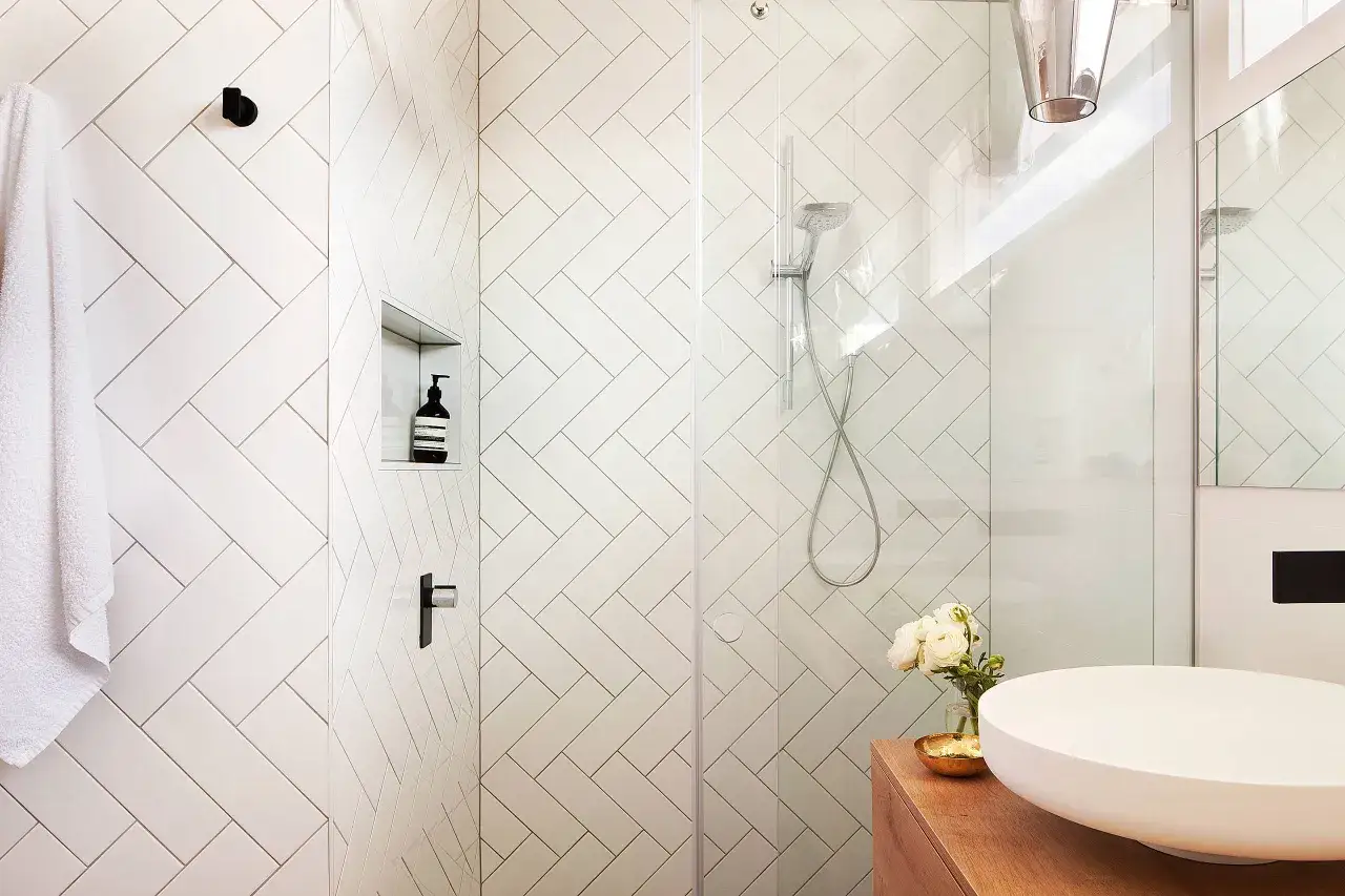
How to use chevron tile without making the room feel busy
The safest way to keep chevron fresh is to give it one clear job. I usually pick one plane, one finish direction, and one visual weight, then let everything else calm down around it.
- Use it on one surface only. A shower feature wall, vanity backsplash, or powder room focal wall is usually enough.
- Keep the grout close to the tile color. Matching or near-matching grout softens the geometry and makes the surface feel more designed than busy.
- Choose an elongated format. Longer tiles, such as 3x12 or 4x12 pieces, usually create a cleaner chevron than small modules.
- Let the rest of the room stay quiet. Flat-front cabinetry, simple mirrors, and restrained metal finishes help the tile stay in control.
- Use high contrast only on purpose. Dark grout against light tile is a strong look, but it reads graphic first and timeless second.
If I were using chevron in a shower, I would usually place it on the main wall rather than the floor unless the room is large enough to breathe. Floors add a lot more visual movement because they sit under every other finish in the room.
Once the layout is under control, the pattern itself is easier to compare with the other two layouts people usually consider.
Chevron, herringbone, or straight stack
These three layouts often compete for the same bathroom, but they do not do the same job. I use this comparison when a client likes pattern but is not sure how much energy the room should carry.
| Pattern | Feel | Best use | Main trade-off |
|---|---|---|---|
| Chevron | Sharp, directional, and more fashion-forward | Feature walls, statement backsplashes, polished powder rooms | Needs tighter detailing and can feel busy if overused |
| Herringbone | Softer, classic, and easier to live with | Floors, shower walls, transitional bathrooms | Less graphic than chevron, so it makes a smaller statement |
| Straight stack | Calm, modern, and understated | Small bathrooms, resale-focused remodels, spa-like spaces | Gives up some drama in exchange for longevity |
If the bathroom already has a strong material story, straight stack often wins because it lets the stone, hardware, or vanity lead. If you want texture without a hard edge, herringbone is usually the safer middle ground. Chevron is the boldest of the three, which is exactly why it works best when the rest of the room is disciplined.
That comparison usually settles the choice, but I still use one final rule before recommending chevron.
The rule I use before I say yes to chevron
I approve chevron when the room needs structure, not more noise. That usually means a bathroom with simple cabinetry, limited surface variety, and a layout that benefits from a strong visual line.
I hesitate when the space already has competing movement. Busy marble, heavily textured wall tile, ornate mirrors, or too many finish changes can make the pattern feel anxious instead of elegant. In those rooms, I would rather keep the tile calm and let one other element carry the personality.
- Choose chevron for one focal surface in a room that feels plain or boxy.
- Choose herringbone when you want motion but need a softer, more timeless result.
- Choose straight stack when longevity, resale, or visual calm matters most.
My practical answer is simple: chevron tile is not out of style, but it is no longer the pattern I reach for first. It works best when it is edited, proportional, and allowed to be the accent rather than the whole story.