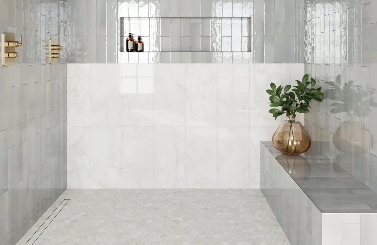
The appeal of subway tile on floor is simple: it gives a room a familiar, timeless shape without making the surface feel busy. In practice, the result depends far more on tile body, finish, grout joint, and layout than on the shape itself. I’m breaking down where this look works best, what to avoid in bathrooms and other interior spaces, and how I would choose a floor that feels clean, durable, and easy to live with.
The safest version of this look is floor-rated tile with the right finish and joint plan
- Porcelain is my default for bathrooms, laundry rooms, and other moisture-prone floors.
- A wet-floor DCOF of 0.42 is a useful reference point, but it is not a guarantee of safety in every condition.
- Matte or satin finishes are usually easier to live with than glossy finishes on a floor.
- Grout width and layout affect both traction and how much cleaning you’ll do later.
- With elongated rectangles, I keep the offset modest to reduce lippage, which is the height difference between adjacent tiles.
When this look works and when it does not
For me, the biggest mistake is treating the shape as the decision instead of the product rating. A rectangular tile can be beautiful on a floor, but it still has to be sold and installed as a floor tile. Wall-only versions are fine on backsplashes and shower walls; they are not the version I would put under daily foot traffic.
This look works best in rooms that benefit from a calm, orderly surface: powder rooms, hall bathrooms, laundry rooms, mudrooms, and compact entry spaces. It can also work in a larger primary bath if the rest of the design is restrained. The shape feels familiar, but the floor still reads as intentional when the finish and grout are chosen well.
I would be more cautious in areas that stay wet, get tracked with grit, or need aggressive cleaning. That is where the surface needs to do more than look good, and where a floor-rated porcelain version usually makes more sense than a decorative ceramic one. Once that boundary is clear, the rest of the selection process becomes much easier.
Choose the right material first
If I had to narrow the options, I would start with porcelain. Its dense body and low water absorption make it the most forgiving choice for bathrooms and other interior floors that see moisture. Ceramic can still work, but only when the specific product is approved for floor use and the room is not unusually demanding. Natural stone brings character, but it asks for more maintenance and more discipline from the owner.
| Material | Best use | Strengths | Tradeoffs |
|---|---|---|---|
| Porcelain | Bathrooms, laundry rooms, kitchens, most interior floors | Dense, moisture-resistant, durable, and widely available in floor-friendly sizes | Harder to cut and usually more demanding to install |
| Glazed ceramic | Dryer, lighter-use floors or powder rooms, if floor-rated | Affordable, easy to style, and available in many colors | More porous than porcelain and less forgiving in wet or high-traffic spaces |
| Natural stone | Design-led rooms where patina is welcome | Rich texture and depth | Needs sealing and more upkeep than most homeowners want on a busy floor |
| Glass | Occasional accent, not my first-choice floor surface | Bright and reflective | Less practical underfoot and more likely to feel slippery |
One number I pay attention to is the 0.5% water absorption threshold used to define porcelain. That is why porcelain remains the practical default for bathrooms, even when the style itself is classic. Daltile’s porcelain guidance uses that benchmark as part of the case for moisture-prone spaces, and I think that is the right way to frame the decision: material first, pattern second.
Once the material is right, the finish and slip behavior become the next filters.
Finish, slip resistance, and grout matter more than the pattern
The surface finish changes how the floor feels day to day. A glossy tile can be attractive in a dry powder room, but I usually prefer matte or satin for real bathroom use because it hides water marks better and tends to feel less slick. The shape may be the same, but the experience underfoot is not.
TCNA’s wet-floor guidance uses a 0.42 DCOF reference point for level interior floors intended to be walked on with water present. I treat that as a baseline, not a promise. Standing water, shampoo residue, soap, tracked-in grit, or a steeper transition can change the experience quickly, which is why I would never choose a tile by a single number alone.
Grout is doing more work than most people expect. It fills the joints, helps control movement, and changes the way the floor reads visually. For cement grout, sanded formulas are commonly used for 1/8-inch to 1/4-inch joints, while unsanded grout is usually better for 1/16-inch to 1/8-inch joints. In a bathroom, I often lean toward a grout that is a touch darker than the tile if I want the floor to look cleaner longer.
If stain resistance is a priority, epoxy grout is worth a serious look. It costs more and takes more care during installation, but I like it for busy baths because it handles moisture and cleaning better than basic cement grout. That said, the best grout choice still depends on joint width, tile finish, and how much visual contrast you want.Once finish and grout are set, the pattern choice becomes much more about style than survival.
Patterns that flatter the shape without making the floor busy
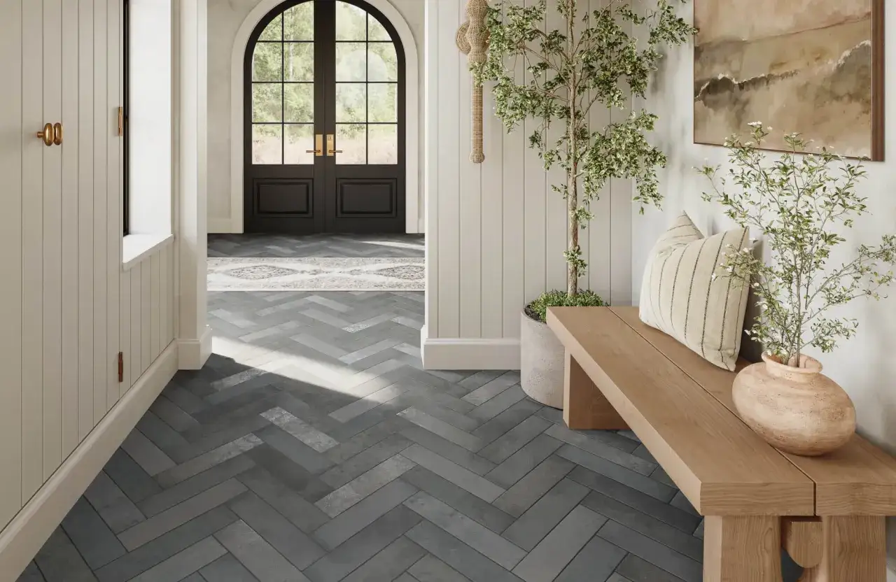
Rectangular tile gives you more layout options than people usually expect. The classic running-bond pattern is the obvious choice, but I do not think it is the only one worth considering. The right pattern can make a small room feel composed, while the wrong one can make the floor feel fussy.
| Pattern | What it does | When I use it |
|---|---|---|
| Running bond | Feels familiar and calm | Most bathrooms, laundry rooms, and hallways |
| Straight stack | Looks cleaner and more modern | Spaces with strong cabinetry lines or simple architecture |
| Herringbone | Adds movement and a little energy | Smaller rooms that need visual interest without extra color |
| Vertical or mixed orientation | Makes the surface feel less expected | Design-forward bathrooms where the floor is meant to stand out |
For longer rectangular tiles, I keep the stagger conservative. A common manufacturer guideline is to limit the offset to 33% when the tile is long enough to create lippage risk, especially in a brick-joint layout. That matters because the floor can look fine on paper and still feel uneven underfoot once light hits the joints from the side.
I also prefer to dry-lay a few rows before committing to a pattern. That lets me see whether the layout will create awkward slivers at the walls or awkward cuts around a toilet flange, shower curb, or vanity leg. A good pattern should look effortless, not engineered to death.
With the layout settled, the installation details become the part that decides whether the floor feels premium or merely expensive.
Installation details that keep the floor flat and quiet
The cleanest-looking tile floor starts with a flat substrate. I am much less worried about the shape of the tile than about what it is sitting on. If the floor is out of plane, elongated tiles exaggerate the problem fast, and the joints will telegraph every small hump or dip.
- Check flatness first. Rectangular tile is less forgiving than many people expect.
- Use the right joint width. Forcing tiles too close together can make the floor look sharper in the showroom and worse in the house.
- Honor movement joints. Perimeter gaps and transitions matter more than most DIYers realize.
- Dry-fit critical areas. Doorways, toilet cuts, and tub edges are where sloppy layouts show first.
- Match the mortar to the tile. Heavy or larger-format pieces may need a more supportive setting material.
In renovated bathrooms, I like to think about the floor as one system rather than a loose collection of parts. Underlayment, mortar, grout, and transition pieces all affect how long the surface stays stable and how good it still looks after a few years of use. That is the difference between a floor that ages well and one that starts complaining early.
Once those mechanics are right, the remaining question is how to specify the floor so the final result stays practical.
The spec sheet I would use before ordering
If I were choosing this for a real project, I would narrow it down with a short checklist instead of a mood board. The shape is only one part of the decision, and the tile needs to earn its place on the floor.
- Floor-rated product, not a wall-only version.
- Porcelain first for bathrooms and other moisture-prone rooms.
- Matte or satin finish unless the room is very dry and low traffic.
- Grout plan based on the actual joint width, not on appearance alone.
- Layout plan that avoids awkward cuts and excessive lippage.
- Maintenance fit that matches how much cleaning you are willing to do.
My own preference is usually a floor-rated porcelain rectangle in a soft matte finish, set with a restrained stagger or straight layout, and paired with a grout color that hides everyday wear without disappearing completely. That combination gives you the classic subway look without turning the floor into a maintenance project. If you want the style to stay useful as well as timeless, that is the version I would trust most.