The right floor pattern does more than decorate a kitchen. It changes how wide the room feels, how much grout you have to maintain, and whether the floor supports the cabinetry or steals the show. In 2026, I am seeing kitchens move toward warmer neutrals, softer contrast, and texture that feels lived-in rather than loud, so the layout you choose matters just as much as the tile itself. This guide breaks down the patterns that actually work, how to match them to the room, and what they mean for cost and upkeep.
What matters most when choosing a floor
- Straight lay and running bond are the safest long-term choices for most kitchens.
- Diagonal, herringbone, basketweave, and checkerboard add movement but increase labor and waste.
- Large-format porcelain helps a floor feel calmer and easier to clean.
- Grout color can make the pattern disappear or turn it into the feature.
- Plan for extra tile so cuts, breakage, and pattern changes do not stall the project.
The patterns that work best in real kitchens
When I narrow down tile layouts, I start with the room’s job. A kitchen floor has to handle traffic, crumbs, spills, chair movement, and years of standing, so the best pattern is rarely the most dramatic one. The layouts below are the ones I come back to most often because they balance style with common-sense performance.
| Pattern | Look | Best for | Tradeoff |
|---|---|---|---|
| Straight lay | Clean, quiet, orderly | Modern kitchens, minimal cabinets, open plans | Can feel plain if the tile itself has little character |
| Stacked grid | Sharp and architectural | Contemporary spaces and large-format tile | Shows alignment mistakes quickly |
| Running bond | Classic, relaxed, slightly directional | Transitional kitchens and narrow rooms | Long tiles can show lippage if the offset is too aggressive |
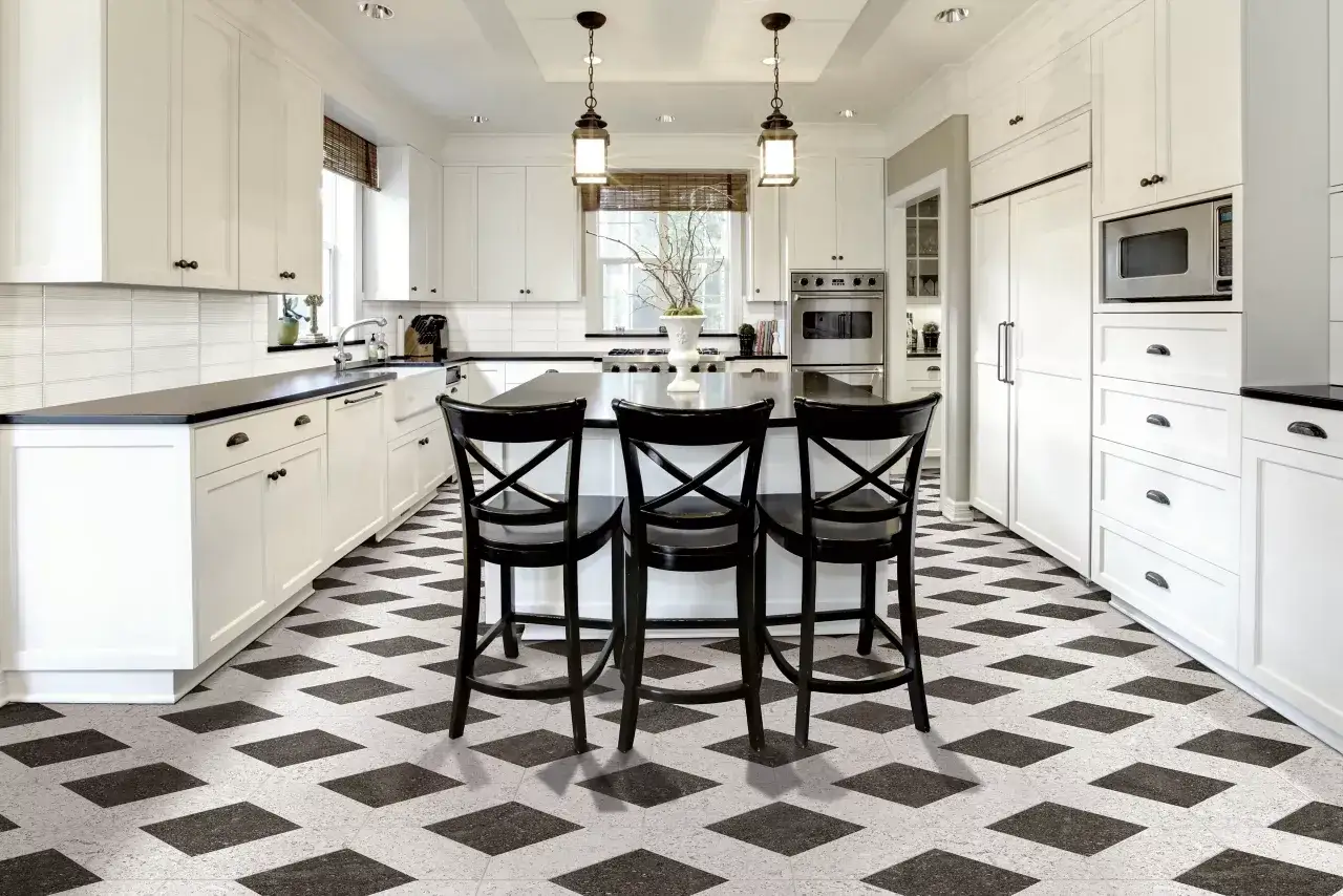
| Diagonal | More movement, slightly larger feel | Smaller kitchens that need visual opening-up | More cuts, more waste, more labor |
| Herringbone | Tailored, energetic, upscale | Feature floors and kitchens with simpler cabinetry | Costs more to install and can overwhelm busy rooms |
| Basketweave | Textured and traditional | Vintage, cottage, and layered interiors | More grout and a stronger visual rhythm |
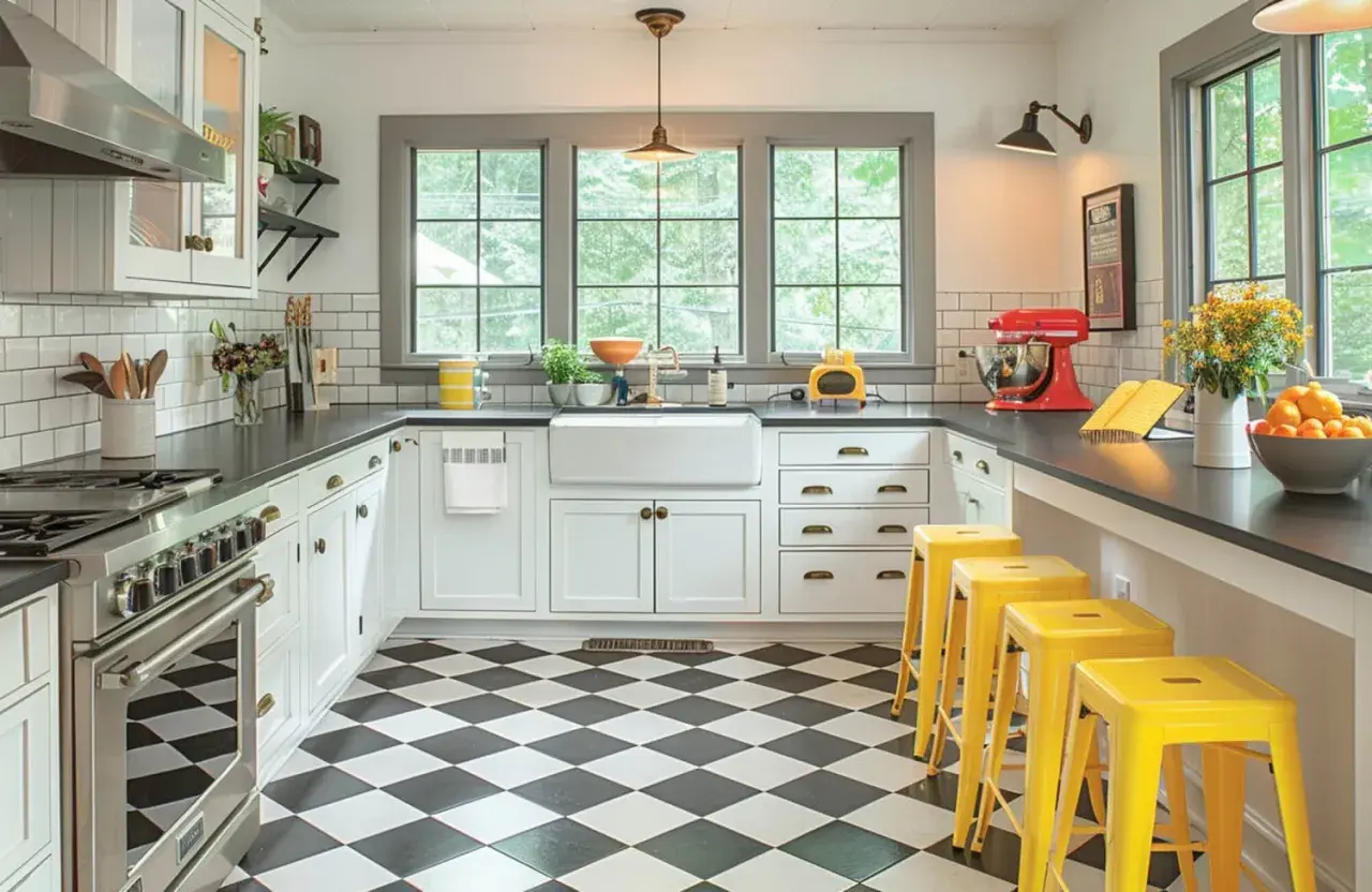
| Checkerboard | Graphic and nostalgic | Larger kitchens that can carry contrast | Strong commitment; it can date faster than quieter layouts |
If you want my quick take, running bond, straight lay, and stacked grid are the safest all-around options. Herringbone and checkerboard are the ones I reach for when the room has enough breathing space to let the floor become part of the design story, not the whole story. That is why the pattern has to be judged in context, not in isolation. Next, I look at the room itself.
How to match the layout to the room
Three things decide whether a pattern feels right: the size of the kitchen, how much visual noise is already happening elsewhere, and the direction your eye naturally follows when you walk in. A floor that looks perfect in a showroom can feel too busy at home if the cabinets, counters, and backsplash already carry a lot of detail.
Small or narrow kitchens
In a compact kitchen, I usually want the floor to make the room feel longer or wider without fighting the architecture. A diagonal layout can visually open the space, while a simple straight or stacked grid can keep the room from feeling chopped up. If the kitchen is a galley, running bond often works well because the offset gives you a little movement without the chaos of a more decorative pattern.
Open-plan kitchens
Open plans need discipline. I try to align the tile to the main sight line, the island, or the longest wall so the floor reads as one continuous surface instead of a patchwork of angles. If the kitchen flows into living or dining space, a restrained layout usually ages better than a dramatic one, especially when the same floor continues beyond the cooking zone.
Read Also: Vinyl Plank Not Flat? Fix It Right – Expert Guide
Cabinets and counters already doing a lot
If the cabinetry is heavily textured, the countertops have strong veining, or the backsplash is patterned, the floor should usually step back. In those rooms, a simple grid or running bond keeps the floor from competing with the rest of the envelope. When the cabinets are flat-front and the counters are quiet, the floor can carry more of the visual interest.
That is the part many people miss: the best layout is not the one with the most personality, it is the one that makes the whole room feel intentional. From there, the next layer of decisions is tile size, grout, and finish.
Tile size, grout, and finish do most of the quiet work
Pattern is only one part of the result. Tile format, grout color, and surface finish often change the final look more than the layout itself. I think of these as the controls that decide whether the floor feels soft, crisp, rustic, or formal.
| Design choice | What it changes | Practical effect |
|---|---|---|
| Large-format tile | Fewer grout lines, calmer surface | Makes simple layouts feel more expensive and easier to clean |
| Small-format tile | More joints and more visible structure | Adds character, but also more maintenance |
| Matching grout | Softens the layout | Lets the tile color lead instead of the grid |
| Contrasting grout | Emphasizes the pattern | Works best when the room can handle stronger graphics |
| Matte finish | Less shine, more texture | Usually hides everyday wear better in family kitchens |
| Polished finish | More reflection and sharper light bounce | Can look elegant, but it shows smudges and footprints more easily |
Rectified tile, which is machine-cut for more even edges, usually allows a tighter joint and a cleaner-looking grid. Handmade or intentionally irregular tile needs a little more room, and that extra space becomes part of the design. That is also why the current 2026 direction feels less stark and more tactile: warm neutrals, matte surfaces, and subtle texture are doing more work than hard contrast.
What the budget looks like in the United States
For most U.S. kitchens, budget is where the pattern conversation becomes real. A typical installed tile floor falls somewhere around $10 to $50 per square foot, depending on tile type, labor rates, and how complex the layout is. For a 200-square-foot kitchen, that works out to roughly $2,000 to $10,000 before demolition, leveling, trim, or radiant heat work.
| Project element | Typical installed range | What drives the cost up |
|---|---|---|
| Ceramic tile floor | $12 to $40 per square foot | Specialty finishes, intricate cuts, extra prep |
| Porcelain tile floor | $15 to $50 per square foot | Harder material, larger formats, more labor |
| Simple straight layout | Usually near the lower end | Fewer cuts and faster installation |
| Diagonal or herringbone layout | Usually toward the middle or upper end | More layout time, more waste, more trimming |
| Complex basketweave or mixed pattern | Often near the upper end | Precision work and slower installation |
I usually tell people to budget with a little discipline and a little honesty. If you know you want a more elaborate layout, do not pretend it will cost the same as a basic grid. The pattern changes the labor, and labor is where kitchen floor projects often drift upward. Once the budget is realistic, the last thing to get right is avoiding the mistakes that make a good tile choice look off.
Mistakes that make a good pattern look awkward
The worst kitchen floors I see are not usually bad tile. They are good tile used without enough restraint. Most problems come from mismatching the floor to the room or underestimating how much precision the installation actually needs.
- Choosing a busy layout for an already busy room. If the counters, cabinets, and backsplash all have strong visual energy, the floor should usually calm down.
- Ignoring tile movement rules on long planks. With elongated tiles, many manufacturers recommend a 33% offset instead of a full half-bond to reduce lippage caused by warpage.
- Skipping sample boards. Grout, tile, and finish can look very different once they are together and seen in natural light.
- Underordering material. I usually allow about 10% extra for simple layouts and closer to 15% or more for diagonal or herringbone cuts.
- Forgetting transitions. A great floor can still feel wrong if it collides with adjoining wood, stone, or vinyl in the next room.
- Letting the grout dominate. If the grout is too dark or too light for the tile, the pattern can become harsher than intended.
There is a practical takeaway here: the floor should look deliberate from five feet away and still make sense when you are standing on it every day. That means checking the pattern in daylight, at night, and next to the actual cabinet and counter samples, not just in a showroom.
A simple way to choose the right floor before you order
If I were narrowing this down for a real kitchen, I would keep the process simple and physical. Screens and product photos are useful, but they do not tell you how the pattern behaves in the room you actually live in.
- Decide whether the floor should disappear or lead the room.
- Place full-size samples next to cabinets, counters, and wall color in daylight.
- Tape out two or three pattern options on the floor so you can see scale, direction, and movement.
- Check the sight lines from the entry, the sink, and the main cooking zone.
- Confirm lead time, waste allowance, and installation experience before you buy.
My default recommendation for most kitchens is a porcelain floor with a restrained layout, moderate grout contrast, and a matte or softly textured finish. If you want more personality, I would put it into the geometry rather than into loud color. That approach keeps the room interesting now and harder to regret later.