These porcelain tile shower ideas work best when the tile is doing more than decorating the walls. In a shower, the color, size, finish, grout, and drain layout all affect how the room feels and how easy it is to keep clean. I’m focusing on the looks that hold up in real bathrooms, not just in mood boards.
What matters most is the balance between style, traction, and cleanup
- Porcelain is a strong shower material because it is dense, low-absorption, and available in convincing stone, marble, concrete, and wood looks.
- Large-format wall tile makes a shower feel calmer and more expensive, but it only looks good if the substrate is flat.
- Shower floors need traction first, so matte or textured finishes usually outperform glossy surfaces.
- One accent surface is usually enough; too many patterns make the room feel busy fast.
- Waterproofing, slope, and grout choices matter just as much as the tile you pick.
Why porcelain is the right base for a shower
Porcelain earns its place in showers because it is fired dense and typically absorbs very little water, usually below 0.5%. That makes it a practical fit for steam, splash, and everyday cleaning. I also like that porcelain can convincingly imitate stone, marble, cement, and wood, so you can build a refined bathroom without inviting natural stone maintenance into the shower.
The tile itself usually does not need sealing, which is one of the reasons I reach for it so often. The grout joints are the part that may need attention, especially if you choose a cement-based grout rather than an epoxy product. Once you understand that, the rest of the design choices become easier to judge with a real shower in mind, not a showroom sample board.
From here, the fun part is deciding what kind of visual statement the shower should make.
Shower layouts that feel current in 2026
Large-format stone look
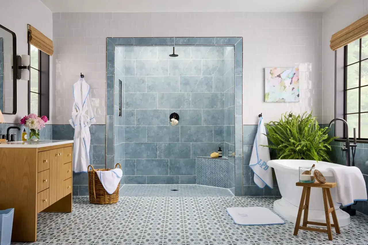
A 12x24, 24x24, or 24x48 wall tile in a stone-look porcelain gives a shower a quiet, architectural feel. Fewer grout joints usually means the room reads larger and cleaner, which is exactly why this approach keeps showing up in primary baths. I like it most when the palette is restrained and the veining is subtle rather than loud.
This style works especially well when the shower has a bench or niche that can be wrapped in the same family of tile. The whole space feels intentional instead of pieced together.
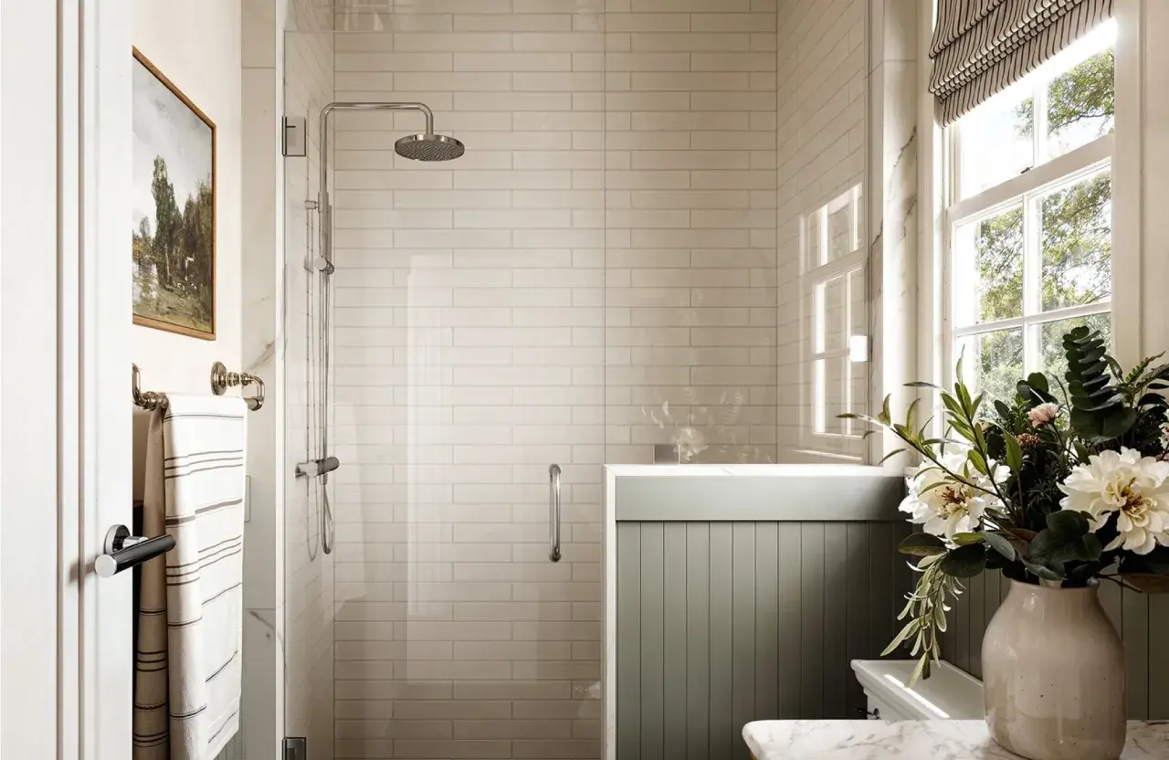
Vertical stack in a soft neutral
Stacking rectangular tile vertically is one of the simplest ways to make a shower feel taller. It draws the eye upward, which helps in compact bathrooms and in rooms with lower ceilings. I prefer this layout when the rest of the bathroom is already busy and the shower needs to calm the overall composition.
Use a grout color close to the tile if you want the effect to stay soft. If the contrast is too sharp, the eye starts reading every joint, and the height advantage disappears.
Tile drenching from floor to ceiling
Tile drenching means carrying the same porcelain family across the shower walls, often from floor to ceiling, so the shower feels wrapped rather than assembled. It is a strong move when the goal is spa-like calm. This approach looks best when the tile has some movement or texture, because perfectly flat and perfectly matching surfaces can feel sterile.
I reach for this concept when the bathroom is meant to feel restful, not decorative. It is a good example of restraint doing more work than ornament.
Dark and moody without feeling heavy
Deep charcoal, walnut-brown, or ink-toned porcelain can look excellent in a shower with enough natural or layered artificial light. The trick is to keep the lines crisp and the hardware simple. In a smaller room, I usually reserve the darker tone for one wall or one band of the shower instead of covering every surface with it.
That way the room gains depth without losing brightness. It also makes the space feel designed, not simply dark.
Those quieter base layers give you room to add character where it matters most.
Accent moves that add character without making the shower busy
Textured feature wall
A lightly dimensional porcelain wall is one of my favorite ways to add interest without adding chaos. Fluting, ribbing, and soft sculpted textures catch light in a way flat tile cannot, which gives the shower movement even when the color stays neutral. I use this when the bathroom needs a focal point but not a loud one.
Keep the rest of the shower simple if you go this route. The texture should feel like a detail, not a competing theme.
Wood-look bench or niche
A wood-look porcelain accent on a bench or inside a niche can warm up a cool shower instantly. It is a small area, so the visual payoff is high and the risk is low. I especially like this move in baths that lean too gray and need a touch of softness.
Use it sparingly. When wood-look tile is spread across too many surfaces, it stops feeling like an accent and starts looking generic.
Patterned floor with quiet walls
If you want more personality, the floor is usually the safest place to put it. Small hex, penny, or subtle terrazzo-style porcelain adds detail underfoot while the walls stay calm. This works because the shower floor already has a natural break in the surface from the slope and drain, so pattern reads as part of the architecture instead of as noise.
I like this option for homeowners who want the room to feel custom but still easy to live with.
Framed feature panel
A single vertical panel behind the shower head can create a focal point without turning the whole shower into a feature wall. The rest of the enclosure can stay understated, which gives the room balance. It is a smart compromise when one person wants a bit of drama and the other wants the shower to stay timeless.
Used well, this is the difference between a room with one clear design move and a room that feels overdesigned.
After that, the choice between finishes and formats becomes much easier.
The finishes and formats I would choose first
| Surface | What I usually choose | Why it works | Watch out for |
|---|---|---|---|
| Walls | Large-format porcelain in a matte or satin finish | It keeps the shower visually calm and reduces grout lines | It needs a flatter wall, or lippage becomes obvious |
| Shower floor | Small-format mosaic or another textured tile | It follows the slope more easily and usually gives better traction | Glossy finishes can feel slick and are harder to justify underfoot |
| Bench and niche | The same tile family or a coordinated accent | It keeps the detail coherent and avoids a patchwork look | Edges and corners need clean planning before setting begins |
| Statement wall | Rectified stone-look porcelain or slab-look panels | It creates a high-end, nearly seamless effect | It demands careful layout and very accurate substrate prep |
Rectified tile is porcelain that has been mechanically cut after firing so the edges are cleaner and more precise. That allows for tighter grout joints, but it also exposes any problem in the wall faster. If the substrate is not flat, the tile will not hide it for you.
That flatness question matters more with larger pieces. For tile with at least one edge 15 inches or longer, industry guidance allows no more than 1/8 inch of variation in 10 feet, and I think that number is worth respecting because shower light makes small flaws look bigger than they are.
DCOF, or dynamic coefficient of friction, is the industry measure used to estimate wet traction. On the floor, I look for a wet DCOF of at least 0.42, which is the common benchmark for wet interior areas. Some shower-floor products are rated even higher, around 0.60, and I get more conservative as the floor gets more exposed. No floor tile is truly slip-proof, so traction has to be part of the design brief.
Once the finish and format are right, the shower still depends on the work you cannot see.
The installation choices that protect the design
Waterproofing and slope
I want a continuous waterproofing system in the shower, not just tile and grout pretending to be protection. The floor should slope 1/4 inch per foot to the drain so water moves instead of lingering in low spots. If the design uses large-format tile, a linear drain, the slot-style drain that runs along one edge or the back wall, can make the layout cleaner because it gives the installer more freedom to keep the floor plane controlled.
That slope is not a styling preference. It is one of the things that decides whether the shower works in everyday use.
Flatness and lippage
Lippage is the height difference between adjacent tile edges, and it becomes obvious very quickly on a shower wall. I check the substrate with a long straightedge before tile goes up because grout cannot hide a bad plane. Thin-set is a bonding mortar, not a leveling product, so the wall or floor needs to be corrected before the setting work starts.
This is where large-format porcelain is both attractive and demanding. It looks expensive when the prep is right, and it looks careless when it is not.
Read Also: Black-and-White Tile Texture - Design for Your Bathroom
Grout, caulk, and movement joints
I usually keep grout color close to the tile color when the goal is a soft, continuous look. A closer match makes the joints recede and lets the tile pattern do the talking. At changes of plane, I prefer a flexible sealant rather than hard grout because movement joints need room to move.
Epoxy grout, a resin-based grout that is far less porous than cement grout, can lower maintenance in a busy family shower, but it costs more and is less forgiving to install. In a straightforward bathroom, a quality cement grout with proper sealing is often enough as long as the detailing is done correctly.
- Avoid polished tile on the shower floor.
- Do not rely on thin-set to fix an out-of-plane wall.
- Do not skip waterproofing around benches and niches.
- Keep the design simple if the tile already has strong pattern or veining.
When those details are handled well, the design reads as intentional instead of merely expensive.
That balance between upfront spend and long-term upkeep is usually what separates a shower that still feels fresh in five years from one that starts looking tired quickly.
What the budget and upkeep usually look like
For a professional shower tile installation in the U.S., I would usually budget roughly $15 to $50 per square foot for porcelain, with custom details, substrate repair, and labor pushing the total toward the higher end. Waterproofing alone often lands around $450 to $750, and a shower with niches, a bench, or a custom drain typically costs more than a simple rectangular enclosure. The tile choice matters, but prep and detailing often move the final number just as much.
The good news is that porcelain itself is easy to live with. The main maintenance tasks are wiping down the walls, cleaning grout with a neutral pH product, and checking the caulk lines occasionally so small failures do not become water problems. If you pick cement grout, sealing it is a smart habit; if you choose epoxy grout, you trade some of that upkeep for a higher material cost and a trickier install.
I also tell clients to think about what will age visually, not just physically. A calm stone look, a warm neutral, or a soft textured tile usually stays relevant longer than a loud pattern that only works while it feels novel.
That is why I keep coming back to a few dependable shower formulas rather than chasing whatever is loudest in the moment.
The shower formulas I trust when I want the result to age well
- A warm off-white or sand-colored wall tile with a small textured floor tile and grout that stays close to the tile tone.
- A vertical-stacked rectangular porcelain with a restrained accent niche and a linear drain for a sharper, more architectural look.
- A stone-look field tile on the walls, a patterned mosaic on the floor, and one textured feature wall for a controlled dose of personality.
If I were choosing for a typical U.S. primary bath today, I would keep the walls quiet, give the floor texture, and save the strongest visual move for one surface only. That formula gives the shower a clear hierarchy, keeps cleaning manageable, and avoids the dated look that comes from trying to make every wall compete for attention.