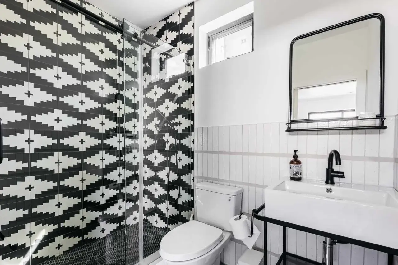
Black-and-white tile can look crisp, vintage, modern, or quietly luxurious depending on how the surface is finished and how the pattern is put together. When I describe a black-and-white tile texture, I’m thinking about sheen, relief, grout contrast, tile scale, and the way light moves across the room. This article breaks down what changes that effect, where it works best in a bathroom, and how to choose a surface that looks intentional instead of busy.
The details that shape the look fastest
- Finish matters as much as color. Glossy surfaces feel sharper; matte surfaces feel softer and more grounded.
- Grout changes the reading. High contrast emphasizes the pattern, while tone-on-tone grout quiets it down.
- Scale controls the mood. Small tiles add movement, large tiles feel calmer, and bevels add depth.
- Bathrooms need practical choices. Floors usually benefit from matte or lightly textured surfaces, especially in wet zones.
- Lighting changes everything. The same tile can look bold in daylight and flatter under warm artificial light.
What actually creates the texture
When I look at black-and-white tile, I separate physical texture from visual texture. Physical texture is the actual surface relief: a beveled edge, a rippled glaze, a pressed pattern, or a lightly embossed face. Visual texture comes from contrast, repetition, and grout lines, even when the tile itself is flat.
That distinction matters because two bathrooms can use the same colors and still feel completely different. A flat checkerboard with tight grout joints reads clean and graphic. Add beveled edges, a handmade glaze, or a slightly uneven surface and the room suddenly feels more layered and tactile. Even the edge profile changes the effect: rectified tiles create sharper seams, while softer edges make the surface look less rigid.
In practice, I usually pay attention to four things: the finish on the glaze, the depth of the grout joint, the size of each tile, and whether the pattern is supposed to be the star or the background. Once those pieces are clear, it becomes much easier to choose the right finish for the room.
From there, the real question is how that surface behaves in light, because sheen can completely change the mood.
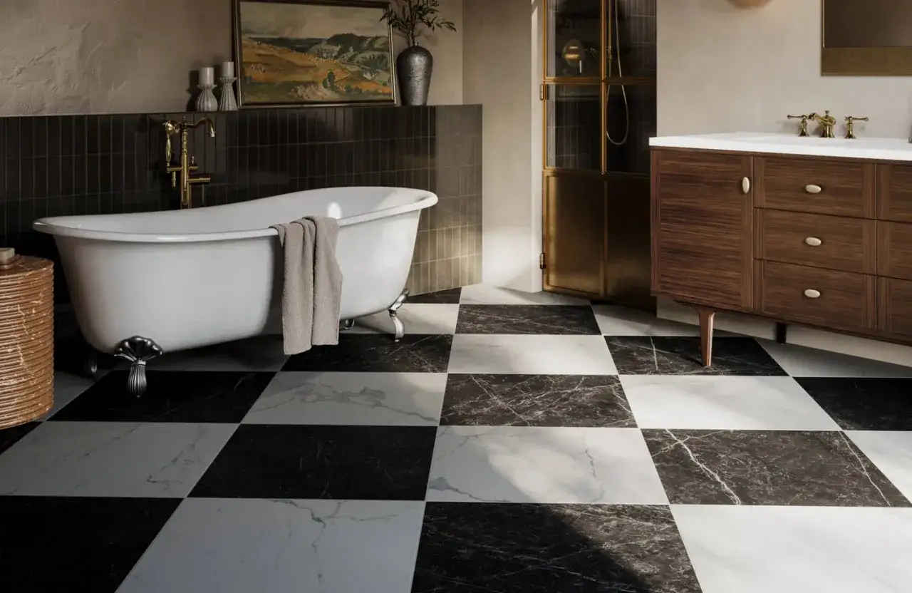
How finish changes the visual reading
The same black-and-white tile can feel polished and formal in one finish, then calm and understated in another. If you only look at color, you miss the part that usually makes the biggest difference: how the surface reflects light.
| Finish | What it looks like | Best for | Tradeoff |
|---|---|---|---|
| Glossy | Bright, reflective, and high-contrast | Walls, backsplashes, powder rooms, decorative accents | Shows water spots and soap residue more easily |
| Matte | Soft, muted, and more grounded | Floors, showers, and rooms that need less shine | Can feel flatter if the layout is too simple |
| Satin or honed | Between glossy and matte, with a softer glow | Bathrooms that need balance and a quieter finish | Less dramatic than glossy, less forgiving than full matte |
| Textured or embossed | More tactile, with subtle movement across the face | Feature walls, niches, shower walls, and accent fields | Can trap grime if the texture is too deep or the grout is wide |
| Handmade-look glaze | Soft variation from tile to tile | Spaces that need character and a less uniform look | Requires careful sampling so variation does not feel random |
I like glossy black on walls when I want the white to pop and the room to feel sharper. I reach for matte white on floors when I want the pattern to stay readable without turning the bathroom into a reflection box. If the room already has strong lighting, a satin or honed finish often lands in the safest middle ground.
Once you know how sheen behaves, the next decision is placement, because not every surface in a bathroom asks for the same kind of texture.
Where it works best in a bathroom
Black-and-white tile is versatile, but it is not equally effective everywhere. I think of it as a tool for creating emphasis, and the best place to use it depends on how much visual weight you want the room to carry.
- Bathroom floors: Best when the finish is matte or lightly textured. The pattern feels grounded, and the surface is usually easier to live with under wet feet.
- Shower walls: A strong choice if you want drama without making the floor feel busy. Vertical surfaces can handle more contrast.
- Shower floors: Usually better in smaller modules or mosaics, where the extra grout lines add traction and help the tile follow the slope.
- Powder rooms: Ideal for bold checkerboard or graphic layouts, because the space is used briefly and can handle more visual punch.
- Wainscots and niches: Useful when you want a smaller dose of contrast rather than a full-room commitment.
That leads naturally to the part people underestimate most: grout, tile size, and layout are what make the room feel crisp instead of chaotic.
Grout, scale, and layout do most of the work
Color gets the attention, but layout does the editing. A black-and-white surface can look refined, classic, or overly busy depending on the size of the tile and the width of the grout joint.
| Layout | Visual effect | Best when you want |
|---|---|---|
| Checkerboard | Classic, graphic, and easy to read from across the room | A timeless statement with strong contrast |
| Subway tile with dark grout | A more architectural grid that emphasizes structure | Clean lines and a slightly tougher edge |
| Hex or penny tile | More movement and surface detail | A softer, more textured feel without losing contrast |
| Large-format squares | Calmer and more contemporary | Less visual noise and fewer grout lines |
| Beveled tile | Extra shadow and depth around each piece | A surface that feels dimensional even in a simple palette |
Grout color is where the design either sharpens or softens. Black grout on white tile makes the grid stand out. White grout on black tile does the same in reverse. Mid-gray grout is often the most forgiving choice when you want contrast without making every joint feel like a border. I also think grout width matters more than most people expect: thin joints read cleaner, while wider joints make the pattern more obvious and a little more active.
For smaller bathrooms, I usually lean toward larger tile formats or a more restrained grout color so the room does not start to feel chopped up. For vintage or highly decorative spaces, the opposite can work beautifully. The right answer depends on whether you want the tile to recede or to lead.
Once the pattern is set, the final test is whether the surface is still easy to maintain after a few months of real use.
How to choose a surface you can live with
Good tile design is not just about the first impression. It is about how the surface behaves after toothpaste splatter, steam, hard-water marks, and daily cleaning. That is where a lot of glossy black-and-white tile looks great on paper but becomes annoying in practice.
For bathroom floors, I usually prefer matte or lightly textured porcelain because it tends to feel more secure underfoot and less delicate visually. For walls, glossy tile can be a smart choice because it wipes down quickly and reflects light in a useful way. If you are using natural stone rather than porcelain or ceramic, ask whether the tile needs sealing and how often that maintenance will actually be required.
Here is the practical test I recommend before making a final decision:
- Look at the sample in daylight and under the room’s night lighting.
- Wet the surface lightly and see how the shine changes.
- Run a microfiber cloth over it to see how quickly fingerprints or residue show up.
- Check the grout sample next to it, not on its own.
- Ask whether the exact product is intended for floors, walls, or both.
Lighter grout usually asks for more care, especially on floors and in showers. Dark grout can hide wear better, but it also changes the balance of the design very quickly. If you want the room to stay easy, do not choose texture that is so deep it becomes a cleaning problem. The best tile surface has enough character to feel dimensional, but not so much detail that maintenance starts to dictate your routine.
Once those practical pieces are in place, the room can focus on style again, which is exactly where the look becomes memorable.
The details that make the look feel designed
The strongest black-and-white tile rooms usually have a clear point of view. They do not try to make every surface equally loud. Instead, they use one or two deliberate moves: a crisp checkerboard floor, a softly beveled wall tile, or a bold grout line that frames the pattern without fighting it.
- Pair strong tile with quiet fixtures. Chrome, polished nickel, or matte black can all work, but keep the rest of the room disciplined.
- Use texture to balance contrast. If the pattern is sharp, a lightly rippled or matte finish keeps it from feeling cold.
- Let one surface lead. If the floor is graphic, keep the walls calmer. If the walls are dramatic, simplify the floor.
- Test samples at home. Store lighting and bathroom lighting rarely behave the same way, and that difference can change the whole read.
When I choose tile like this, I am not just asking whether it looks good up close. I am asking whether it still feels balanced when the room is wet, dim, messy, and lived in. That is the real measure of the finish, and it is what separates a decorative idea from a bathroom that actually works.
If you are narrowing down a sample set, start with one matte option, one glossy option, and one grout color that is slightly darker than you first expect; that combination usually reveals which version has the right black-and-white tile texture for the room you are designing.