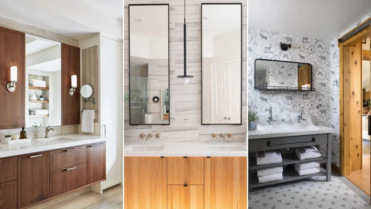
The strongest modern double vanity bathroom ideas balance symmetry with breathing room, so two people can use the space without turning the counter into a traffic jam. In a contemporary bath, the vanity is doing more than holding sinks: it shapes the layout, sets the mood, and determines whether the room feels calm or cramped. I focus on the decisions that matter most in real life: size, storage, lighting, materials, and the fixture details that make two sinks feel intentional.
The quickest wins for a modern double vanity are the right size, the right light, and the right amount of storage
- A double vanity usually starts at 60 to 72 inches wide, which gives each user enough room to function comfortably.
- NKBA planning guidance puts the centerlines of two lavatories at 36 inches apart; 30 inches is the code minimum, but it feels tight.
- Floating vanities, warm wood tones, and natural stone are the clearest contemporary signals in 2026.
- Two mirrors, one wide mirror, or mirrored medicine cabinets all work, but the best choice depends on whether you want a cleaner visual line or more personal zones.
- The room will look better if the counter stays open, the lighting is layered, and the storage is divided before the accessories ever go in.
- If the bathroom cannot support circulation and plumbing for two sinks, a smarter single vanity can be the better design decision.
What makes a double vanity feel modern instead of crowded
A modern double vanity does not just add a second sink. It creates two usable zones without making the room feel split, oversized, or overly decorative. When I design one, I look for a clear visual rhythm: enough symmetry to feel calm, enough restraint to keep the countertop from looking busy, and enough storage that daily items do not spill across the surface.
The most successful versions usually have three things in common. First, the cabinet reads as a single clean piece rather than a clunky bank of boxes. Second, the finishes are edited down to a small palette, which keeps the room from feeling like a sample board. Third, the vanity has a strong relationship to the mirror and lighting above it, because the wall composition matters just as much as the base below.
What usually makes a double vanity feel dated is the opposite: bulky cabinetry, too many decorative details, and a countertop crowded with products because there is nowhere else for them to go. Once that happens, even expensive finishes start to look ordinary. The next step is choosing a layout that gives the vanity some visual lightness, which is where the design options get more interesting.
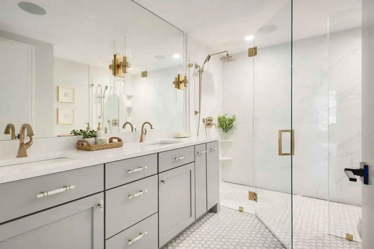
Layouts that look current without wasting counter space
There is no single best layout for every bathroom, but there are a few that consistently feel fresh and functional. The right choice depends on how wide the room is, how much storage you need, and whether you want the vanity to disappear into the architecture or stand out like a piece of furniture.
| Layout | Best for | Why it works | Main tradeoff |
|---|---|---|---|
| Floating double vanity | Smaller primary baths and contemporary spaces | Shows more floor, feels lighter, and makes cleaning easier | Needs strong wall support and careful plumbing planning |
| Furniture-style vanity | Baths that need warmth and extra storage | Reads more like custom furniture and softens hard surfaces | Can feel heavy if the room is already dark or narrow |
| Two separate vanities | Primary suites where each user wants a distinct zone | Creates privacy and clear personal storage | Uses more wall space and can fragment the visual line |
| Continuous counter with two sinks | Wide rooms that need a calm, uninterrupted surface | Keeps the room visually quiet and works well with one large mirror | Can lose a bit of individual storage unless the drawers are well planned |
| Wall-mounted faucets with integrated sinks | Narrower counters that need every inch back | Frees up deck space and makes the vanity feel more architectural | Requires early rough-in decisions; it is not a last-minute change |
If the room is tight, I usually prefer a floating base or a continuous counter with integrated sinks over a chunky cabinet with too many visual breaks. If the room is generous, two separate vanity zones can be excellent, especially when the household wants privacy and more defined routines. The best layout is the one that makes the bathroom easier to use at 7 a.m., not just better in a photo.
That layout choice sets the stage for the finish palette, because the materials will either calm the room down or make the cabinet feel heavier than it should.
Materials and finishes that feel right in 2026
In 2026, the strongest bathroom vanity finishes lean warmer and more tactile than the glossy gray-and-white combinations that dominated for years. I would rather see a vanity that feels quietly architectural than one that tries too hard to look sleek. That usually means natural wood, honed stone, brushed metal, and textures that add depth without shouting for attention.White oak and walnut are both strong choices because they bring warmth without turning rustic. A honed quartz or natural stone top gives the vanity a durable surface, and stone with visible movement can keep the room from looking flat. If the cabinetry has a fluted or reeded front, I like to keep the rest of the room simple so the texture can breathe. That detail adds interest fast, but only when the surrounding surfaces are restrained.
For hardware and fixtures, brushed nickel, brushed brass, champagne bronze, and soft black all work if they are used deliberately. My rule is simple: pick one metal language and repeat it. The room starts to feel messy when the faucets, pulls, mirror frame, and lighting all compete in different finishes. If you want a more modern edge, wall-mounted faucets can make the whole counter feel cleaner and more open. That becomes even more useful once you start measuring the space correctly.How to size the vanity so it feels generous, not forced
Size is where a lot of double vanities go wrong. A bathroom can look large enough at a glance and still fail once two people try to use the sinks at the same time. In the U.S., double vanities are usually a 60- to 72-inch choice, and that range is popular for a reason: it gives the cabinet enough width to hold two sinks, some counter space, and usable storage without feeling improvised. Lowe's notes the same practical range for most double-sink setups.
| Planning element | Practical target | Why it matters |
|---|---|---|
| Vanity width | 60 to 72 inches for most double sinks | Leaves room for basins, drawers, and a little counter between users |
| Sink spacing | 36 inches center to center recommended | Helps two people use the vanity without elbow collisions |
| Code minimum between lavatory centerlines | 30 inches | Meets the lower threshold, but it usually feels tight in daily use |
| Overall lavatory height | 32 to 43 inches, depending on the user | Supports comfort and reduces awkward bending |
| Clear space in front of the vanity | 30 inches recommended, 21 inches minimum | Keeps doors, drawers, and circulation usable |
| Vessel sink adjustment | Add the sink height to the base height | Prevents the finished counter from landing too high |
NKBA planning guidance is especially useful here because it reminds you that the legal minimum is not always the comfortable minimum. I would treat 36 inches between sink centerlines as the real design target and 30 inches as the fallback only when the room gives you no other option. If you are using vessel sinks, remember that a 5- to 6-inch bowl changes the ergonomics quickly. A vanity that looks elegant on paper can feel awkward the moment it is too tall.
Once those dimensions are set, the bathroom starts to behave like a real shared space. The next challenge is making the wall above it feel as polished as the cabinet below it.
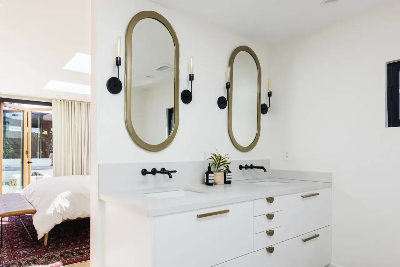
Lighting and mirrors do more than decorate the vanity wall
The wall above a double vanity does a lot of work. It sets the tone for the whole room, it controls how flattering the space feels, and it can either sharpen or soften the symmetry of the sinks below. I rarely rely on one overhead fixture alone. It throws light, but not always the right kind of light, and a double vanity deserves better than a single bright bar across the face area.
Side sconces are usually the most flattering choice because they put light where people actually need it. If you want the room to feel wider, one continuous mirror can do that. If you want a clearer sense of personal territory, two mirrors are better. A third option, which works especially well in contemporary bathrooms, is a pair of mirrored medicine cabinets that hide everyday clutter while still reading clean from across the room.
Lighting should also respect the fixture finish below. A brushed metal faucet pair with soft, warm sconces feels composed; a shiny overhead light with dark mirrors and a heavy cabinet often feels accidental. If I am planning for a busy household, I also like to build in outlets inside drawers or just off the counter so hair tools and chargers do not live permanently on display. Small electrical decisions like that have more visual impact than most people expect.The wall composition is only half the story, though. The other half is how the vanity handles storage once two people start using it every day.
Storage that keeps two routines from colliding
The biggest design mistake I see with double vanities is assuming that two sinks automatically solve organization. They do not. They only work when the storage underneath is planned for two different routines, two different product sets, and two different levels of morning chaos.
I prefer a dedicated storage zone for each user, even if the cabinet looks unified from the outside. That can mean separate drawer stacks, divided top drawers, or a center tower that holds shared items like tissues, backup soap, and extra toiletries. Deep drawers are better than shelves for most daily items because they keep the counter cleaner and make it easier to see what is actually in the cabinet.
- Use shallow top drawers for the things you reach for every morning.
- Reserve deeper drawers for blow dryers, styling tools, and backups.
- Keep the center of the counter as clear as possible so the vanity still looks modern.
- Choose soft-close hardware, because slamming drawers make a finished bath feel cheaper.
- If one user needs more storage than the other, let the cabinet reflect that instead of forcing symmetry everywhere.
Open shelving can work, but only in small doses and only if the items stored there are visually calm. Towels, one or two trays, and maybe a basket can look good. A row of half-used bottles usually cannot. Once storage is under control, it becomes much easier to spot the small mistakes that make even a nice vanity feel off.
The mistakes that make a double vanity feel smaller than it is
Most bad double vanities are not bad because of the sinks themselves. They go wrong because the room is asked to do too much without enough space, planning, or restraint. When I review a layout, I check for the same recurring problems every time.
| Common mistake | Better move | Why it helps |
|---|---|---|
| Forcing two sinks into a cabinet that is too narrow | Use a 60- to 72-inch base, or simplify to one sink | Stops the countertop from feeling cramped and awkward |
| Choosing a bulky cabinet with no visual lift | Float the vanity or pick slimmer legs and lighter proportions | Makes the room feel larger and easier to clean |
| Mixing too many finishes | Limit the palette to one wood tone, one stone, and one metal | Creates a cleaner and more intentional look |
| Relying on one ceiling fixture for all the light | Add sconces or another layer of task lighting | Improves visibility and makes the vanity feel more refined |
| Ordering cabinetry before confirming plumbing and outlet locations | Lock in the rough-in plan first | Avoids costly rework and awkward compromises later |
The other common problem is visual clutter. If the mirror is too small, the sink layout feels chopped up. If the countertop is too shallow, soap bottles and toothbrush holders crowd the edge. If the color palette is too cold, the whole setup starts to feel more like a utility room than a primary bath. That is why the final decisions matter so much: the best version is not the flashiest one, but the one that still works cleanly after years of daily use.
The details I would keep if I were remodeling this bath today
If I were building this space now, I would keep the formula simple: a 60- to 72-inch vanity whenever the room allows it, 36 inches between sink centerlines, a warm material palette, and lighting that flatters the faces using the room. I would also put more effort into the inside of the cabinet than most people do, because the drawers are what decide whether the vanity stays neat after the first month.
- Choose a floating or lightly detailed base if the room needs visual relief.
- Use wood, stone, or a quiet painted finish instead of a high-gloss cabinet that shows every mark.
- Keep fixtures in one family so the room feels edited, not assembled.
- Give each sink a clear zone, but do not waste space on unnecessary symmetry.
- Leave room for everyday movement, not just for the vanity itself.
The version that ages best is usually the one that feels calm on Monday morning and still looks balanced after the towels, toothbrushes, and styling tools are in place. If the bathroom can support two sinks without crowding the circulation, a double vanity is still one of the smartest upgrades you can make. If it cannot, a more restrained layout will almost always look better in the long run.