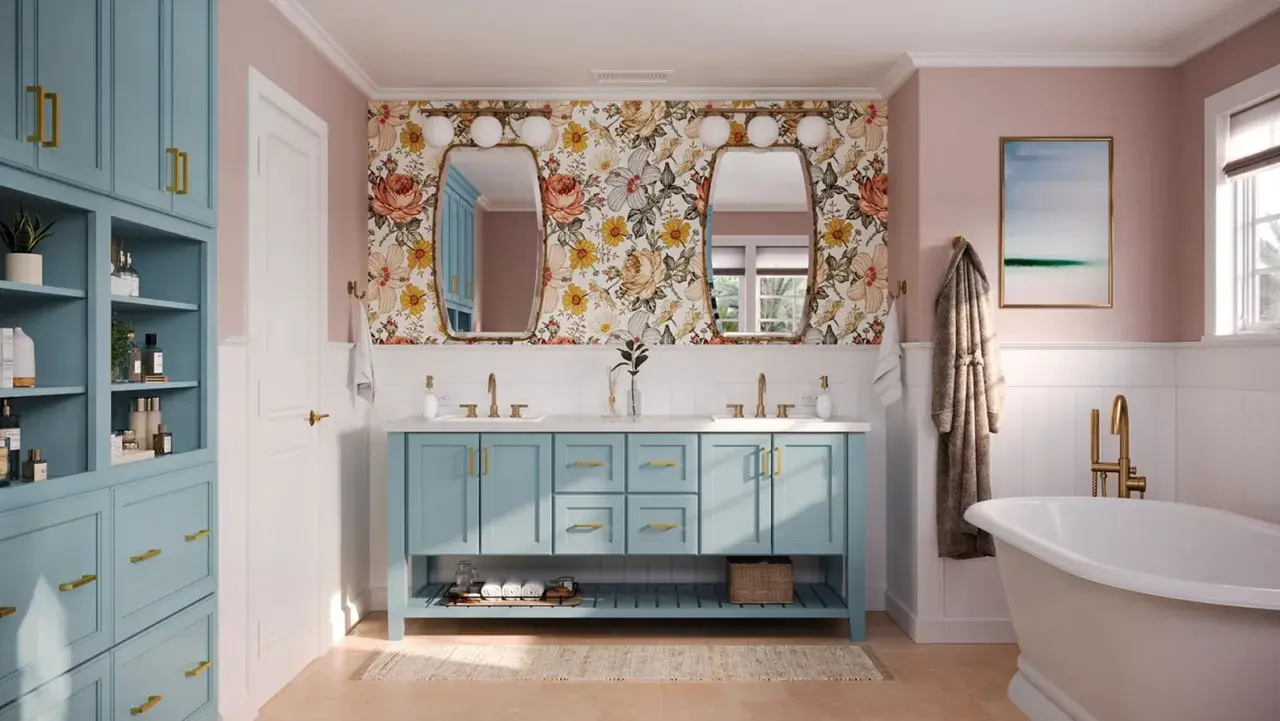
There is no single best color for bathroom cabinets, but there are a few shades that consistently work better than the rest because they handle light, moisture, and mixed finishes gracefully. The right cabinet color can make a small bath feel cleaner, a dated vanity feel intentional, and a crowded fixture mix look coordinated instead of random. In this guide, I’ll narrow the choice down to the colors I trust most, how they behave with tile and metal finishes, and how to test a shade before you commit.
The safest cabinet colors are the ones that work with light, fixtures, and tile
- Warm white and soft greige are the most flexible choices for most bathrooms.
- Muted sage and dusty blue add character without taking over the room.
- Deep navy and charcoal work best when the bathroom has real daylight and layered lighting.
- Fixture finish changes the color story; brass, chrome, nickel, and black each push the palette in a different direction.
- Satin or semi-gloss usually holds up better than flat paint in a humid room.
What makes a cabinet color work in a bathroom
When I choose a vanity color, I do not start with trend boards. I start with the room itself: how much natural light it gets, what the tile is doing, and which finishes are already fixed in place. A cabinet color can look beautiful on its own and still fail in the space if it fights the countertop undertone or makes the room feel cramped.
- Natural light changes everything. North-facing or interior bathrooms usually need lighter, warmer colors to avoid looking flat.
- Fixed materials matter more than most people expect. Tile, stone, flooring, and the shower surround all push the cabinet color warmer or cooler.
- Room size affects how much contrast you can use. A compact bath can handle color, but usually not a heavy, low-light color with no reflective surfaces.
- Fixture finish shapes the mood. Chrome reads crisp, brass reads warm, matte black reads graphic, and brushed nickel sits in the middle.
- Maintenance matters in a room that sees steam, fingerprints, and frequent cleaning. Some colors hide wear better than others, but sheen matters too.
Once those basics are clear, the palette gets smaller fast. That is where the most reliable color families start to make sense.
The color families I trust most
In real bathrooms, I keep coming back to a handful of colors because they are dependable, not because they are boring. They work across different styles, and they are easier to coordinate with tile and hardware than a highly specific trend shade.
| Color family | Why it works | Best fit | Watch out for |
|---|---|---|---|
| Warm white | Brightens the room and makes fixtures feel crisp without looking harsh. | Small bathrooms, classic interiors, resale-focused updates. | Can feel sterile if the undertone is too cold or the room lacks texture. |
| Soft greige or khaki | Balances warm and cool surfaces and feels current without being loud. | Bathrooms with mixed materials, stone counters, or patterned tile. | Can go muddy if it clashes with the tile or floor undertone. |
| Muted sage or eucalyptus | Adds a spa-like softness and brings a natural note into the room. | Spaces with wood accents, matte black fixtures, or warm stone. | May read gray in low light if the green is too subdued. |
| Dusty blue | Feels calm, airy, and a little more personal than standard neutrals. | Traditional, coastal, or family bathrooms with white tile. | Can look overly pastel if the room already has a lot of shine. |
| Deep navy | Creates a strong focal point and gives the vanity furniture-like presence. | Brighter bathrooms, larger vanities, brass hardware. | Needs enough light and contrast, or it will feel heavy. |
| Charcoal or near-black | Sharp, modern, and dramatic when you want the vanity to anchor the room. | Powder rooms, contemporary spaces, bold design schemes. | Can shrink a dim room if the surrounding finishes are also dark. |
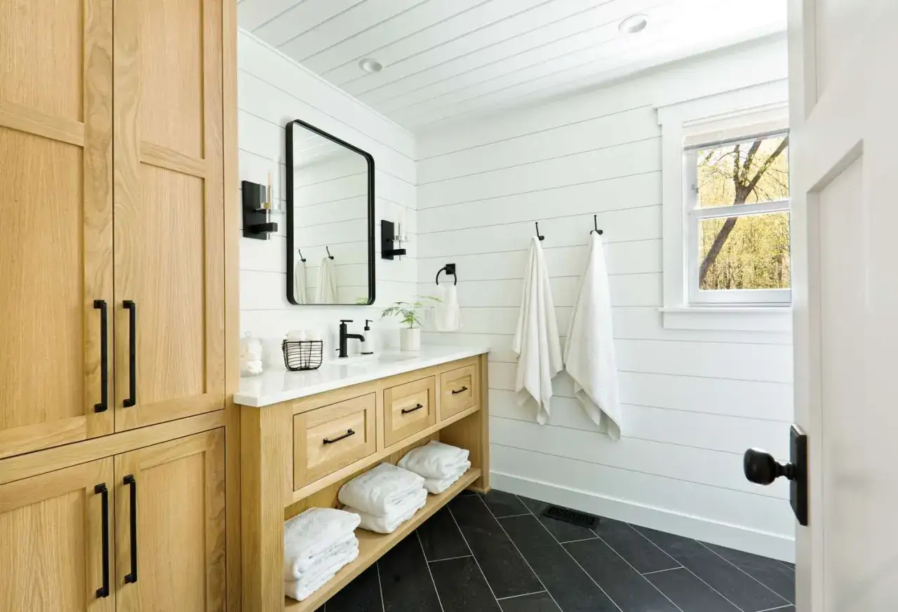
| Natural wood stain | Brings warmth and texture, which is especially useful in 2026 bathrooms that lean more tactile and less sterile. | Organic, transitional, or modern-bungalow looks. | Busy grain needs simpler surrounding materials to avoid visual clutter. |
That preference for warmer, grounded neutrals matches the broader direction I’m seeing in 2026. Sherwin-Williams’ Color of the Year, Universal Khaki, signals a move away from icy, over-sterile rooms and toward finishes that feel more layered and lived in. I read that as confirmation that bathroom cabinets usually look better when they add warmth, not just contrast.
From here, the real question is not just which color looks good in isolation, but how it behaves next to the fixtures you already have.
How to match cabinets to tile, counters, and fixtures
Bathroom fixtures set the tone more than many homeowners realize. A cabinet color that works with polished chrome can look wrong beside unlacquered brass, and a warm greige that feels perfect with stone may look dull next to icy white tile. I look at the whole system before I commit to a paint color.
| Fixture finish | Cabinet colors that usually pair well | Why the pairing works |
|---|---|---|
| Polished chrome | Warm white, soft blue, pale greige | Chrome is cool and reflective, so it likes a crisp palette with enough softness to keep the room from feeling cold. |
| Brushed nickel | Warm white, khaki, muted sage, dusty blue | Nickel is forgiving and transitional, which makes it one of the easiest finishes to coordinate. |
| Brass or champagne bronze | Warm white, sage, navy, natural wood | These finishes read warmer, so they pair well with colors that already have depth or warmth. |
| Matte black | Warm white, greige, wood, deep green | Black hardware needs a color that can support the graphic contrast without making the room feel too hard. |
| Oil-rubbed bronze | Creamy white, sage, walnut tones | This combination leans traditional and earthy, which works well in bathrooms with warmer materials. |
Tile and countertop undertones deserve the same attention. If your stone leans warm, an icy cabinet color usually feels disconnected. If your tile is already cool and high-contrast, a warmer cabinet color can soften the room and make the whole space easier on the eye.
When the metal, stone, and paint agree on temperature, the bathroom looks intentional even if the palette is simple. If they fight each other, even a good color can feel slightly off, which is why darker choices need their own careful review.
When darker or bolder cabinets are worth it
I like dark cabinets in bathrooms, but only when the room can support them. Navy, charcoal, and black can look expensive and tailored, yet they also expose weak lighting and awkward finishes faster than lighter colors do. They are strongest when they have something to balance them: bright walls, reflective tile, brass hardware, or a lot of daylight.
- Use darker cabinets when the bathroom gets good natural light and has at least one reflective surface, such as glossy tile or a polished mirror.
- Use them in powder rooms when you want a more dramatic, furniture-like vanity that acts as the focal point.
- Use them with brass or warm wood if you want the room to feel rich rather than stark.
- Avoid them when the bathroom has one weak ceiling fixture, dark flooring, and very little daylight.
- Be careful with highly saturated color if the tile pattern is already busy. Too many strong statements in one small room create visual noise.
Better Homes & Gardens is right about one thing that still matters here: light colors make compact bathrooms feel larger, but that does not mean every small bath has to be all white. I would rather see a modest room with a well-chosen sage vanity than a cold, over-bright space that feels flat.
So the real distinction is not light versus dark. It is whether the color has enough support from the room around it.
Finish, sheen, and sample testing decide the final result
Paint color gets the attention, but finish often decides whether the vanity looks polished or tired after a few months. In bathrooms, I usually prefer satin or semi-gloss for painted cabinets because both are easier to wipe down than flat paint and handle moisture better. Satin gives a softer look; semi-gloss is more durable and more forgiving in a high-use family bath.
If you are comparing swatches, pay attention to LRV, or light reflectance value. It is a measure of how much light a color bounces back, and in a bathroom that usually means the difference between airy and heavy. You do not need to chase a specific number for every project, but the concept helps explain why one pale color can still feel dim while another looks bright.
- Test at least three sample colors on removable boards or primed cabinet panels.
- Keep the samples at least 3 feet apart so they do not visually blur together.
- Check them beside the tile, countertop, and flooring, not just on a blank wall.
- Look at them in morning light, afternoon light, and at night with the vanity lights on.
- Judge the undertone as carefully as the surface color, because undertone is what usually causes the mismatch.
If the cabinet is wood and you are staining rather than painting, the same rule applies: test the stain on the actual wood species first. Oak, maple, walnut, and MDF all take finish differently, so the sample on a paint chip or online image is never enough.
The last step is simple, but it saves the most regret: compare the cabinet color to the exact fixtures and bulbs that will stay in the room.
The quickest way to make the final call before you buy paint
When I have two or three viable colors left, I reduce the decision to a short checklist. If the bathroom is small or dim, I lean warm white or soft greige. If the room has daylight and brass hardware, I am comfortable with sage, khaki, or even navy. If the vanity needs to feel like a piece of furniture, wood stain usually gives the most depth.
- Choose blend if the bathroom already has a lot of visual activity in the tile or countertop.
- Choose contrast if the room is simple and you want the vanity to become the focal point.
- Choose warmth if the room feels cold, blue, or overly crisp under LED lighting.
- Choose a lighter shade if the room is small, windowless, or used heavily every day.
- Choose a deeper shade only if the lighting and surrounding finishes can support it.
If you want the low-risk answer, start with a warm white or a warm greige. If you want more personality without making the room difficult to live with, move toward sage, dusty blue, or khaki. And if you are after drama, go dark only when the rest of the bathroom gives that color enough breathing room.