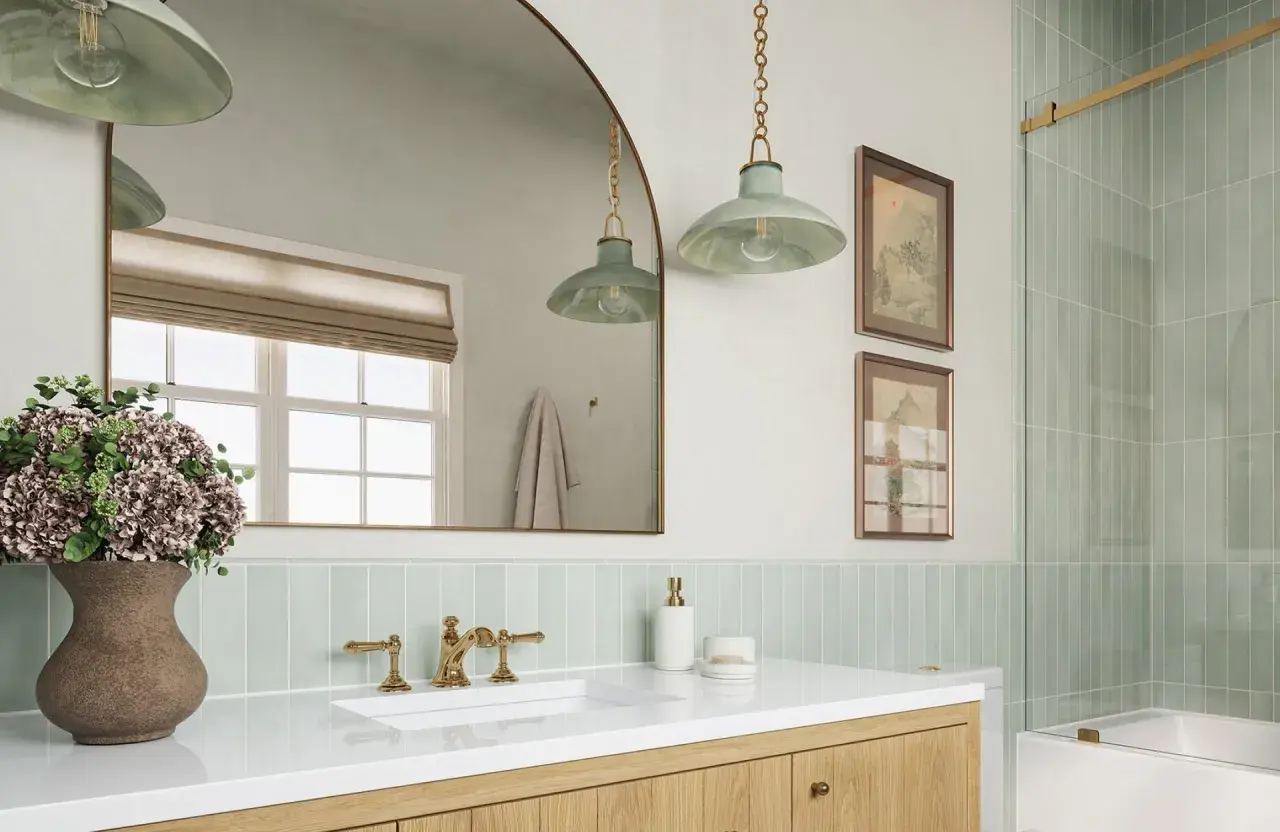
Getting the tile line right changes how a bathroom wall feels: cleaner, calmer, and easier to maintain. The best result is not always the tallest one; it is the one that fits the vanity, the mirror, the faucet, and the way the wall is used every day. I approach backsplash placement as a proportion problem first and a protection problem second, because the wrong stopping point is what makes an otherwise good bathroom feel awkward.
The smartest height is the one that fits the fixtures
- Most vanity backsplashes still land in the 4 to 6 inch range, but taller runs often look more finished.
- The faucet, mirror, and outlet locations usually matter more than a fixed measurement.
- Full-height tile can look cleaner and be easier to wipe down, especially with porcelain, quartz, or large-format tile.
- Short splash strips work best when the room is small, low-traffic, or intentionally minimal.
- Tile size, grout color, and edge trim all affect how high the wall appears once installed.
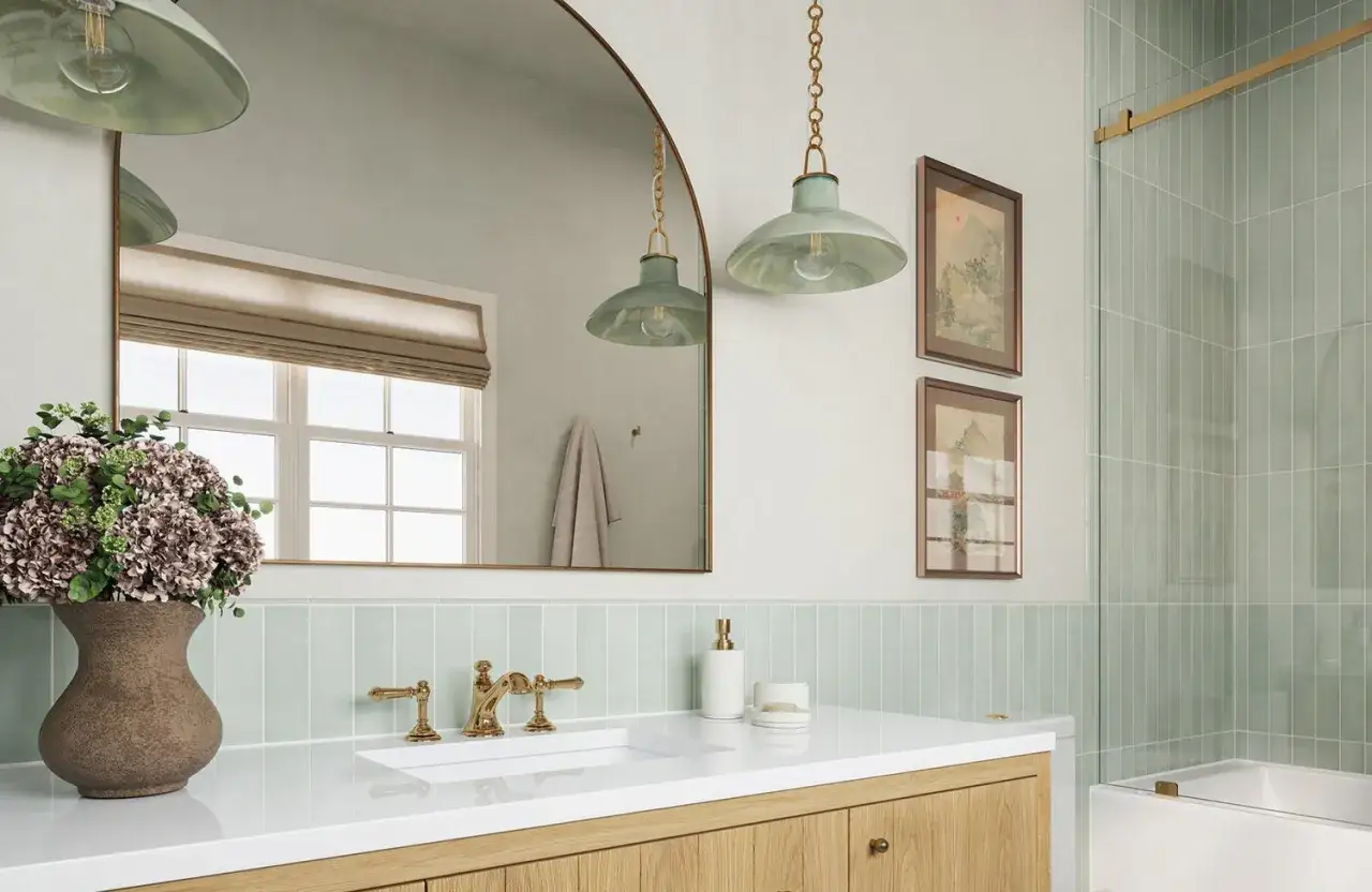
How high a bathroom backsplash usually goes
The usual starting point is modest: 4 to 6 inches above the counter is still the most common vanity backsplash height I see. That range protects the wall, keeps material use down, and works well when the mirror and lighting are doing most of the visual work. Once the wall starts carrying more of the composition, though, I usually move the tile higher so it looks intentional rather than added as an afterthought.
| Placement option | Best used when | Why it works | Tradeoff |
|---|---|---|---|
| 4 to 6 inches | Small powder rooms, simple mirrors, restrained updates | Protects the wall with minimal material and keeps the composition light | Can look thin if the faucet is tall or the mirror is large |
| 8 to 12 inches | Daily-use baths that need a little more wall protection | Adds presence without taking over the room | Needs more careful alignment with the mirror line |
| To the bottom of the mirror | Most standard vanity walls | Ties the sink zone to the mirror and reads deliberate | Requires cleaner spacing and a more thoughtful mirror size |
| Full height to the ceiling | Statement walls, narrow rooms, seamless looks | Feels architectural, wipes down easily, and hides wall imperfections | Higher material and labor commitment |
My rule is simple: if the wall above the sink already feels busy, keep the splash clean and restrained; if the wall is visually plain, a taller field often looks more finished. The same logic applies at a kitchen sink, but bathroom vanities add one more constraint, which is the mirror line. Once you know the height range, the next question is which fixtures should control the line.
Let the faucet, mirror, and outlets set the line
I do not start with the tile sample board; I start with the hardware. The faucet tells me where splashing is most likely, the mirror tells me how the wall will read, and the outlets tell me where the tile can stop without awkward cuts or exposed boxes. When those three elements work together, the backsplash feels built into the room instead of added later.
Faucet height matters more than most people expect
A low-spout faucet lets you keep the wall calmer, while a tall or forward-reaching spout often justifies a taller run of tile. If the water lands farther from the sink bowl, a token strip can leave too much painted wall exposed behind the splash zone.
Mirror and tile should look deliberate together
I like the top of the tile to either meet the mirror cleanly or sit below it with a clear, intentional gap. What I avoid is the awkward middle ground: a random sliver of wall that looks like no one planned the composition. That becomes even more noticeable when the mirror is wide, because the transition line has nowhere to hide.
Electrical boxes need a real plan
Outlets should not be an afterthought. Once tile adds thickness to the wall, boxes often need an extender ring so the faceplate sits flush, and the cuts should land close enough to feel neat without burying the screws. I always check outlet locations before finalizing the tile height, because moving the wall line by even a few inches can change the whole layout.
Plan the width as carefully as the height
I usually run tile across the full visible vanity span, not only behind the basin. If the counter ends before the wall does, I either return the tile onto the side wall or stop it at a deliberate vertical edge; leaving a random painted strip beside the vanity is what makes the work feel incomplete.
When the fixtures are mapped first, the rest of the design decisions become much easier to trust.
When a short splash works and when it looks unfinished
Short backsplashes still make sense in the right room. In a powder room, for example, a restrained 4-inch or 6-inch strip can protect the wall without competing with wallpaper, a statement mirror, or decorative lighting. In a busy primary bath, though, the same treatment can look underplanned unless the rest of the wall is doing something strong enough to justify it.
- Use a short strip when the room is compact, the sink is lightly used, and you want the mirror or wall finish to stay dominant.
- Go taller when the vanity is a daily-use zone, the faucet splashes more than average, or the wall needs a stronger visual anchor.
- Run tile to the ceiling when the vanity wall is the main feature, the room is narrow, or you want fewer painted transitions.
The practical test I use is simple: if the backsplash is the smallest thing on the wall, it probably needs either more height or a cleaner finish detail. If it already has a strong partner, like a bold mirror, rich stone, or wall-mounted lighting, a modest height can be enough. In 2026, the most current-looking bathrooms usually feel integrated rather than chopped into separate bands, so I reserve short runs for rooms where restraint is clearly part of the design.
Tile format changes how the wall reads
The same height can feel completely different depending on the tile. Large-format porcelain, slab-style stone, and elongated rectangles make a backsplash read as one surface, while mosaics and heavily grouted patterns make the wall feel more segmented. That matters because a 6-inch backsplash in a busy mosaic can feel louder than a 12-inch backsplash in a quieter, larger tile.
Large-format tile feels cleaner
Fewer grout lines mean the eye sees the wall as a single field. That is why large-format porcelain and stone are strong options when you want the backsplash to feel architectural rather than decorative. They also make taller placements look less fragmented, which is useful on vanity walls with wide mirrors.
Smaller tile needs more discipline
Subway tile and handmade ceramics can look excellent, but they demand cleaner termination points. If the tile stops at an odd height or dies into a narrow cut near the mirror, the layout starts to feel fussy. The same is true for busy mosaics: they work best when the whole composition is committed, not when they are used as a token strip behind the sink.
Read Also: Random Subway Tile - Master Intentional Design
Grout color changes the visual height
A matching grout calms the wall; a contrasting grout emphasizes the grid and makes the placement feel more graphic. Neither choice is wrong, but the joint color changes how tall the backsplash appears once it is on the wall. If you want the tile to disappear into the room, quiet grout is usually the better move.
That is why the tile itself matters just as much as the measurement on the tape.
The mistakes that make a vanity wall feel awkward
Most backsplash problems are not about the tile itself. They happen when the termination point ignores the rest of the room, or when the wall is measured from one fixture and then forgotten. These are the issues I watch for most often:
- Stopping at a random height. A line with no relationship to the mirror, outlet, or cabinetry usually looks accidental.
- Ending in skinny cuts. Tiny slivers of tile at the side of the vanity or under the mirror make the install feel cramped.
- Ignoring edge trim. If the tile stops in open air, the edge has to be finished with a profile, a bullnose, or another deliberate termination detail.
- Letting outlets dominate the layout. If the boxes are not planned early, the backsplash can end up full of patches and awkward cuts.
- Mixing too many materials. A stone counter, patterned tile, ornate mirror, and dark grout can all compete for attention on one small wall.
- Tile that only follows the sink cutout. On most vanity walls, that makes the backsplash feel narrower than the actual use of the counter.
The fix is usually not more decoration. It is a cleaner line, better proportions, and a finish detail that looks like it belongs there.
The layout check I use before the first tile goes up
Before I commit to a backsplash, I tape the intended top line on the wall and look at it from the doorway, not just straight on. That quick check tells me whether the tile height supports the mirror, whether the wall feels balanced, and whether the install will leave ugly slivers at the ends.
- Measure the vanity width, faucet centerline, mirror size, and outlet positions together.
- Decide whether the tile should stop below the mirror, meet it, or continue to the ceiling.
- Dry-fit the first row so the cuts land in clean, symmetrical places.
- Choose the edge finish before installation day.
- Confirm grout color and caulk joints so the finished surface reads as one system.
If you get the line, the fixture spacing, and the edge detail right, the backsplash stops being a separate feature and starts working like part of the architecture. For me, that is the real test: not whether the wall has tile on it, but whether the whole vanity wall still looks right after the room has been lived in for a few years.