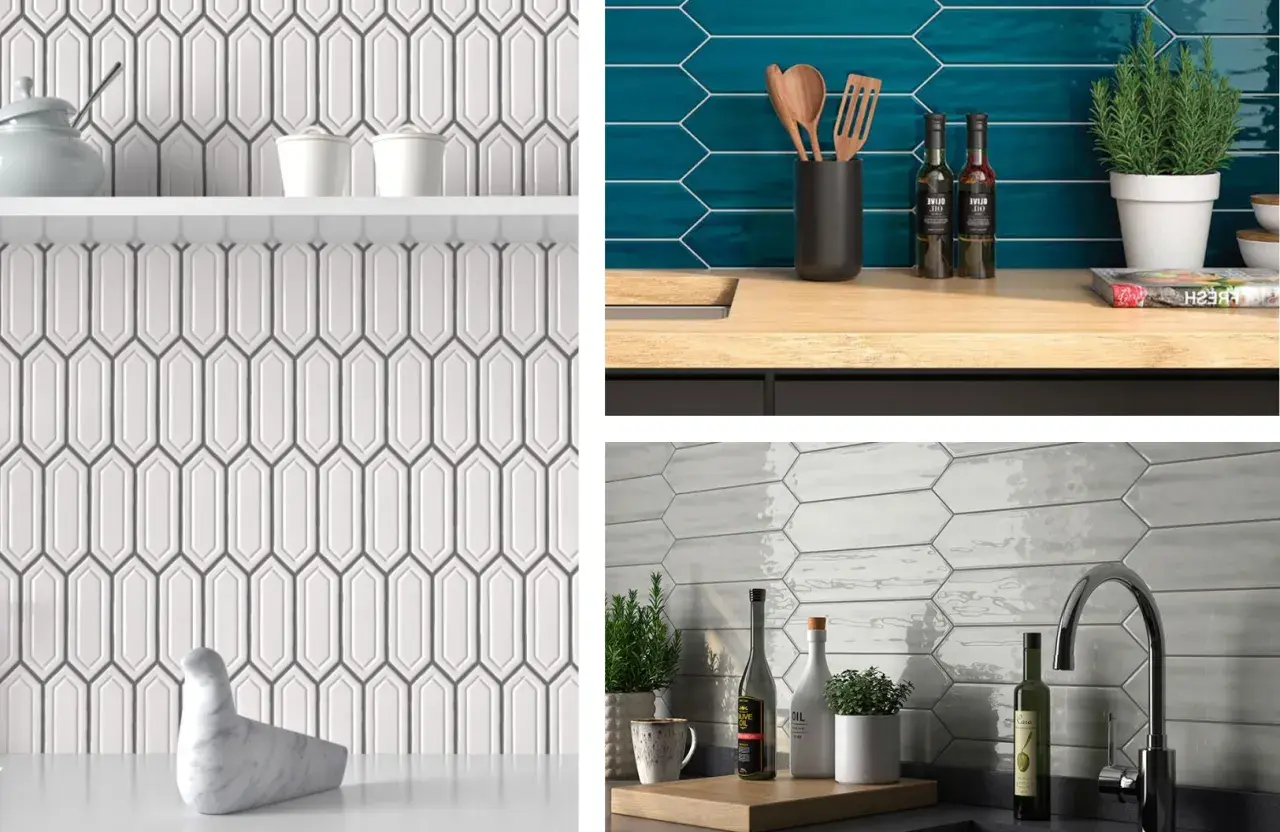
The right orientation can change a picket tile backsplash from merely decorative into a real design decision. The picket tile backsplash horizontal or vertical choice affects how wide, tall, calm, or graphic the kitchen feels, and that matters more than most people expect once the tile is on the wall. In this guide, I focus on the visual effect, the practical trade-offs, and the details that make one layout work better than the other.
What matters most when choosing the tile direction
- Horizontal usually makes a kitchen feel wider, steadier, and more relaxed.
- Vertical usually makes the wall feel taller, sharper, and more contemporary.
- The best choice depends on ceiling height, cabinet layout, countertop movement, and how much visual attention you want the backsplash to take.
- Grout color, tile finish, and edge detailing can either soften the layout or make it much more graphic.
- A full-size mock-up is worth the time, because a backsplash band is often only about 18 inches high and small shifts can change the whole read.
The quick rule I use before committing to a layout
The simplest way to think about it is this: horizontal orientation calms the room, while vertical orientation lifts it. That is why I usually lean horizontal when the kitchen already feels busy, wide, or visually low, and vertical when the room needs more height or a cleaner architectural line.
That rule is especially useful because picket tile already has direction built into its shape. Turning the tile changes the way the eye moves across the backsplash, so the result can feel noticeably different even if the material, color, and finish stay exactly the same. In practice, the layout should solve a room problem, not just follow a trend.
Once I know what the room needs most, the rest of the decision becomes much easier. The next step is seeing what each orientation actually does on the wall.
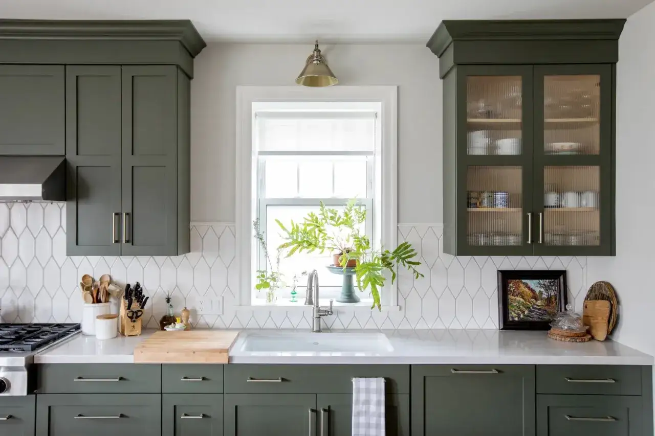
What a horizontal layout does for the room
Horizontal picket tile gives a backsplash a stretched, grounded look. I like it when the kitchen already has a lot happening vertically, such as tall cabinets, a strong range hood, or open shelves, because the horizontal lines quietly balance the composition instead of competing with it.
- It can make a narrow kitchen feel a bit wider.
- It looks natural in classic, transitional, and coastal spaces.
- It works well when you want the backsplash to support the room rather than become the main feature.
- It softens the transition between countertop, backsplash, and upper cabinets.
The trade-off is that horizontal tile can flatten a kitchen that already feels short or compressed. If the ceiling is low, the cabinet run is heavy, or the room lacks visual lift, a horizontal stack may reinforce that feeling instead of correcting it. That is where a vertical layout starts to make more sense.
Why vertical often looks fresher
Vertical picket tile does something different: it introduces rhythm and height. In current kitchen design, it often reads as cleaner and more custom because the eye moves upward instead of across. I especially like it in kitchens with lower ceilings, tighter cabinet spacing, or a hood that needs help looking taller and more intentional.
- It helps pull the eye up in a room that feels squat.
- It pairs well with flat-front cabinets and simpler countertop materials.
- It gives a backsplash a more tailored, slightly more modern personality.
- It can make a small wall feel deliberate instead of crowded.
The downside is that vertical tile can feel overly restless if the room is already tall and narrow. It also puts more pressure on the installation details, because any uneven cut, awkward outlet placement, or off-center starting point becomes more noticeable. A vertical layout rewards planning, not guesswork.
How to choose for your kitchen layout
In the real world, the best choice usually comes down to the shape of the kitchen, not the tile sample. A standard backsplash band is often around 18 inches tall between the countertop and the bottom of the upper cabinets, which means the orientation has to work hard in a relatively small space. The good news is that a quick comparison usually makes the answer obvious.
| Kitchen condition | Horizontal usually works better when | Vertical usually works better when |
|---|---|---|
| Ceiling height | The ceiling is already tall enough and does not need extra lift. | The room feels low, compressed, or visually heavy. |
| Cabinet layout | You have a long run of uppers and want the wall to feel steadier. | You have open shelves, a tall hood, or more negative space above the counter. |
| Countertop pattern | The counter is busy, veined, or visually active. | The countertop is quiet and the backsplash can carry more of the design work. |
| Room shape | The kitchen feels narrow and needs a wider visual base. | The kitchen feels flat and needs more vertical energy. |
| Style goal | You want the safest timeless choice with a softer read. | You want a more contemporary, tailored, or slightly bolder look. |
Before I ever approve a final layout, I like to see a mock-up that covers at least 2 to 3 feet of wall, not just a single loose tile. That bigger sample shows how the orientation behaves around outlets, cabinet bottoms, and the range area, which is where good intentions often fall apart. From there, the finish details matter more than people realize.
Grout, finish, and edge details change the final read
The orientation does not work in isolation. Grout color, tile sheen, and edge treatment can either sharpen the pattern or soften it. With picket tile, I think of grout as the part that decides whether the backsplash feels graphic or quiet.
- Light grout keeps both orientations calmer and more seamless.
- Contrasting grout emphasizes the tile shape and makes the layout read more deliberately patterned.
- Glossy finishes bounce more light and can make the repeated geometry feel busier.
- Matte finishes usually feel more relaxed and are easier to live with in a busy kitchen.
- Rectified edges, meaning machine-cut edges that are more uniform, can allow tighter joints and a cleaner stacked look.
I also pay attention to the edges at the ends of the backsplash run. A horizontal layout can look awkward if it ends in a tiny sliver near a cabinet side, and a vertical layout can look just as bad if the top or bottom cut feels accidental. Good tile work is often less about the center field and more about those final edge decisions.
Once those details are set, the most common mistakes become much easier to avoid.
Mistakes that make the tile orientation feel off
- Choosing an orientation from a photo without looking at the full wall in context.
- Centering the layout on one tile instead of the full composition, especially around the range or sink.
- Ignoring outlet placement, which can interrupt the rhythm of the tile in a very obvious way.
- Using a busy stone countertop and a high-contrast grout at the same time, which can make the wall feel overloaded.
- Leaving edge cuts too narrow, especially cuts under about 2 inches, because they tend to look like mistakes rather than design.
- Assuming the installer can fix proportion problems after the tile is already on the wall.
My strongest advice here is to dry-lay the pattern and look at it from the normal standing distance you use in the kitchen, not from a close-up inspection. Most backsplash decisions are made too early, then judged too late. A little planning prevents the layout from fighting the room.
What I would choose in common kitchen scenarios
If I had to make the call quickly, I would use the room as the guide rather than the trend. In a kitchen with a low ceiling, tall cabinets, or a compact footprint, I would usually choose vertical. In a kitchen with a long counter run, a busy stone top, or a lot of visual movement already, I would usually choose horizontal.
- Small galley kitchen and a low ceiling: I would lean vertical to add lift.
- Long open kitchen with a lot of counter space: I would lean horizontal to keep the wall grounded.
- Kitchen with a tall range hood: I would often choose vertical so the backsplash supports the height of the focal point.
- Classic kitchen with calm materials: I would usually choose horizontal because it feels more settled and timeless.
If the decision still feels split, I would stop chasing the perfect description and build the sample at full scale. In most kitchens, the right answer becomes obvious once you see how the tile lines up with the cabinets, the outlets, and the hood. That is the point where the backsplash stops being a style question and becomes the right design move for the room.