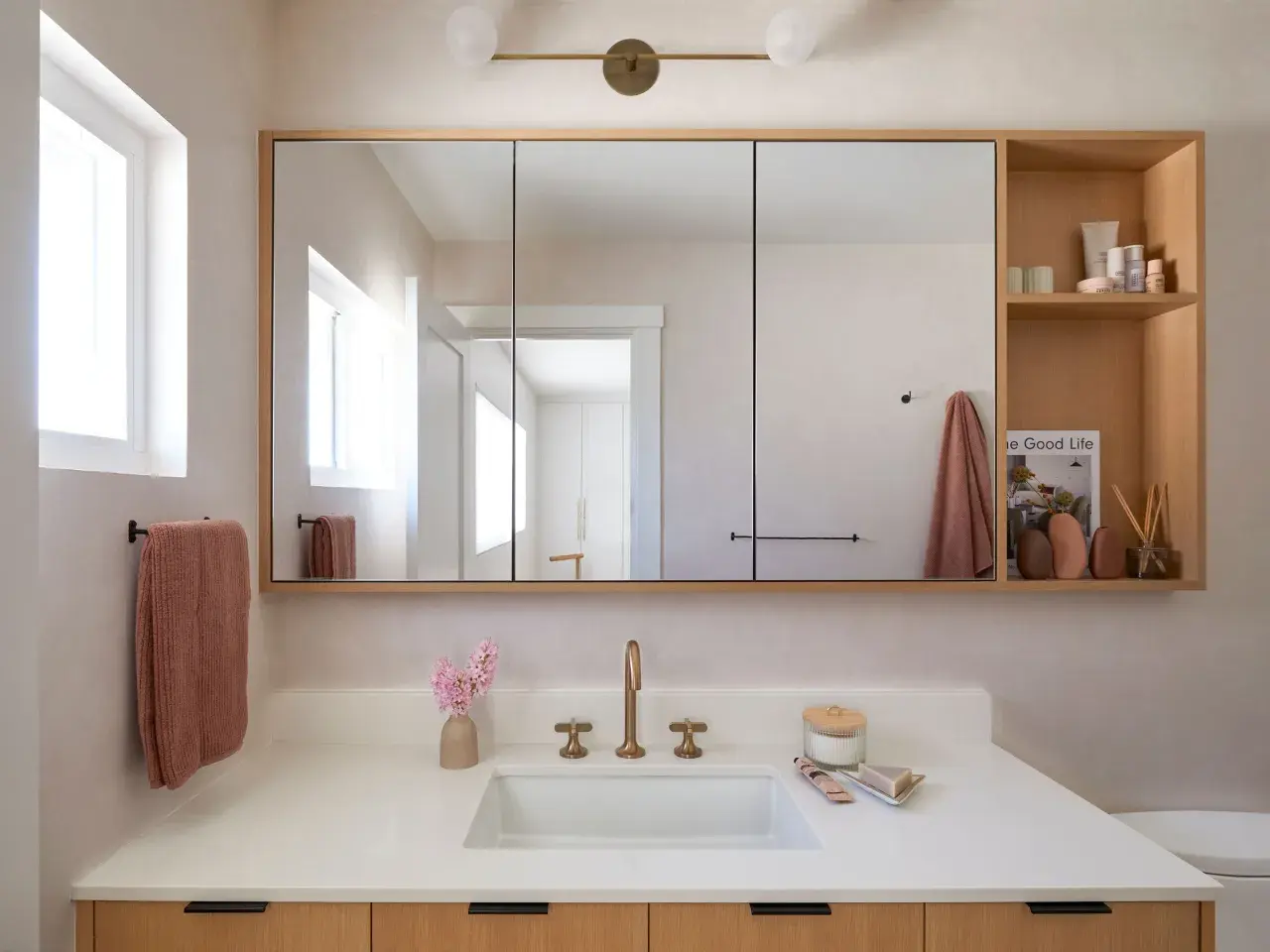
The right mirror arrangement can make a double bathroom vanity feel larger, calmer, and more expensive without changing the plumbing at all. In practice, the best double vanity mirror ideas are the ones that solve proportion first: they respect sink spacing, keep lighting comfortable, and match the room’s level of formality. I would think about layout before frame style, because that decision shapes everything else.
The strongest setups solve function first and style second
- Two mirrors usually feel best when the sink centers are clearly separated and each user needs their own zone.
- One wide mirror works well when you want the wall to read calmer and the room to feel broader.
- Arched, pill, and softly rounded shapes are the easiest way to make the vanity feel less boxy in 2026.
- Lighting matters as much as the mirror; poor lighting can make a good mirror choice feel flat or harsh.
- Scale is the real filter: if the mirror feels like an afterthought, it is probably too small.
Choose the layout before you choose the frame
When I look at a double vanity, I start by deciding whether the wall should read as one continuous composition or as two separate grooming stations. That choice has more visual impact than the frame finish, and it usually determines how the lighting, backsplash, and faucet placement will behave.
| Layout | Best for | Why it works | What to watch |
|---|---|---|---|
| One wide mirror | Compact primary baths, calm modern rooms, or vanities that need a more expansive feel | Visually stretches the wall and keeps the space from feeling chopped up | It can feel generic if the light fixtures and faucet lines are not deliberate |
| Two matching mirrors | True two-user vanities and rooms with clear sink centers | Creates balance and gives each side its own identity | Too-small mirrors make the wall look busy instead of refined |
| Two mirrors with a center feature | Long vanities, larger primary baths, or rooms that need a stronger architectural rhythm | Adds structure and can make the wall feel custom | The center element has to earn its place; otherwise it reads as clutter |
| Mirrored cabinets | Shared baths, older homes with limited storage, and anyone who wants function to lead the design | Keeps toiletries hidden and makes the vanity work harder | Bulkier cabinet fronts can overwhelm a small or highly decorative room |
If the sink centers are clearly separated, I usually lean toward two mirrors. If the room is small, visually busy, or unusually narrow, one wider mirror often gives a cleaner result. Once the layout is settled, the mirror shape becomes the next real design decision.
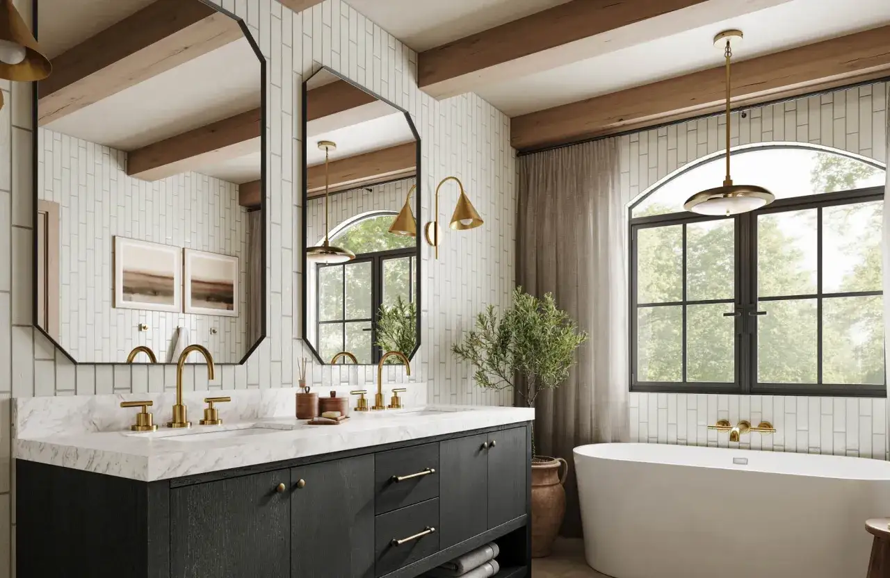
Mirror shapes that make a double vanity feel intentional
In 2026, the strongest bathroom mirror choices are less fussy and more architectural. Current design work keeps moving toward softer curves, cleaner edges, and larger reflective surfaces, which is one reason simple shapes keep outperforming overly ornate frames.Framed rectangles for a tailored look
Framed rectangles are the safest choice when the vanity has strong lines, the tile is restrained, or the room already uses a lot of texture. They look especially good with shaker cabinetry, transitional millwork, and stone counters that need a little visual structure. I would choose this option when I want the bathroom to feel composed rather than decorative.
Arches and rounded tops to soften hard materials
Arched mirrors do a good job of breaking up a bath that is full of straight grout lines, square tile, or slab-front cabinetry. A soft top curve can keep the wall from feeling severe. The tradeoff is that arches need enough vertical room; if the ceiling is low or the sconces are awkwardly placed, the shape can feel cramped.
Round or pill mirrors for a lighter composition
Round and pill-shaped mirrors are useful when you want symmetry without too much rigidity. A pair of rounded mirrors can make a double vanity feel friendlier and less formal, which is especially helpful in a guest bath or a modern primary suite. The key is scale: if the circles are too small, they look like accessories instead of part of the architecture.
Medicine cabinets when storage is part of the design
Mirrored medicine cabinets are not the prettiest choice in the abstract, but they are often the smartest one in a real home. If you are designing for daily use, built-in storage can save the whole wall from looking cluttered later. I prefer shallow cabinets with slim trim and minimal projections, because bulky cabinet fronts can make a double vanity feel top-heavy.
My rule is simple: if the room already has a strong shape story, keep the mirrors quieter. If the bathroom is plain, let the mirrors carry more of the personality. That balance matters even more once the lighting comes into play.
Get the lighting right or the mirrors will never look finished
Lighting changes how a mirror reads more than most people expect. A beautiful mirror placed under a poor light source will still cast shadows, flatten skin tones, and make the vanity feel unfinished. I prefer to solve lighting and mirror placement together instead of treating them as separate decisions.
Side lighting is still the most flattering
When there is room for sconces, side lighting is usually the best choice for a double vanity because it softens facial shadows and feels balanced across both sinks. With two mirrors, one sconce on each outside edge often looks cleaner than trying to force a single fixture to serve both sides. If the vanity is wide, vertical sconces can also add height to the composition.
Backlit mirrors create a softer mood
Backlit mirrors work best when the goal is atmosphere rather than task lighting alone. They are especially effective in modern bathrooms with minimal hardware and a restrained palette. I would not rely on them by themselves in a space where makeup, shaving, or detailed grooming matters every morning. They look refined, but they are not a full substitute for well-placed task light.
Overhead light needs to be disciplined
A single overhead fixture centered above a double vanity often causes more problems than it solves. It can create shadows under the eyes and make the mirrors feel less useful. If overhead lighting is part of the plan, I like to treat it as ambient light and keep it visually quiet, then let the mirrors and side fixtures do the real work.
For color quality, I aim for warm white light in the 2700K to 3000K range and a high color rendering index, or CRI, which simply means the bulbs show skin tone and finish colors more accurately. That detail is easy to overlook, but it makes the whole vanity feel more polished. Once lighting is under control, the finish choices become much easier to judge.Materials and finishes that feel current in 2026
The cleanest bathrooms right now feel a little warmer and more tactile than the all-chrome look that dominated for years. I keep seeing more wood, softer metals, and mirrors that feel built into the architecture rather than bolted on as decoration.
Warm metals feel more natural than shiny chrome
Brushed brass, aged brass, and bronze frames bring warmth to stone and tile without making the room feel busy. They work especially well when the vanity has a natural wood tone or the walls use creamy, off-white finishes. If you want longevity, I would choose a brushed or softly aged finish over a highly polished one, because it holds up better visually as trends shift.
Wood frames make the vanity feel more like furniture
Wood frames can be excellent in a bathroom that is trying to feel spa-like or custom. Oak, walnut, and stained ash bring texture without adding visual noise, and they pair well with brushed metals. The practical caveat is moisture: the finish needs to be bathroom-safe, and the frame should not be so heavy that it crowds the sink area.
Matte black should be used with restraint
Matte black mirrors and trims can look sharp in a room with strong contrast, but they are easy to overuse. If the faucet, hardware, and lighting are already black, adding black-framed mirrors can make the vanity feel too hard-edged. I like black more as an accent than as the entire story.
Read Also: Toilet Paper Holder Height - The Perfect Placement Guide
Frameless glass still works when the wall has enough character
Frameless mirrors are not boring when the backdrop is doing real work. If the backsplash has texture, the wall tile is strong, or the vanity is unusually refined, a frameless edge can keep the composition clean and let the materials speak. This is the option I reach for when the room already has enough personality and the mirror should stay out of the way.
Finish choice is not just about taste; it changes how large the vanity feels and how formal the room reads. The next step is making sure the proportions are right, because even a beautiful style will fail if the sizing is off.
Use size and placement rules that keep the wall balanced
Two practical benchmarks help here. Kohler’s buying guidance is a useful sanity check: the mirror should generally be narrower than, or at most equal to, the vanity width. Robern also uses a 5- to 10-inch gap above the faucet as a reasonable starting point, which is how I think about it too, although backsplash height, faucet style, and lighting can push that number up or down.
| Situation | Good starting point | Why it works | Common mistake |
|---|---|---|---|
| 60-inch double vanity | Two mirrors around 24 to 28 inches wide each, centered on the sinks | Keeps the wall readable without crowding it | Choosing mirrors that are so narrow they look accidental |
| 72 to 84-inch vanity | Two mirrors around 28 to 34 inches wide each, or one mirror that spans most of the vanity | Matches the scale of a larger room | Using mirrors sized for a smaller bath, which makes the wall feel underdesigned |
| Compact primary bath | One wider mirror with slim edges and clean lighting | Makes the room feel calmer and more continuous | Using thick frames that close in the vanity wall |
| Tall ceiling | Choose a taller mirror or a shape with more vertical presence | Keeps the vanity from looking visually short | Keeping the mirror too low, which leaves too much dead wall above it |
I always recommend taping the mirror footprint on the wall before ordering. Cardboard cutouts or painter’s tape reveal problems faster than any rendering can, especially when the faucets, sconces, and backsplash all need to relate to each other. Once the proportions are set, the last major risk is avoiding the obvious mistakes.
The mistakes that make a double vanity feel off
- Making the mirrors too small - This is the fastest way to make a double vanity look temporary instead of designed. Small mirrors can work in very tight rooms, but in most baths they read as undersized.
- Ignoring sink centers - If the mirror does not line up with the basin, the whole arrangement feels slightly wrong even when the style is attractive.
- Overcrowding the wall - Too many fixtures, too much frame material, or too many decorative breaks can make the vanity feel busy instead of clean.
- Using a mirror shape that fights the tile - Sharp rectangles next to very ornate tile can feel rigid, while highly decorative mirrors in an already active room can tip into noise.
- Letting light reflect badly - If you see bare bulbs or hard glare in the mirror, the placement needs to change. Good mirrors cannot compensate for bad reflections.
- Mixing too many finishes - A brass frame, black sconces, chrome faucets, and a nickel cabinet pull can work in theory, but most rooms are stronger when one finish leads and the others support it.
The real goal is not to make the wall look expensive at a glance. It is to make it feel inevitable, as if every element was placed with the sink line, the light, and the room size in mind. That is what separates a polished vanity from one that simply has mirrors hung over it.
The combinations I would actually specify in real bathrooms
If I were choosing mirror setups for a client, I would usually start with one of these combinations because they solve both the visual and the functional problem.
- Tailored and classic - Two framed rectangles in brushed brass, paired with slim sconces outside each mirror. This is the safest choice for a transitional primary bath with stone counters and a shaker vanity.
- Clean and architectural - One large frameless mirror with simple vertical lighting and a quiet backsplash. I like this for compact spaces because it stretches the wall without adding visual clutter.
- Soft and current - Two arched mirrors with thin bronze frames over a wood vanity. This version works well when the room needs warmth and a little shape without becoming ornate.
- Storage-first and practical - Two shallow mirrored cabinets with discreet lighting and minimal trim. This is the most useful option in shared bathrooms, especially when counter space is already limited.
If I had to give one final rule, it would be this: make the mirror system look like it was designed with the vanity, not added after the fact. When the scale is right, the lighting is flattering, and the finish matches the room’s tone, even a simple double vanity can feel custom and complete.