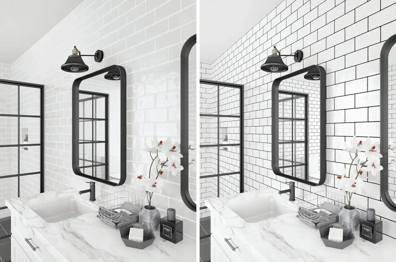
White or cream subway tile reads very differently once the grout turns dark: the grid becomes sharper, the wall feels more architectural, and the tile stops blending into the background. That is why this finish shows up so often in bathrooms and backsplashes where people want a clean surface with more definition and less maintenance than bright white joints. The real question is not whether the look works, but which shade, grout type, and joint width will keep it looking deliberate instead of busy.
Key things to know before you choose dark grout
- Contrast is the point. Dark grout outlines each tile and makes the pattern feel more structured.
- Color choice matters more than people expect. Charcoal usually feels softer and more livable than pure black.
- The grout formula affects upkeep. Cement grout needs more care than high-performance or epoxy options.
- Tile quality shows up fast. With dark grout, uneven edges and sloppy spacing become much more visible.
- Bathrooms and backsplashes are the safest zones. They benefit from the definition without making the room feel heavy.
Why the contrast works so well
I like this combination because it does something simple but effective: it turns a basic rectangular tile into a pattern you can actually read from across the room. Dark lines sharpen the geometry, which is why a classic white wall suddenly feels more tailored, more modern, and a little more grounded.
That same contrast also makes the surface feel less precious. Light grout can look crisp on day one, but it tends to reveal wear, staining, and discoloration faster in busy rooms. Dark grout is not invisible, but it is more forgiving when a shower gets used every day or a backsplash lives near a real cooking zone.
The tradeoff is equally important. If the tile edges are uneven, the substrate is off, or the installation is rushed, the contrast will call attention to the flaws instead of hiding them. I reach for this look most confidently when the tile is clean-edged, consistently sized, and installed with discipline. That is why the next decision is less about style and more about where the finish will do the most work.
Where the look earns its keep
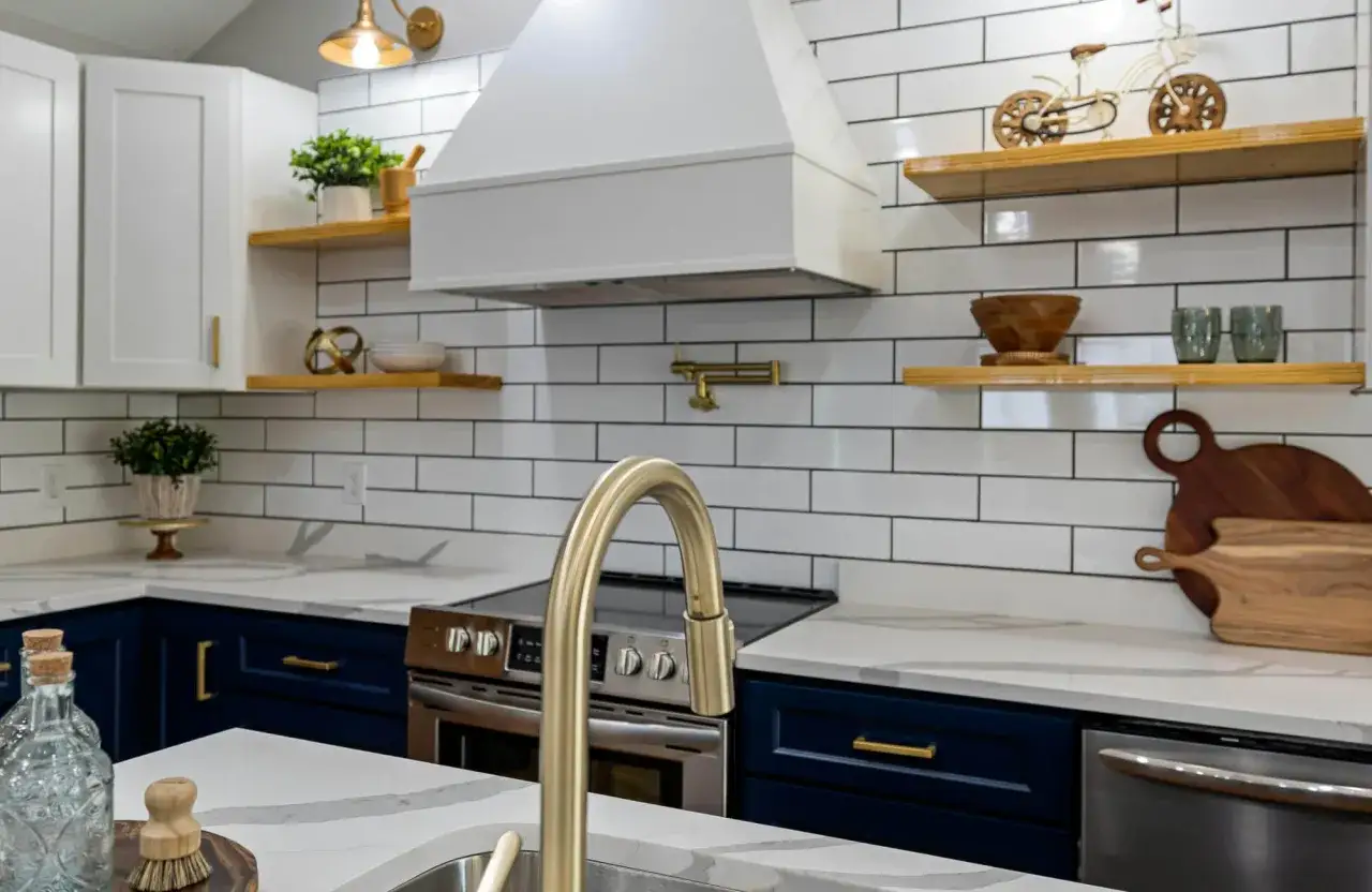
This finish is strongest in rooms that already need practical surfaces. In a bathroom shower, the dark lines help the wall feel more architectural, especially behind clear glass where the tile is always visible. In a kitchen backsplash, the contrast frames the wall neatly without competing with cabinets, counters, or hardware.
- Primary bath showers work well because the tile pattern stays visible even in a simple, low-decor space.
- Powder rooms benefit from the added structure since they usually rely on just one or two visual focal points.
- Kitchen backsplashes get a cleaner read because dark grout helps disguise small splashes and everyday cooking marks.
- Laundry and mudroom walls gain a more durable, utilitarian feel that matches the function of the space.
I am more cautious in very small, low-light rooms if the grout goes almost black on every surface. The effect can become visually heavy, especially if the tile is glossy and the room already lacks natural light. In those cases, a softer charcoal or medium gray usually gives you the definition without making the room feel boxed in. Once you know the room can support the contrast, the next choice is which exact shade gives you the right amount of edge.
How to choose the right grout shade
My default is not pure black. It is usually a medium charcoal, because it gives you the outline without turning every joint into the main event. Pure black is powerful, but it can read harshly if the tile is bright white, the room is small, or the rest of the finishes are already strong.
| Grout shade | Visual effect | Best for | Watch out for |
|---|---|---|---|
| Warm gray | Soft contrast with a calmer, more blended look | Warm whites, beige walls, relaxed bathroom palettes | Can look a little flat if you want a sharper graphic line |
| Charcoal gray | Balanced contrast that still feels livable | Most white subway tile installations in kitchens and baths | Needs good installation because spacing errors still show |
| Soft black | Strong definition with a more dramatic edge | Modern bathrooms, black-and-white palettes, matte tile | Can feel heavy in small or dark rooms |
| Deep taupe or brown-gray | Less stark, slightly warmer and more organic | Farmhouse, transitional, and warmer stone-adjacent looks | May look muddy if the tile is a cool bright white |
If the tile is bright white and the room is cool-toned, charcoal is usually the safest middle ground. If the tile has a cream base, a warmer dark gray often looks more intentional than true black. And if you want the tile to read as a pattern rather than a statement, test a board in both daylight and evening light before you commit. Lighting changes the contrast more than most homeowners expect, which is why the next decision is the grout itself, not just the color.
Choose the grout chemistry before you fall in love with the shade
Grout type affects maintenance, stain resistance, and how forgiving the finished wall will be. A beautiful color can still be the wrong choice if the formula is not suited to the room. For a bathroom or kitchen, I usually separate the options into three practical buckets.
| Grout type | Best use | Upside | Tradeoff |
|---|---|---|---|
| Standard cement grout | Dryer backsplashes and light-use walls | Widely available and easy to match in color | More porous and usually needs sealing |
| High-performance cement grout | Most family bathrooms, showers, and kitchens | Better color consistency and better stain resistance than basic cement grout | Usually costs more and still benefits from good care |
| Epoxy grout | Heavy-use showers, wet zones, and high-cleanability spaces | Excellent stain and chemical resistance | Harder to work with and usually the most expensive option |
For a daily-use shower, I lean toward high-performance or epoxy grout because the cleanup is easier over time, not just on installation day. For a backsplash that sees light splatter and less moisture, standard cement grout can still be perfectly reasonable if you are willing to seal and maintain it. In other words, the best-looking grout is not always the one with the deepest color; it is the one that stays that color after a year of real life. That is where installation details start to matter more than most people realize.
The installation details that make or break the look
Dark grout is unforgiving in a good way. It reveals whether the tile is square, whether the joints are even, and whether the pattern was laid with enough care to hold up under close inspection. The cleaner the layout, the better this finish looks.
- Respect the tile’s recommended joint width. Many rectangular wall tiles are designed to work around 1/16 inch, and 1/8 inch is often used when the tile is laid in a staggered brick pattern.
- Avoid pushing the offset too far. Longer rectangular tiles can bow slightly, so too much stagger can create lippage, which is the height difference between adjacent tiles.
- Use spacers and dry-fit the layout first. Dark grout makes spacing mistakes obvious, especially around outlets, niches, and corners.
- Plan for movement joints. The corners where walls meet are not the place for rigid grout; matching caulk is usually the smarter choice there.
- Remove haze promptly and evenly. A thin film left behind on glossy tile can dull the whole wall and make the grout color look patchy.
I would rather see a slightly narrower joint done well than a wider joint that wanders from line to line. The visual payoff of this style depends on precision, not on making the grout as dominant as possible. Daltile’s tile guidance reflects that same logic: many rectangular wall tiles are set up around 1/16-inch joints, with 1/8 inch used when a staggered brick pattern needs a little more room. Once the wall is installed cleanly, the last question is how to keep that crisp look from drifting toward dingy.
How to keep it sharp over time
Dark grout may hide some everyday dirt better than white, but it does not eliminate maintenance. In showers, the main enemy is usually soap residue, mineral film, and whatever settles into the joint over time. In kitchens, the issue is often grease and fine surface buildup rather than dramatic staining.
For cement-based grout, sealing is still worth doing in wet or high-traffic areas. That is the practical advice I follow most often, because porous grout can absorb water, oils, and grime more readily than a denser product. If you want the look to stay consistent, a penetrating sealer and a gentle cleaning routine are usually enough to protect the finish without overcomplicating the room.- Use a pH-neutral cleaner for routine cleaning.
- Wipe shower walls regularly so soap film does not build up on the tile face.
- Avoid abrasive powders that can dull the grout surface or scratch glossy tile.
- Check for efflorescence, which is a light mineral deposit that can appear after moisture moves through cementitious materials.
- Re-seal cement grout on the product’s schedule, which often means every 1 to 2 years depending on use.
Mapei’s care guidance lines up with that approach: porous cement grout is generally worth sealing, especially in wet or high-use areas. If you do that and keep the cleaning simple, dark grout tends to age in a controlled way instead of turning blotchy. That brings the decision back to the room itself, which is where I like to finish when I am specifying this look for a real project.
What I would specify for a bathroom that gets daily use
If I were choosing this finish for a primary bath, I would start with a crisp white tile, a charcoal grout, and a grout formula with better stain resistance than basic cement. That combination gives you enough contrast to define the tile without making every joint shout for attention.
- For a busy shower, I would choose a high-performance or epoxy grout first, then fine-tune the shade.
- For a powder room or low-moisture wall, a standard cement grout can be enough if the upkeep will be light.
- For handmade or slightly irregular tile, I would soften the grout color so the wall reads textured rather than uneven.
- For a modern kitchen backsplash, I would keep the spacing tight and the lines consistent so the pattern feels intentional.
The best version of this look is balanced: enough contrast to define the tile, not so much that every irregularity screams back at you. When the shade, joint width, and grout chemistry are chosen together, the wall reads crisp for years instead of trendy for one season.