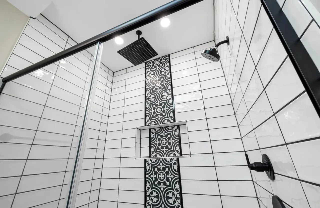
A black tile with brown grout installation can feel rich and architectural, but only if the warmth in the grout fits the tile’s finish and the room’s light. Get the tone right and the surface looks intentional; get it wrong and the whole field can read muddy, dated, or busier than you planned. I’m focusing here on the visual effect, the rooms where it works best, and the practical choices that keep the result crisp.
Key things to know before choosing the grout color
- Brown grout adds warmth and makes tile joints more visible, so it changes both mood and pattern.
- It works best with matte or softly textured black tile, especially in larger formats.
- Lighting matters: warm light flatters brown tones, while cool light can make them look dull or rusty.
- A narrow joint usually looks cleaner; wider joints turn the grout into part of the design.
- Test at least 2 or 3 grout samples on a real board before you commit.
What brown grout does to black tile
I think of grout as part of the surface color, not just the gap between tiles. On black tile, brown grout adds warmth, softens the edge of each tile, and makes the installation feel less severe than white, light gray, or bright contrast grout. The result can be elegant, but only when the brown is deep enough to sit beside the tile instead of floating on top of it.
That is why undertone matters. A cocoa or espresso grout usually feels richer and more grounded, while a reddish or orange brown can start to look disconnected under bathroom lighting. If the room is small or naturally dark, that mismatch becomes obvious fast. The eye does not read color in isolation; it reads the whole field at once.
When the match is good, the tile looks intentional and layered. When it is off, the joints can make the whole surface feel dusty or tired. That difference is subtle on a sample chip and very loud on a wall. That visual shift is what separates a warm, architectural finish from one that just feels uncertain, which is why the room itself matters next.
Where the combination looks deliberate
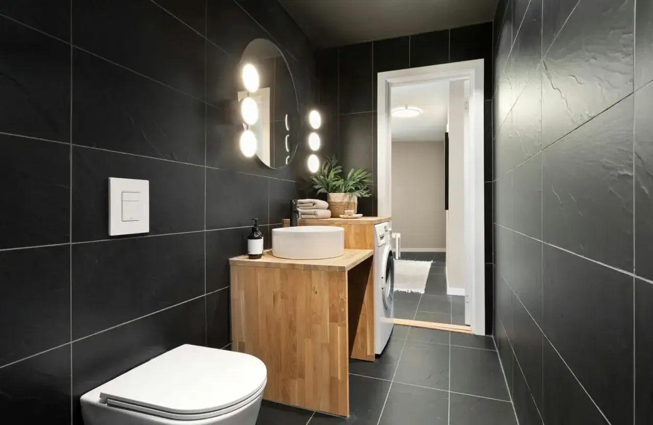
In 2026, this palette works best when the rest of the room already leans warm or tactile: oak, walnut, brass, bronze, linen white, or stone with visible movement. That is when brown grout reads as a design decision instead of an apology for not choosing black. The combination can feel quietly upscale, slightly vintage, or even spa-like, depending on the tile format.
| Setting | What it feels like | My read |
|---|---|---|
| Matte black large-format shower wall | Calm, tailored, architectural | This is the safest and cleanest-looking use case. |
| Black subway tile with a walnut vanity and brass trim | Warm, classic, slightly hotel-like | A strong fit if you want the room to feel finished rather than stark. |
| Small mosaic or busy patterned tile | Graphic and visually active | Use carefully, because the grout can make the pattern feel crowded. |
| Glossy black tile under cool LEDs | Sharper contrast with a risk of muddiness | This is the hardest case, and brown can read rusty if the undertone is wrong. |
If the room already has white counters and chrome fixtures, brown grout can feel like it came from a different design language. If the room has wood, stone, and warmer metal finishes, the same grout can suddenly look intentional. That is why I judge the combination by the whole bathroom, not by the tile alone. Once the palette is aligned, the next variable is the physical shape of the tile and the joint.
How finish and joint width change the mood
The tile surface changes everything. Matte black tile absorbs light and lets the grout sit back; glossy tile throws highlights at the joint line and makes every color decision more visible. A smooth, rectified edge also looks calmer than a rustic, uneven edge, because the grout line stays thin and predictable.
My rule of thumb is simple: the more movement the tile already has, the quieter the grout should be. If the tile is handmade, textured, or patterned, brown grout can make the wall feel crowded. If the tile is flat and monolithic, the grout can do more of the visual work without overwhelming the design.
Joint width matters as much as the grout color. A 1/16-inch joint reads refined and almost seam-like; 1/8 inch begins to define the pattern; anything wider turns the grid into part of the look. That is useful if you want a strong architectural rhythm, but it is not forgiving if the layout is not clean. Dark tile does not hide sloppy alignment, and darker grout can actually make unevenness easier to spot.
Once the geometry is right, the next decision is the specific brown tone, because that is where many projects go off course.
Choosing a brown that does not fight the tile
I rarely start with a medium brown. I start with a sample that is either a warm taupe, a deep cocoa, or an espresso shade, then I compare it under the real light in the room. The wrong brown can look reddish in the morning, flat at noon, and muddy at night. On a black surface, that shift is harder to ignore than it sounds.
| Brown family | Best use | Risk |
|---|---|---|
| Warm taupe-brown | Modern bathrooms that need softness | Can feel too beige next to cool black tile |
| Cocoa or chocolate | Moody, layered rooms with wood or brass | Can look heavy in very small spaces |
| Espresso | Large-format tile where you want the joints to fade | May disappear too much in low light |
| Reddish umber | Rustic or vintage-inspired spaces | Can turn orange under warm LEDs |
| Gray-brown | Minimal rooms that need warmth without obvious color | Can feel dull if the room already lacks contrast |
For bathrooms, I would test the samples under at least three conditions: daylight, 2700K to 3000K evening light, and whatever light hits the room after the mirror lamps are on. That usually exposes the real undertone immediately. If a grout sample looks good in all three, it is probably safe.
One more practical point: build the sample board with the same joint width and the same tile finish you plan to install. A color chip alone is not enough; the joint shape changes how the color reads.
The maintenance tradeoffs behind the look
Brown grout can be useful because it hides some discoloration better than a pale joint, but it does not make a black surface low-maintenance. Dust, soap film, hard-water spotting, and limescale still show on dark tile, especially in bathrooms with hard water or poor ventilation. The grout may stay calmer than white, yet the tile faces can still demand frequent wipe-downs.- Cementitious grout often benefits from sealing, depending on the product.
- High-performance, color-consistent grout tends to hold shade better and resist staining more reliably.
- In showers, ventilation matters more than color choice; grout cannot compensate for trapped moisture.
- Uneven installation shows quickly on dark tile, so lippage and joint consistency need real attention.
I also tell clients not to judge brown grout before it has cured. The final shade can settle a bit after installation, and that small shift matters more on dark tile than it does on a lighter field. Once the grout is in place, the room either feels crisp or it does not, and the chemistry underneath should support that look instead of working against it.
When another dark grout color works better
Brown is only one way to soften black tile. Sometimes I steer a project toward charcoal, warm gray, or near-black instead, because those colors give the room the same restraint without pushing the palette toward earthiness. If the bathroom already has a lot of wood, stone, or brass, brown may be exactly right. If the room is meant to feel sharp and modern, another dark neutral usually performs better.
| Design goal | Better choice | Why |
|---|---|---|
| Nearly seamless black surface | Charcoal or black grout | The joints recede and the tile form becomes the focus |
| Soft warmth without obvious brown | Warm gray or taupe | It keeps the surface quiet but less earthy |
| Vintage or handcrafted mood | Medium cocoa brown | It adds warmth and a slightly lived-in feel |
| Architectural contrast | Deeper espresso brown | It keeps definition while avoiding a stark black-on-black edge |
If the room is small, low light, or very contemporary, I usually lean away from medium brown and toward a quieter neutral. That is not because brown is wrong; it is because the room already has enough visual complexity. In the right space, though, the warmer tone is what makes the whole installation feel finished rather than merely dark.
The safest way to get the look right the first time
The cleanest workflow is simple: choose the tile first, then narrow the grout choices to two or three shades, then build a sample board that shows the real joint width. View it under daytime light and at night, next to the vanity finish, the wall paint, and the metal hardware. If the grout still feels good after that, it is probably the right call.
I would also keep one design rule in mind: if you want the tile to feel calm, let the grout disappear; if you want the grid to be part of the design, make the joints a deliberate feature. The mistake most people make is choosing a brown because it sounds warmer, without asking whether the room actually needs warmth or just less contrast. That answer is what decides whether the finished surface feels polished, or slightly off.