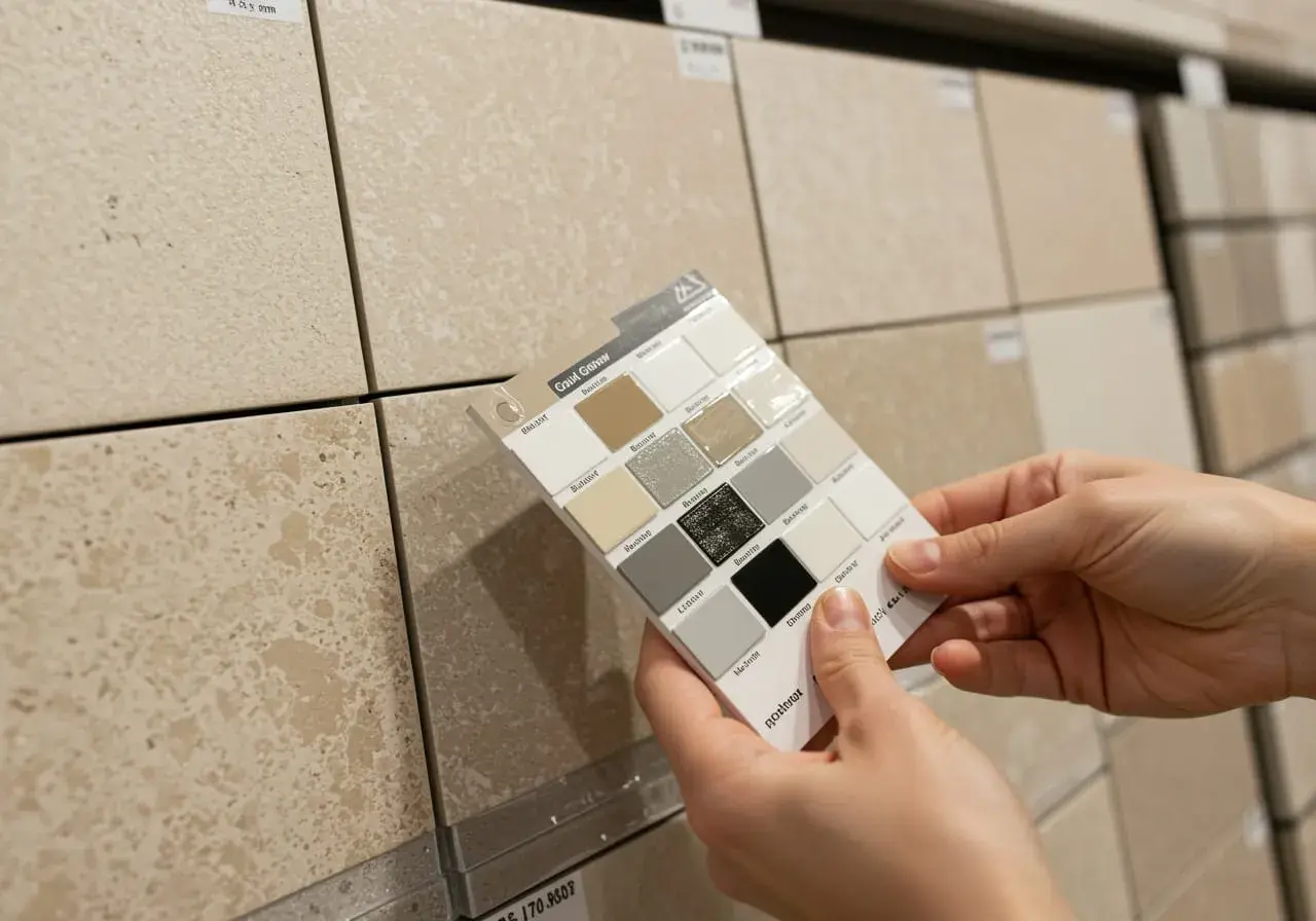
Beige tile looks best when the grout supports its undertone instead of competing with it. When people ask about the best grout color for beige tile, I usually start with warm taupe, sand, biscuit, or a soft greige, because those shades keep the surface calm without making the joints disappear completely. This article breaks down the shades I trust, the combinations I avoid, and the simple sample test I use before anyone commits to a full installation.
The fastest way to narrow the choice
- Match undertone first, because beige can lean yellow, pink, stone-like, or gray.
- For most rooms, a warm taupe or greige grout is the safest all-around choice.
- If you want a seamless look, stay close to the tile color; if you want definition, go one step darker.
- Bright white and cool charcoal are the two extremes most likely to disappoint on beige tile.
- Test cured grout in the actual room lighting before buying enough for the whole job.
Why undertone matters more than the word beige
Beige is not one fixed color. One tile may lean creamy and warm, another may read sandy, and a third may sit closer to greige or stone. That difference matters more than most people expect, because grout that looks perfect beside one beige tile can feel off by a mile next to another.
My first move is to look for the tile’s undertone before I look at the grout chart. Warm beige usually wants a warm grout. Cooler beige or stone-look porcelain often works better with a muted greige or mushroom tone. If the tile has strong movement, texture, or veining, I usually keep the grout quieter so the tile can stay the star.
Here is the shortcut I use most often:
| Beige tile undertone | Grout shades that usually work | What the look does |
|---|---|---|
| Warm or yellow beige | Sand, biscuit, light taupe | Keeps the surface soft and cohesive |
| Creamy or pink-beige | Ivory, almond, warm off-white | Feels clean without turning stark |
| Greige or stone-look beige | Greige, mushroom, medium taupe | Feels modern and hides wear better |
| Textured or handmade beige tile | Matching beige or slightly deeper taupe | Lets shape and texture do the visual work |
Once I know the undertone, I can choose whether I want the grout to disappear, gently frame the tile, or add a little structure. That decision shapes the whole room, so the next step is deciding how much contrast you actually want.
The shades I would shortlist first
I rarely start with pure white or a dramatic contrast. For beige tile, I usually narrow the field to a small group of dependable neutrals and pick from there.
- Sand gives a warm, relaxed look and works especially well with creamy beige tile.
- Biscuit is a little softer and milkier, which makes it useful when you want the tile field to feel continuous.
- Light taupe is my safest middle ground when the tile is neither obviously warm nor obviously cool.
- Mushroom adds an earthy depth that hides day-to-day grime better on floors and high-traffic areas.
- Greige is the best fit when the tile leans stone-like or when the room already includes cooler metals and fixtures.
- Matching beige is the quietest option and works best when the tile itself has a lot of movement or visual texture.
If I had to choose one color family for many beige bathroom installations, I would start with light taupe or warm greige. It usually looks polished without turning the grout lines into the main event. From here, the choice becomes less about a color name and more about how much definition you want the tile layout to show.
When matching beats contrast and when it does not
There are three basic ways to handle grout with beige tile: blend it in, balance it, or frame it with contrast. I use each one for a different reason.
| Look | What to choose | Result |
|---|---|---|
| Seamless | Grout one shade lighter or darker than the tile | Soft, unified, and a little larger-feeling |
| Balanced | Taupe, greige, or mushroom close to the tile body | Defined enough to look finished, not busy |
| Contrasting | Noticeably darker grout | Stronger grid and more visual structure |
I reach for matching grout when the tile already has enough movement, when the room is small, or when the goal is a calm bathroom that feels a little spa-like. I use moderate contrast when the tile pattern deserves to be seen, such as on a backsplash with a clean layout or on a floor where the shape of the tile matters. I avoid extreme contrast in most beige installations, because beige usually looks better with a softer hand than with a graphic one.
That trade-off changes again once you factor in where the tile is installed, because a shower wall does not age the same way a kitchen backsplash does.
How the room changes the best choice
The same beige tile can call for a different grout color depending on where it lives. A bathroom floor, a shower wall, and a kitchen backsplash all deal with moisture, dirt, and daily wear in different ways, so I choose with that in mind.
- Bathroom floors: I lean slightly darker, usually toward taupe or mushroom, because those shades hide dust, shoe marks, and everyday dulling better than a pale cream grout.
- Shower walls: I avoid bright white if maintenance matters. A warm light gray or greige usually looks cleaner over time and makes soap film less obvious.
- Kitchen backsplashes: I can go lighter here because the splash zone is smaller and easier to wipe. A matching grout can make beige tile look tailored above the counter.
- Large-format tile: Subtle grout usually wins, because a loud line is more noticeable when the tile field is broad.
- Small tiles or mosaics: The grout becomes part of the pattern, so the color choice has a much bigger visual impact than most people expect.
One detail I never ignore is grout-joint width. Wider joints make the color read more strongly, so the same beige tile can look much lighter or darker depending on how much grout is exposed. That is why a sample that looks perfect on a tiny board can feel very different once it covers a full wall or floor.
Room use sets the frame, but the wrong color can still flatten a beautiful tile, which is why I am careful with the shades that tend to cause trouble.
Colors I would avoid or use very carefully
Some grout colors look good in a chart and less convincing once they are installed beside beige tile. These are the ones I treat with caution:
- Bright white: It can make beige tile look dirty faster because the contrast is unforgiving, especially around showers and floors.
- Cool blue-gray: It often clashes with warm beige and can leave the room feeling disconnected.
- Charcoal or black: This can work in a very deliberate modern scheme, but with most beige tile it creates a grid that feels harsher than necessary.
- Pink-beige: Some versions look dated or overly creamy once installed under strong indoor lighting.
- Very dark brown: It can swallow the tile pattern and make beige look muddy unless the tile itself is already very earthy and stone-like.
My rule is simple: if the grout color pulls attention away from the tile finish, it is probably doing too much. Beige tile usually looks best when the grout reinforces the palette instead of shouting over it.
That leads to the part I trust most in real projects, because no color chart can replace seeing the grout cure in the room itself.
How I test a grout color before I commit
I do not trust a small store sample on its own. I want to see the tile, grout, and light source together, because that is where the final color either settles beautifully or falls apart.
- Make a test board with at least three to five tile pieces and real grout.
- Let the grout cure fully before judging it; the wet color is not the finished color.
- Check it in morning light, evening light, and with the bathroom or kitchen lights on.
- Look at it next to the vanity, countertop, paint, and trim, not just the tile alone.
- If you are stuck between two shades, choose the one that is slightly warmer or slightly deeper. Beige tile usually forgives a subtle shift better than a harsh one.
This is where a lot of DIY tile projects go wrong. People choose grout by color name, not by the way the room actually behaves. The better habit is to sample in place and let the space make the decision for you.
If I were choosing the finish today, my final shortlist would be easy to defend and easy to live with.
The shade I would start with for most beige tile today
For a typical bathroom or kitchen in the United States, my first choice is usually a warm greige or light taupe. It is neutral enough to feel timeless, warm enough to sit comfortably beside beige tile, and practical enough to handle daily wear without looking tired after a week. If the tile leans creamy, I move a touch warmer with sand or biscuit; if it leans stone-like, I move slightly cooler toward mushroom or soft greige.
- Choose sand or biscuit when the tile is soft and creamy.
- Choose light taupe or greige when you want the safest all-purpose result.
- Choose mushroom when the floor needs more concealment and a stronger frame.
Before I stop, I always look at the room as a whole: tile, paint, fixtures, and light. That is the difference between grout that merely matches and grout that quietly makes the entire surface feel finished.