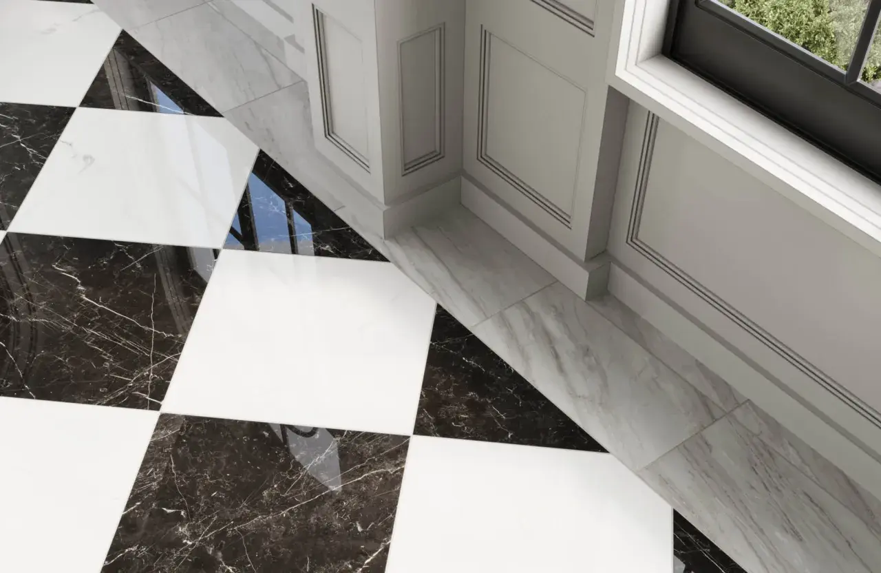
Grout color changes a black-and-white checkerboard floor more than most people expect. The right shade can keep the pattern crisp and timeless, or soften it so the room feels calmer and easier to live with. In a bathroom, that decision also affects cleaning, visual balance, and how the tile will age once the room is used every day.
The safest grout choice is usually a balanced gray
- Light gray keeps the checkerboard readable without making the joints feel harsh.
- Medium gray is the most practical all-around option for bathrooms and floors.
- Bright white gives the sharpest vintage look, but it asks for more upkeep.
- Charcoal or black creates a stronger graphic effect and can make the pattern feel bolder.
- Room size, lighting, tile finish, and grout type can change the result as much as the color swatch itself.
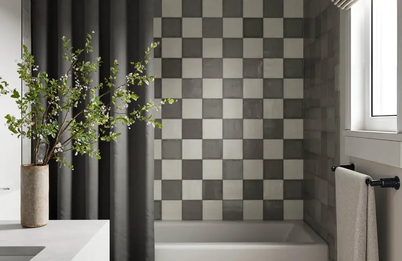
The main grout colors that work with checkerboard tile
When I narrow this down for a real bathroom, I usually think in terms of four lanes: bright white, light gray, medium gray, and charcoal or black. Each one changes the floor in a different way, and none of them is universally right. The best choice depends on whether you want the checkerboard to feel airy, classic, quiet, or graphic.| Grout color | What it does visually | Best for | Main tradeoff |
|---|---|---|---|
| Bright white | Creates the sharpest contrast and the cleanest retro look | Bright bathrooms, vintage-inspired spaces, carefully maintained floors | Shows dirt, staining, and color drift sooner |
| Light gray | Softens the grid without hiding the checkerboard pattern | Small or bright rooms that still need some definition | Less dramatic than a pure white or black line |
| Medium gray | Balances the black and white tiles and keeps the floor grounded | Most bathrooms, family homes, high-traffic floors | Less “picture perfect” than a stark contrast choice |
| Charcoal or black | Turns the grout into part of the design and pushes the floor toward a bolder, more architectural look | Modern baths, dramatic vintage rooms, statement floors | Can feel heavy if the room is small or dim |
If you want the shortest honest answer, I usually start people at medium gray. It sits between the two tile colors without competing with either one, and it tends to survive real life better than white. From there, the room itself tells you whether to go lighter for more lift or darker for more drama.
Why gray is usually the most balanced choice
Gray works because it frames the pattern instead of shouting over it. On a checkerboard floor, grout lines are already doing design work, so I prefer a color that supports the squares rather than drawing even more attention to every joint. Medium gray, in particular, keeps the black tiles from swallowing the floor and keeps the white tiles from feeling overly outlined.
There is also a practical reason gray gets recommended so often: it is forgiving. A bathroom floor collects dust, soap residue, and the odd splash from daily use, and a mid-tone grout disguises that better than bright white. If your tiles lean warm, I would look at a warm gray or greige. If the tiles are cool and crisp, a cooler gray often looks cleaner and more intentional.
That middle ground is useful, but the room around the tile can still push the result in one direction or another, which is where scale and light matter.
How lighting, scale, and fixtures change the look
The same grout can look completely different in a sunlit bathroom and in a small room with only ceiling lighting. That is why I never judge grout color from a tiny sample card alone. I judge it in context, because context is what the eye actually reads.
- Small bathrooms: Dark grout can make the floor feel busier and more confined. A light or medium gray usually keeps the room from feeling boxed in.
- Bright natural light: Contrast becomes stronger during the day, so white grout may look even whiter and charcoal may look even darker than expected.
- Windowless or dim spaces: White grout can turn dingy faster, while medium gray tends to hold its shape without looking muddy.
- Fixture finishes: Matte black, polished chrome, brass, and nickel each push the floor in a different direction. Black grout pairs well with strong black accents, while softer grays are easier to coordinate.
- Tile finish: Glossy tile reflects more light and can make grout lines feel stronger; matte tile usually softens the contrast.
My rule of thumb is simple: the more compact or lower-light the room is, the less I want the grout to fight for attention. That leads directly into another choice people treat as an afterthought, even though it changes the final result just as much as color does: the grout type.
The grout type matters as much as the color
Color gets all the attention, but grout chemistry decides how the color behaves over time. In a bathroom, that matters. A gorgeous white grout line is only useful if the product behind it can handle moisture, cleaning, and regular wear without shifting too quickly.
Here is the practical breakdown I use:
- Cementitious grout: A classic choice with a wide color range. It is common, affordable, and usually needs sealing for better stain protection.
- Epoxy or high-performance grout: Better for stain resistance and color consistency, especially when you want a cleaner long-term finish with less maintenance.
- Ready-to-use or single-component grout: Often easier for DIY projects and typically more consistent in color than basic cement grout.
If you are choosing a light grout, I would lean toward a more stain-resistant product. If you are choosing a very dark grout, I would pay attention to color consistency and UV exposure, because even dark grouts can shift slightly over time. The point is not just to pick a color that looks good on day one; it is to pick a system that still looks right after the room has been used for a while.
Once you understand the material, the next step is simple but essential: test the color in the actual bathroom before you commit.
How to test the color in your own bathroom
I would never choose grout from a tiny printed chart alone. Tile, light, and finish all change the way the color reads, and checkerboard patterns are especially unforgiving because they give the eye so many reference points.
- Bring home two or three likely grout colors. For most people, that means one gray a little lighter than expected, one true mid-gray, and one darker option.
- Look at them against both tiles. A grout that looks great next to the black tile may feel too harsh next to the white tile, and vice versa.
- Check the samples in three lighting conditions. Daylight, overhead bathroom light, and evening light can each change the result.
- View them wet and dry. Grout often looks different during cleanup than it does after it has fully cured.
- If possible, test on a spare board with the actual tile size. The joint width and layout matter almost as much as the pigment.
That little bit of testing prevents the most common regret I see: choosing a grout that looked balanced in the store but feels too white, too dark, or too cold once it is installed. It also helps when you are deciding whether to stay safe with gray or push the look into a more dramatic range.
When white, charcoal, or black grout is worth the risk
There are times when I would absolutely move away from gray. The trick is to do it for a clear design reason, not because a bold swatch looked interesting on its own.
Choose white grout if you want a crisp, vintage, almost hotel-like checkerboard and you are willing to maintain it. White is best when the room is bright, the fixtures are clean-lined, and the floor is part of a more polished design story.
Choose charcoal or black grout if you want the floor to feel more graphic and grounded. This can work beautifully in modern bathrooms or in rooms with strong black accents, but it can also make the space feel heavier than expected if the room is small.
Use black with caution when the tile edges are irregular, the room has a lot of texture, or the white tiles are especially porous. In those cases, the line between dramatic and messy can get thin quickly. I usually prefer charcoal over pure black when I want depth without a harsh outline.
Those are the exceptions, though. For most bathrooms, a softer middle tone is still the most reliable choice, especially if you want the room to look good long after the novelty of the checkerboard has worn off.
The version I would choose for a bathroom that has to age well
If I were specifying a checkerboard floor for a typical bathroom, I would start with medium gray grout and then adjust warmer or cooler based on the tile undertone and the rest of the room. It gives the floor definition, hides everyday wear better than white, and avoids the harshness that pure black or pure white can bring.
If the room is airy and bright, I might move one step lighter. If it is compact, heavily used, or meant to feel calm instead of dramatic, I would stay in the middle or go slightly deeper. That is the practical answer I keep coming back to: match the grout to the way the room lives, not just to the way the tile looks in a sample photo.
For a black-and-white checkerboard, the smartest finish is usually the one that still looks deliberate after cleaning day, morning light, and a few years of foot traffic.