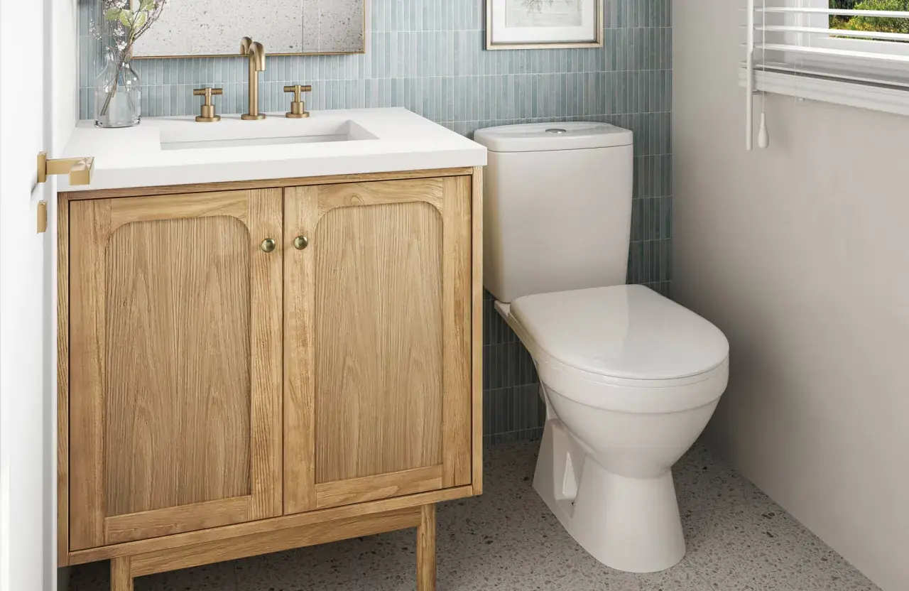
A small bathroom needs a vanity color that does more than look pretty on a swatch. The right shade can make the room feel brighter, cleaner, and more intentional, while the wrong one can make tight corners feel even tighter. Here I focus on the colors that actually work, when a darker vanity is worth the risk, and how to pair the finish with your walls, countertop, and hardware.
The right vanity color makes a small bathroom feel brighter, calmer, and more finished
- Warm whites and soft greiges are the safest starting point for compact bathrooms.
- Pale blue-gray and muted sage add personality without creating visual weight.
- Deep navy, charcoal, and black can work, but they need strong contrast and good lighting.
- Satin or semi-gloss usually performs better on a vanity than flat paint.
- Sample the color in morning, afternoon, and evening light before buying the full amount.
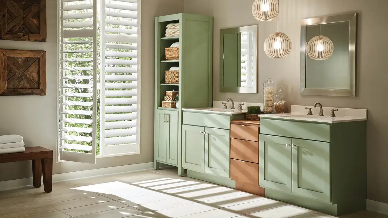
The colors that usually work best in a small bathroom
If I had to narrow the field fast, I would start with colors that add brightness without looking flat. In a compact bathroom, the winning move is usually lightness with enough warmth or contrast to feel designed, not sterile. That is why I keep coming back to a few dependable families:
| Color family | What it does in a small bathroom | Best paired with | My take |
|---|---|---|---|
| Warm white or off-white | Reflects light, keeps the room open, and works in almost any style. | White quartz, chrome, polished nickel, soft stone tile | The safest default when you want the room to feel larger without drawing attention to the vanity itself. |
| Soft greige or taupe | Adds warmth and a little depth, which helps the room feel finished instead of blank. | Brass, black accents, marble-look counters, warm wood floors | Best when the bathroom needs softness more than extra brightness. |
| Pale blue-gray | Feels airy and calm, especially in bathrooms with limited natural light. | White tile, chrome, light countertops, simple mirrors | A strong choice if you want color without making the vanity visually heavy. |
| Muted sage or green-gray | Brings a spa-like look and takes the edge off hard surfaces. | Brass, creamy white stone, matte black hardware | One of the easiest ways to make a small bathroom feel current without chasing a trend too hard. |
| Navy, charcoal, or near-black | Adds depth and makes the vanity look custom when the rest of the room is light. | Large mirror, white countertop, bright walls, strong task lighting | Best in powder rooms or better-lit baths where contrast has room to breathe. |
If you want the shortest answer, I would choose warm white first, soft greige second, and muted sage or blue-gray when the room can handle a little more personality. Dark shades are not off-limits, but they need better planning, which brings me to the part most people miss: the same color can feel very different depending on light, undertone, and sheen.
Why light, undertone, and sheen matter more than the swatch name
I rarely judge a vanity color by its label. I judge it by how much light it reflects, how the undertone behaves in the room, and whether the finish supports the look you want. In practice, higher-LRV colors read brighter because they reflect more light; that is why many popular bathroom whites sit in the high 70s or low 80s on paint charts. A color in that range usually feels safer in a tight bathroom than a deeper shade with the same base tone.
Undertone matters just as much. A white with a cool blue cast can look crisp in daylight but slightly icy under warm bulbs. A greige with too much brown can feel heavy if the room already has dark tile or a low ceiling. I pay close attention to the direction of the light too. North-facing bathrooms tend to make colors feel cooler, while south or west light can warm them up and soften the edges.
Sheen changes the result again. Satin and semi-gloss are usually the practical choices for a painted vanity because they hold up better to moisture and wipe-downs, and they add just enough reflectivity to keep the cabinet from looking flat. That slight shine also helps a small room feel cleaner and more deliberate, which is why finish choice is never just a technical detail. Once you understand that, pairing the vanity with the rest of the room gets much easier.
How to match the vanity with walls, countertop, and hardware
The vanity should not compete with the rest of the bathroom. In a small space, I usually want one clear star and a few quiet supporting elements. If the countertop is busy, the vanity should calm things down. If the walls are plain, the vanity can carry a little more color. If the tile already has strong pattern or contrast, I keep the cabinet quieter and let the surfaces do the talking.
- White or light quartz gives you the widest range of vanity colors. It makes dark blue, sage, or charcoal feel intentional instead of overwhelming.
- Brass hardware warms up white, greige, and sage finishes. It is especially useful when the room risks feeling cold.
- Chrome or polished nickel works best with crisp whites, pale blue-grays, and navy. Those pairings feel clean and a little more tailored.
- Busy tile usually calls for a quieter vanity. If the floor or shower already has a lot going on, I would not add a loud cabinet color on top of it.
- Dark flooring can support a lighter vanity beautifully. That contrast keeps the room from turning into a single heavy block of color.
My rule is simple: if two major surfaces are strong, the third should step back. That balance keeps a compact bathroom from feeling visually crowded, and it leads directly to the mistakes I see most often when people pick vanity paint.
The mistakes that make a compact bathroom feel smaller
- Choosing a color from the chip alone. A swatch in the store is not the same as a painted cabinet under your lighting.
- Using a cool white in a warm room. The vanity can end up looking slightly gray or dingy if the bulbs and tile pull it in the opposite direction.
- Going dark without contrast. Navy, charcoal, and black need a white or light counter, a bright mirror, and enough light to keep them from flattening the room.
- Matching the vanity too closely to the wall. That can work in some color-drenched spaces, but in a small bathroom it often makes the room feel featureless.
- Ignoring the finish. A flat finish on a vanity can look muddy fast, while the right satin or semi-gloss keeps the piece feeling crisp.
Most of these mistakes are easy to avoid if you test the color properly before committing. I would rather spend an extra day checking samples than repaint an entire vanity because the shade changed under real light.
How to test a vanity color before you buy paint
When I test vanity colors, I do not paint a tiny square and call it done. I want a sample large enough to show the undertone, the sheen, and the way the color sits next to the countertop. A painted board, a spare cabinet door, or even a primed poster board gives you a far better read than a small patch on drywall.
Here is the sequence I recommend:
- Paint at least two thin coats on a sample board so the color looks finished, not translucent.
- Place it beside the vanity top, wall color, floor, and trim so you can see the full relationship.
- Check it in morning light, late afternoon light, and with the bathroom lights on.
- Leave it in place for a day or two, because some colors feel right at noon and wrong after dark.
If you are repainting the vanity itself, I would also choose a cabinet-specific enamel in satin or semi-gloss and prep the surface carefully so the color performs as well as it looks. Once you test properly, the final decision gets much clearer, and the best starting palette becomes obvious.
The palette I would choose first for most compact bathrooms
For most small bathrooms, I would begin with one of three directions: a warm white for maximum openness, a soft greige for warmth and flexibility, or a muted blue-green if you want a little more personality without shrinking the room. Those three choices cover the majority of real homes because they work with common US finishes like white quartz, brushed nickel, chrome, and brass.
- Warm white if the room is very tight, low on daylight, or already visually busy.
- Soft greige if you want the vanity to feel a little richer and more forgiving around imperfect tile or trim.
- Muted sage or blue-gray if you want color that still reads calm and easy to live with.
- Navy or charcoal if the bathroom is a powder room, has strong lighting, or needs a more tailored, custom feel.
For the most practical long-term choice, I still lean toward warm white or soft greige because they stay flexible when you change hardware, mirrors, or wall color later. If you want the room to feel brighter without looking generic, that is usually the smartest place to start.